Radish to romanesco: A year in vegetables
February 20th, 2025
4 min
Datawrapper lets you show your data as beautiful charts, maps or tables with a few clicks. Find out more about all the available visualization types.
Our mission is to help everyone communicate with data - from newsrooms to global enterprises, non-profits or public service.
We want to enable everyone to create beautiful charts, maps, and tables. New to data visualization? Or do you have specific questions about us? You'll find all the answers here.
Data vis best practices, news, and examples
250+ articles that explain how to use Datawrapper
Answers to common questions
An exchange place for Datawrapper visualizations
Attend and watch how to use Datawrapper best
Learn about available positions on our team
Our latest small and big improvements
Build your integration with Datawrapper's API
Get in touch with us – we're happy to help
This article is brought to you by Datawrapper, a data visualization tool for creating charts, maps, and tables. Learn more.
Hi, this is Aya from the support team at Datawrapper. You can usually find me answering your questions at support@datawrapper.de.
Last week, I had a flight ticket booked to finally see my family in Japan after three long winters in Berlin. Japan had strict entry restrictions which had been discouraging me from taking a trip until they started loosening the rules in February. It seemed like travel would be getting easier again — until Russia started its attack on Ukraine. This led many countries to ban or avoid flying over Russian airspace, which affected almost all routes from Europe to Japan. After many cancellations and delays, I finally arrived a whole day later than planned.
Since my flights kept changing, I spent a fair amount of time checking flight routes on the flight-tracking website flightradar24.com. So I decided to make some maps out of it.
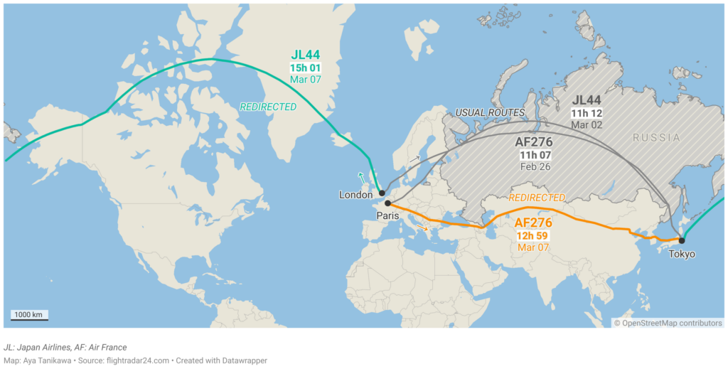
Here’s a locator map showing two airlines’ flights to Japan: the usual routes and the redirected flights for this week.

In normal times, an Air France flight from Paris to Tokyo takes about 11 hours and covers almost 10,000 kilometers, most of which is over Russia. This week, I flew with them on a detour south, over Central Asia. Even though both routes look around the same length on the map, the redirected route adds another few thousand kilometers and two hours to the total flight.
Meanwhile, Japan Airlines has decided on another route for its detour. Instead of flying through Central Asia, it’s taking the “polar route” through Iceland, Greenland, Alaska, and across the Pacific. It turns out that this used to be the standard route during the Cold War, when similar bans existed over Russian airspace. When I first saw this, it felt a little weird. It didn’t feel like an intuitive alternative. It’s even going in the “wrong direction”! Or so it seems on the map above.
The above two maps are in Web Mercator projection, which is the most commonly used projection for web maps. It’s also the projection used for most of the maps I saw growing up, to the point where the world map I picture in my mind is a Mercator map (this even has a name apparently — the Mercator effect). But clearly, Mercator maps have some problems when it comes to visualizing flight paths. So I wanted to try drawing the same routes on a different projection.
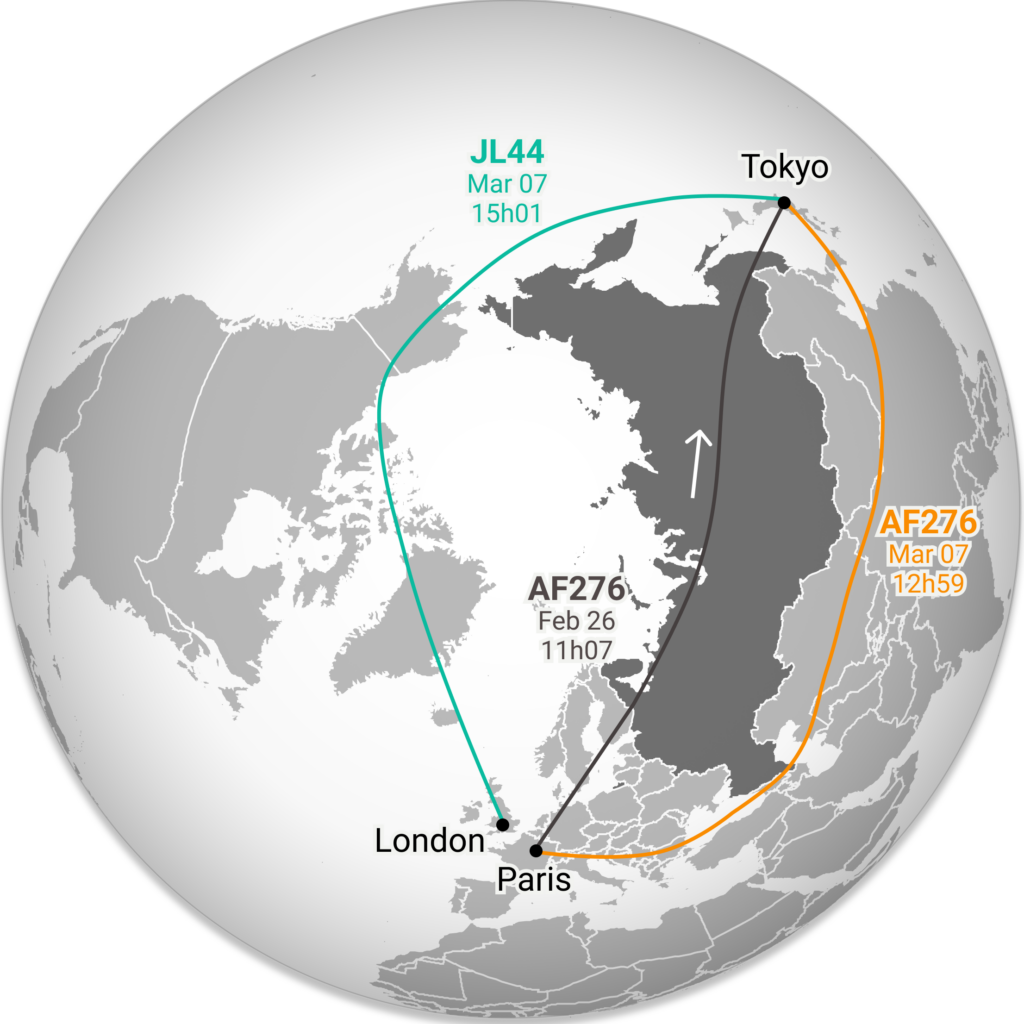
I tried out different projections and settled on an orthographic projection. (Unfortunately, this wasn’t possible with Datawrapper so I simply drew an image instead.)
The orthographic projection overcomes two problems I had in the locator map:

Map projections are complicated — there’s no perfect way of showing a 3D object on a 2D surface. Also, when it comes to routing, it’s never just about connecting two points on a map with the shortest distance. The distance doesn’t always reflect the time it takes to get from one place to another. There are jet streams, wind directions, geopolitical situations, airspace tariffs, airline alliances, and so many other factors to consider. There’s no “right map projection,” but there are better and worse choices for a given purpose and I think that’s always good to remember! Writing this blog post has definitely changed the way I imagine the distance between the two places I call home.
The trip was long, but it was nothing compared to most of the people on that plane, who were only stopping in Tokyo to fly another 9 hours to New Caledonia. I feel very lucky and blessed to get to see my family again and I hope everyone gets to see their loved ones, wherever they may be on the map.
That’s it from me for this week. See you next week!
Comments