This article is brought to you by Datawrapper, a data visualization tool for creating charts, maps, and tables. Learn more.
A fair way (or four) to look at global carbon emissions

Hello everyone! I’m Jack, a developer at Datawrapper. This week (and for my first Weekly Chart) I’m coming at you with a bunch of maps!
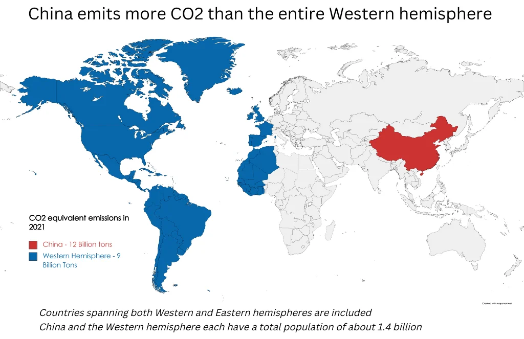
Recently, while seeking the satisfaction of neatly organised information on r/dataisbeautiful, I came across a post with a strong title: “China emits more CO2 than the entire Western hemisphere.”
As is customary on Reddit, a heated debate had ensued in the comments. This one, to sum it up in a sentence, was about the map creator’s choice to base their visualization on the raw, production-based global carbon dioxide emissions from only the previous year.
Ok. That’s a mouthful. And what exactly are the adjustments that these Redditors suggest?
I decided to download the datasets from Our World In Data and try their ideas out myself with Datawrapper’s choropleth maps.
Raw Carbon Dioxide (CO₂) Emissions: Fossil Fuels and Industry
Let’s start with the total annual emissions, as the original map’s creator did:
In 2020, China emitted over twice as much CO₂ as the U.S. In fact, China's emissions were equivalent to the combined emissions of the 14 next highest-emitting countries. This staggering difference raises questions about the scale of China's industrial activities and energy consumption.
However, it's important to consider the broader context when interpreting these emission statistics. As pointed out by the comments under the original post, this measure fails to take into account populations size, historic emissions, and emissions embedded in trade.
So let’s jump in and see how adjusting for these metrics affects how the data looks.
Per Capita CO₂ Emissions: Assessing Individual Footprints
To gain a more nuanced understanding, let's account for a nation's population size.

In this map, we're looking at something closer to individual carbon footprints. As the original map’s annotation points out, China and the next 14 emitters both have a total population of about 1.4 billion — so it's not that shocking that they emit similar amounts of carbon. Focusing solely on total emissions may also cause us overlook the disproportionate impact that smaller countries can have on a per capita basis. For example, this map reveals Qatar as a significant outlier, with per capita emissions of 33.6 tons in 2020.
Mapping per capita emissions helps us understand the importance of adopting sustainable policies and practices at both individual and national levels. It prompts discussions on lifestyle choices, energy efficiency, and the equitable distribution of resources.
Cumulative CO₂ Emissions: Tracking Historical Contributions

CO₂ can take anywhere from 20 to several hundreds of thousands of years to disappear from the atmosphere. To understand the historical contributions of different nations to the climate crisis, we have to consider their cumulative emissions.
Here, the U.S. stands out with more cumulative emissions since 1750 than the five next highest-emitting countries combined. We could show that on a map similar to the original one:
Recognizing the disparities in cumulative emissions among nations helps foster a sense of shared responsibility and calls for collective action. It prompts discussions on the need for developed countries, which have historically emitted higher levels of carbon dioxide, and have already developed the majority of their national infrastructure, to take the lead in reducing emissions and supporting climate adaptation efforts in vulnerable regions.
Consumption-Based CO₂ Emissions: More Realistic National Footprints
Our third commenter suggests looking at carbon emissions by their “destination” country. This approach accounts for the emissions associated with a nation's consumption patterns, regardless of where goods were physically produced.

This map reveals the hidden impacts of consumption patterns, highlighting the behaviors of individuals, households, and societies in their actual use of resources. By analyzing consumption-based emissions, we can better understand the implications of international trade and the interconnectedness of global economies.
Notably, this measure more evenly distributes the responsibility of emissions across the global north and developing countries, reflecting the true impact of consumption choices on the environment.

When exploring global CO₂ emissions, it’s essential to consider various interpretations of the data. Each approach sheds light on different aspects of the climate crisis, and highlights the complexity and interconnectedness of the issue.
- Raw carbon dioxide emissions reveal the scale of industrial activities and energy consumption in different countries, emphasizing the need for sustainable practices and renewable energy sources.
- Per capita emissions expose the disproportionate impact certain nations have on a per-person basis, highlighting the differences in socio-economic development, energy consumption patterns, and carbon-intensive industries.
- Cumulative emissions offer historical context, demonstrating the long-lasting effects of carbon emissions and the urgency of addressing past and present contributions to climate change.
- Lastly, consumption-based emissions provide a realistic assessment of a nation's carbon footprint, emphasizing the importance of sustainable trade practices and global cooperation.
By considering these diverse perspectives, we can challenge the notion that high-emitting countries are solely responsible for the climate crisis. It encourages a more comprehensive approach that emphasizes the need for collective action and shared responsibility among nations to address climate change effectively.
Thanks for reading! See you next Thursday for a Weekly Chart from Pascal.


Comments