This article is brought to you by Datawrapper, a data visualization tool for creating charts, maps, and tables. Learn more.
Sex and the census

Hi, it’s Rose again — I write for Datawrapper’s blog. This week, I’m looking at some dark corners of U.S. history using a deceptively simple piece of data.
This Weekly Chart started with a very simple question: are more Americans men or women?
For questions like that, we have the Census Bureau. And we’ve had it for a long time — a census every ten years since the country was founded. So it was easy and quick to find answers not just for today, but going back to 1820:
The numbers in this chart are my version of what’s usually called the sex ratio, the share of the population that’s made up of women.[1] To make it more concrete, I’m visualizing the number of “extra women” per 100 men — if you’re standing in a room of 100 men and 105 women, that’s 5 “extra” women above an even 100-100 baseline.
For demographers, the sex ratio can reveal all sorts of interesting trends in a society. It’s affected by cultural factors, like a preference for sons that results in sex-selective abortions. It’s affected by public health factors, like advances in life expectancy that disproportionately benefit older women. It’s affected by economic factors, like which industries are attracting immigration and who tends to work in them.
In some countries, these factors add up to a really extreme skew — like the United Arab Emirates, where there are just 45 women for every hundred men. The U.S. has never had a skew like that. Whether there are 95 or 105 women for every hundred men is interesting on a historical scale, but you wouldn’t notice it in a crowded room.
But does that mean you could walk into any room, or any town, in the U.S. and expect a balanced population? Not at all! Although the national numbers might be close to even, there’s variation from place to place and even from region to region. You can zoom in and hover over each county in this map to see its historical chart as well:
Most counties in this map have a pretty light color, meaning that their populations are about half-and-half, as we’d expect. But a few counties are really dark — and all of those dark counties are green. That’s where this story also takes a darker turn.
A few of the dark-green counties are home to industries that attract a lot of male workers far away from their families. The Aleutians East Borough and Aleutians West Census Area in Alaska host workers in commercial fisheries; Alaska’s North Slope Borough and Garza County, Texas were built on oil. But most of the dark-green counties show up on this map because of the prisons located there. Of the twenty most gender-skewed counties in America, fifteen are rural areas with large populations of prisoners. The practice of counting prisoners with the population of their prison’s county doesn’t just throw off this gender data — it’s basically a form of gerrymandering that inflates the political power of prison counties where many prisoners don’t even have the right to vote.
The other trend this map reveals is much subtler — a general gradient across the country with more women in the East and more men in the Mountain West states. That pattern is a very old one in U.S. history:
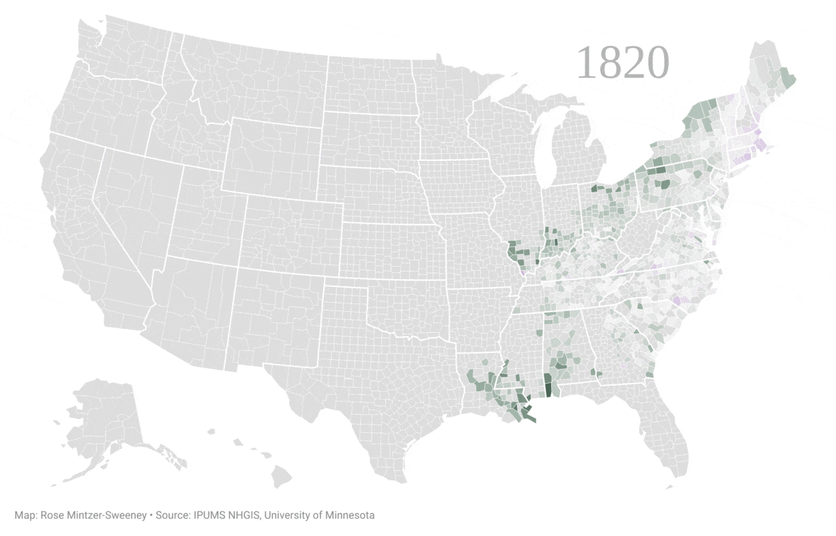
As these historical maps show, the census has always found more men on the frontier — as the U.S. expanded, western counties’ early settlers were disproportionately male, and the effect has never fully faded. You can see a dramatic example in the 1850 map, which shows the Gold Rush-era migrants to California.
The census is great fun for historical snapshots — there’s not many other data sets that can compare such fine-grained geographical divisions at such regular intervals throughout recent history. It’s appealing to work with because it’s easy to access and feels easy to interpret. But this GIF also highlights the limitations of census data. From the very beginning of this time series, the whole land is full of people — both men and women. The census, of course, is only taken in areas under the territorial control of the U.S. government. But even within U.S. states and territories, Native Americans were not counted at all until 1860 and not counted on the general population schedules until 1940. Counting only settler and enslaved residents definitely contributes to the census’s image of a male-skewed West in the 19th century.
Tips for creating these maps and charts
There are a lot of visualizations in this Weekly Chart — 20 historical maps in the GIF as well as a tiny column chart in every tooltip of the interactive map. It would have been impossible to create them all by hand! Instead, I took advantage of two methods for creating visualizations automatically. The column charts in the tooltips aren’t Datawrapper charts at all, but bits of HTML that are styled to represent my data. You can read a guide to creating HTML tooltip charts in the Academy. The set of historical maps, meanwhile, I created in a batch using Datawrapper’s API. The API is free, and there’s a guide to using it in the Academy as well.
That’s all from me this week! See you next Thursday for a Weekly Chart from our developer Ivan.
- Obviously, ideas about sex and gender have changed a lot in the past 200 years and are still changing. The Census Bureau states that their current question wording "specifically intends to capture a person's biological sex and not gender." Respondents don't have the option to choose any answer besides "male" or "female," and so throughout this post I've also had to work from the assumption that everyone is either a man or a woman. All data comes from the IPUMS National Historical Geographic Information System at the University of Minnesota. ↩︎


Comments