Radish to romanesco: A year in vegetables
February 20th, 2025
4 min
Datawrapper lets you show your data as beautiful charts, maps or tables with a few clicks. Find out more about all the available visualization types.
Our mission is to help everyone communicate with data - from newsrooms to global enterprises, non-profits or public service.
We want to enable everyone to create beautiful charts, maps, and tables. New to data visualization? Or do you have specific questions about us? You'll find all the answers here.
Data vis best practices, news, and examples
250+ articles that explain how to use Datawrapper
Answers to common questions
An exchange place for Datawrapper visualizations
Attend and watch how to use Datawrapper best
Learn about available positions on our team
Our latest small and big improvements
Build your integration with Datawrapper's API
Get in touch with us – we're happy to help
This article is brought to you by Datawrapper, a data visualization tool for creating charts, maps, and tables. Learn more.
Hi, this is David W., responsible for design here at Datawrapper, and I present to you this week’s Weekly Chart. Like most of my coworkers, I live in Berlin, but I’m originally from Hamburg, where I spent the majority of my life. In this week’s edition, we take a closer look at my hometown and how it’s structured — so expect to see maps!

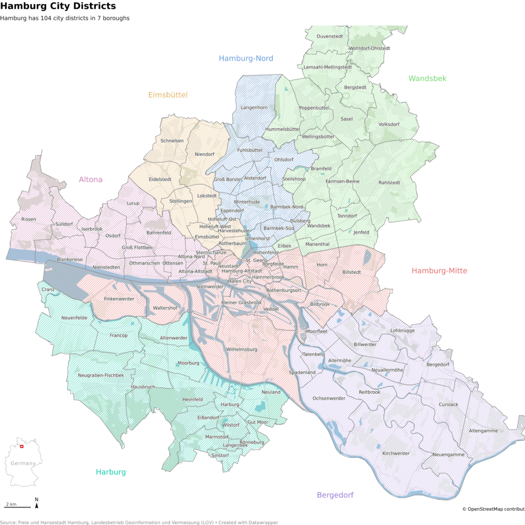
Hamburg is structured into 104 city districts in 7 boroughs: Hamburg-Mitte, Hamburg-Nord, Wandsbek, Bergedorf, Harburg, Altona, and Eimsbüttel. These are shown with the different colors on the map above.
This can be confusing when you realize that nearly every borough (except for Mitte and Nord) also has a city district with the same name. So, for example, the Eimsbüttel borough also has the Eimbsüttel city district inside it.
Well, for one, some of the names can be funny and very “hamburgish” (Poppenbüttel, Hammerbrook, or Blankenese), while others have become iconic, such as St.Pauli. But it’s not just about the names.
As I said, I’m from Hamburg, and now I live in Berlin. I visit my hometown once in a while and sometimes play the role of the city guide for others, showing them around the different districts (”This is Barmbek”, “Now we are in Eppendorf”). I often struggle because I don’t know where one ends and the other begins. The reason is not that I don’t know the city, I can navigate it quite well, but I don’t know the district borders by heart. I use them in daily life, but in my mind, they’re a little different from the map.
Maybe you’ve experienced it yourself — sometimes, the map in your mind differs from the map in your hand. It can be district borders, names you never heard of, or how they are used. For example, as I mentioned earlier, “Wandsbek” can mean both a borough and a city district. But in everyday life, locals always mean the district.
The maps above were created with Datawrapper’s locator map feature. Normally, it’s better suited for maps showing a specific area with some points of interest, but in this case, I wanted to try and make a big overview map with a lot of details.
I imported the city districts as “custom line/area markers” and added all the labels myself. The boroughs can be easily added with the “add region marker” feature and styled afterward. I also added the shape of Hamburg as a region marker and added a very big opaque white vignette to it. That created the cut-out effect.
Personally, I like to find out how I can use the tools of any product to design what I have in mind. How far can I go with the given constraints? How can I use the tool differently? That’s always a lot of fun.
That’s it for this week. I hope you visit Hamburg someday, it’s worth it, and stay tuned for next week’s chart.
Comments