This article is brought to you by Datawrapper, a data visualization tool for creating charts, maps, and tables. Learn more.
To leave or to stay? That is the question.

Hi, this is John the intern. For this Weekly Chart, I wanted to tackle the issue of mapping uncertainty and decision-making in regards to the recent Hurricane, Dorian. My family lives in the American southeast, so this is a recurring topic of interest every year as hurricane season rolls through. It was also a fun exercise in making a contour (also known as an isopleth) map using Datawrapper locator maps.
On the afternoon of Sunday, September 1st, the governor of South Carolina issued a “mandatory” evacuation for 830,000 residents of South Carolina’s coastal region due to the looming threat of Hurricane Dorian. In that moment, each person was faced with the same question: do I leave or do I stay? As humans, we make decisions every day (duh). Sometimes I’ll spend 15 minutes just staring at a wall of cheeses in the supermarket. But the decision to leave or stay at home through the possibility of a natural disaster is significantly more difficult than gouda or muenster. It involves serious matters such as travel logistics & budgeting, property damage, and most importantly, your safety.
The day after the SC governor issued the evacuation order, the hurricane was still 3 days and 400-500 miles away. While at the time the hurricane was a category 5 and ravaging the Bahamas, the National Hurricane Center (NHC), a branch of the National Oceanic and Atmospheric Administration (NOAA), was already predicting that by Thursday, September 5th, Dorian would be a category 2 and 80 miles off the coast of Charleston, South Carolina’s largest metro area. So how does one go about making the decision to stay or leave?
Let’s take a look at what information was available at 12pm on Monday, September 2nd (one day after the evacuation order and two-three days before the arrival of the hurricane).
So what does this graphic mean? Direct from the NHC website, the forecast cone, or the “cone of uncertainty” as it has come to be known, represents, and this is a direct quote, “the probable track of the center of the hurricane, and is formed by enclosing the area swept out by a set of circles (not shown) along the forecast track (at 12, 24, 36 hours, etc). The size of each circle is set so that two-thirds of historical official forecast errors over a 5-year sample fall within the circle.” Great, so everything is explained, right?
As Alberto Cairo explored in his NY Times article, most people misunderstand the cone of uncertainty map graphic used by news rooms. All this graphic tells us is there is a 2/3 chance the center of the hurricane will stay in this cone and a 1/3 chance it will not. Not very helpful. And as the NHC warns, “This graphic contains the probable path of the storm center but does not show the size of the storm. Hazardous conditions can occur outside of the cone.” So what other information can the media provide to help us make decisions?
In Cairo’s article, he briefly shows a picture of wind speed probabilities, but doesn’t explain it. In the below map, a 5-day forecast shows how likely you are to experience 75mph winds, a speed fast enough to be concerned. Because high winds can cause damage or harm from flying debris or knocked down trees and powerlines, this information could have an impact on whether you board up your house, trim your yard trees, or even if you stay or leave.
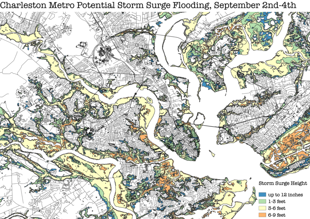
While this map still requires people to make decisions based on probability, it at least gives people specific information about conditions they may face. Along with wind, storm surge (more simply known as flooding) is a large source of destruction during a hurricane. The following map shows storm surge likelihood. According the the NHC, the information is valid for 78 hours (a little over 3 days) from the time its published. This information is also useful in deciding to leave or stay, or whether to surround your property with sand bags.
Both of these maps show us that there is better information available than the cone of uncertainty even 3-5 days before the arrival of a hurricane. With this kind of information, people can make a more informed decision about leaving or staying. Ultimately, Hurricane Dorian stayed on the path predicted by the NHC with relatively little damage to South Carolina and no deaths.
Making the Call
Of course, there is the perspective from the Governor of South Carolina. When, if at all, do you order an evacuation? While forecasts may say the hurricane will pass by, there’s always the worst-case scenario (the 1/3 chance) that a hurricane is not in the cone of uncertainty and makes landfall, putting thousands of people in danger. While “better safe than sorry” seems to be the safest route, at what point does it turn into the boy who cried wolf? Evacuation orders of these sizes are no joke. It’d be like asking the entire nation of Bhutan (and then some) to pack up and vacate the country once a year. Of the 830,000 people ordered to evacuate, 441,000 actually did, or about 53%. South Carolinians have begun to experience what’s being called “evacuation fatigue.” Year after year, residents are ordered to evacuate, and every year so far, many people were likely better to stay at home and tend to minor damages.
As hurricanes get more frequent and stronger due to climate change, the authorities and media in the American southeast may need to implement a better way to communicate the real danger people face. At the very least, perhaps it’s time to rethink the cone of uncertainty.


Comments