


New: Stay organized with a more powerful, faster visualization archive
June 25th, 2024
3 min
This article is brought to you by Datawrapper, a data visualization tool for creating charts, maps, and tables. Learn more.
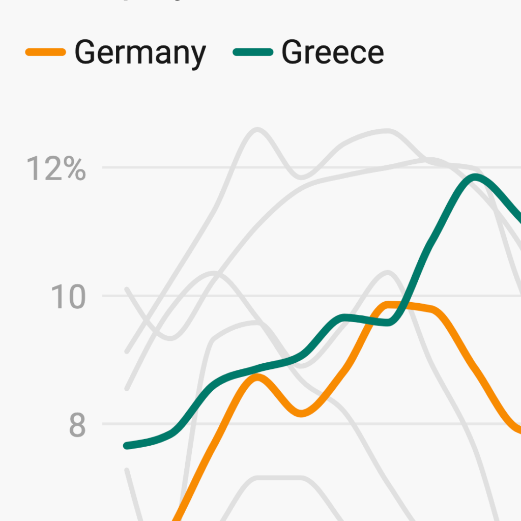
Visualizing data often means visualizing data over time. Line charts are perfect for this, and you use them often: One in five visualizations published with Datawrapper is a line chart.
We know you spend a lot of time on them. That’s why we decided to make line charts more powerful and easier to create. Starting today, you’ll find an improved editing experience for this classic chart type. Here’s what’s new:
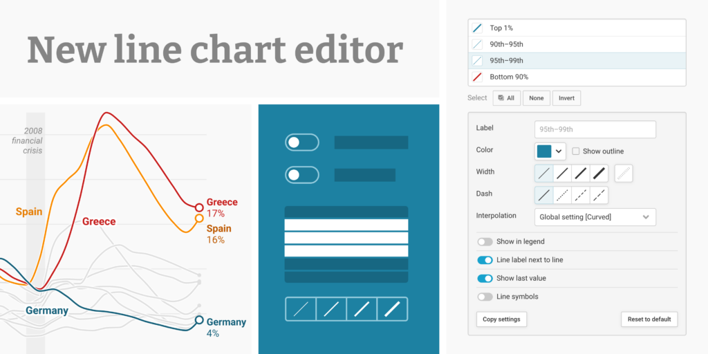
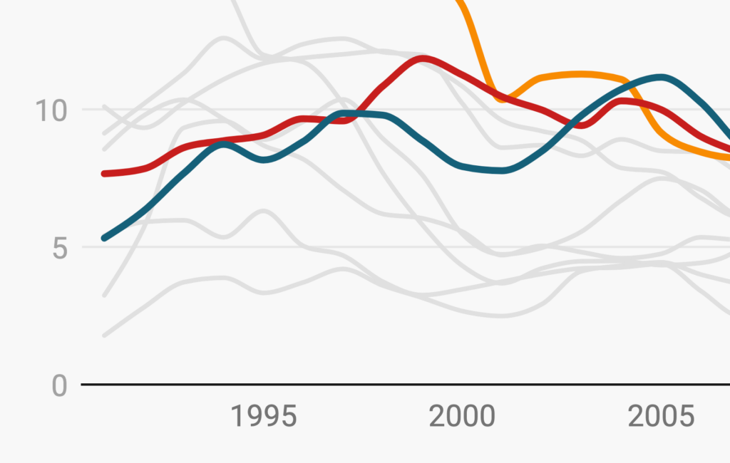
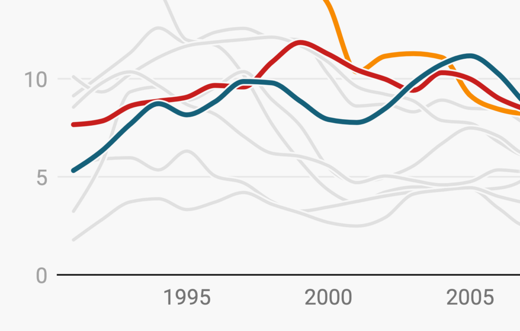
When it comes to chart design, perfection is in the details — and you can now fine-tune those details on a line-by-line basis in the Customize lines section:
This simplifies editing by combining all line settings into one section. But more importantly, it makes certain features customizable per line that were previously only customizable for all lines at once. This opens up many new design possibilities. Display the category or value label for selected lines instead of all lines, and decide which lines to label in the color key, or which ones should have line symbols. These new options are perfect to bring focus to charts with many lines:
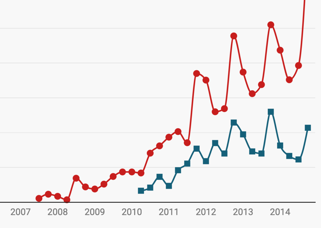
We’ve optimized our new interface for efficiency: As in our multiple lines charts, tables, and locator maps, you can now easily select multiple items to edit at once. It’s simple to apply your changes in bulk, or to copy and paste styles between different lines:
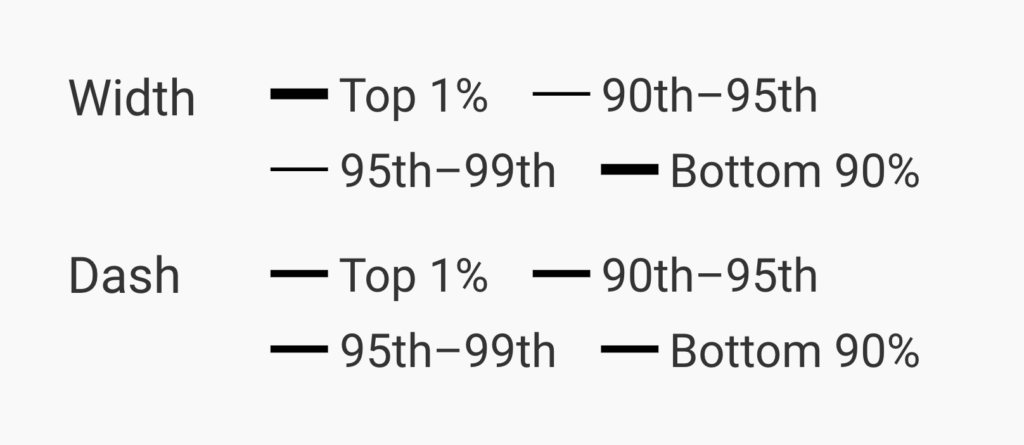
This makes it faster to customize the width and dash of your lines. Select all the lines you want to edit together, then choose their style directly — no more cycling through an unknown set of options.

In this improved editor, it’s much easier for our developers and designers to integrate new line customization options. We couldn’t resist adding two small new possibilities to our line charts:
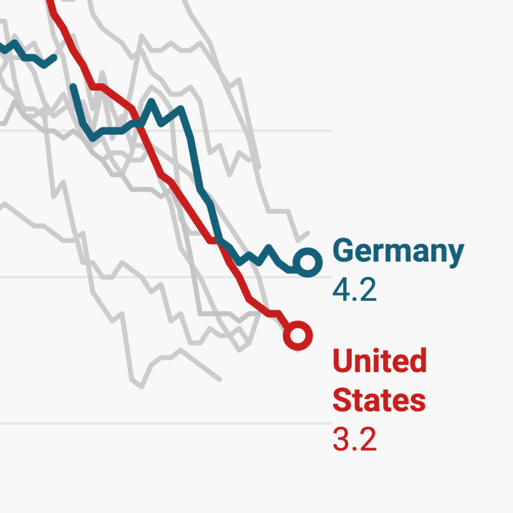
First, you can now highlight one or several lines and bring them to the front by applying a thin outline stroke. That’s useful if you want to give one line some extra focus; we also recommended it for helping your readers to follow the paths of many overlapping lines.
The second new option is to make line symbols “hollow.” Depending on what you’re using symbols for, you may find this more appropriate than the already-available filled style — and now the choice is yours.

While the new editor offers more customization options, we believe that simple things should stay simple. We’ve kept it easy to make quick design decisions that cover all the lines in your chart. Want to change the interpolation method or add a complete color legend? You can still do this with a single familiar click, in an interface that feels familiar to long-time Datawrapper users:

When you do want to go deeper, the Customize lines section is waiting for you.
We’re excited to see what you build with the new options available in our improved line chart editors. Let us know if you have any questions or feedback at support@datawrapper.de. We’re always happy to hear from you.

Comments