
What to consider when creating small multiple line charts
February 7th, 2024
8 min
This article is brought to you by Datawrapper, a data visualization tool for creating charts, maps, and tables. Learn more.
Which interpolation you choose for your color scale has a massive impact on how the data is perceived, how well your statement is communicated, and how intuitively the reader understands the data.
“Interpolation? What’s that?” you might ask. It’s a method to assign each of your data values to a certain color. In Datawrapper, you can choose an interpolation for both stepped (classed) and continuous (unclassed) color scales. (If you're not sure which type of scale to use, visit our article When to use classed and when to use unclassed color scales.)
In this article, we focus on the effect of interpolations on choropleth maps like the one above — but you can also use classed and unclassed color scales for symbol maps, heat maps, and wherever else you're trying to map data to a color gradient.
Index
A Choose an interpolation based on the distribution of your data
B Interpolations for classed color scales
01 Linear (equi-distant) and Rounded values
02 Quantile (equal count)
03 Natural breaks (Jenks)
04 Custom interpolation
C Interpolations for unclassed color scales
01 Linear
02 Median, quartiles, quintiles, deciles
03 Natural interpolation
D The compromise between truthfulness and usefulness
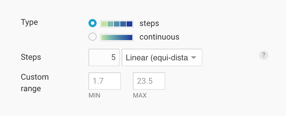
No matter if you’re using Datawrapper or another tool, and no matter if you’re creating a classed or unclassed color scale, you will find a little feature like this that lets you choose different kinds of interpolation:
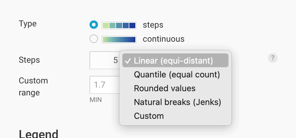
Depending on the interpolation we choose, our data will get segmented into differently-sized parts – and our values will get colored differently.
Maybe you’re thinking: “What’s the problem? I have a lowest value and a highest value. Just give the lowest value the brightest color and the highest value the darkest color, and fill all the values in between in a linear way.” That’s what we get when we choose a “linear” interpolation in either continuous or classed color scales.
It’s a good option when the distribution of our values is fairly even, without many extreme outliers.
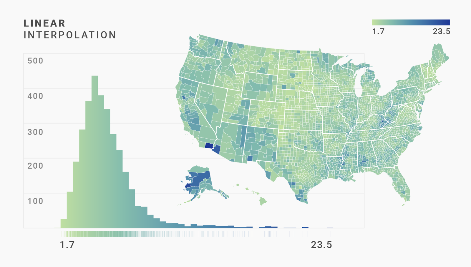
Often, however, we have a tricky distribution with strong outliers. Let’s say we want to map the average 2016 unemployment rate in each of the 3219 U.S. counties:

That column chart with no gaps between the columns is a histogram. It’s a chart type that shows us how many values occur how often in our data set. We see that most of the counties have a fairly low unemployment rate: The highest bar in our histogram is for the range of 4.5%-5% unemployment rates. More than 400 counties have an unemployment rate that falls into that range.
But the histogram also shows us outliers in our data: A few counties have an unemployment rate of more than 15%. One county even had an unemployment rate of 23.5%.
How can we map such a distribution? Let’s look at classed color scales first to answer this question
If we choose a linear interpolation in Datawrapper for our data, it will take the distance between our lowest and highest value (23.5% - 1.7% = 21.8%) and divide it into the number of steps we choose. Here, we choose five steps:
21.8% divided by five is 4.36, so Datawrapper will cut the data at 1.7% + 4.36 = 6.06%, then at 10.42%, then at 14.78%, and finally at 19.14%. Each of those steps then gets a color from our classed color scale:
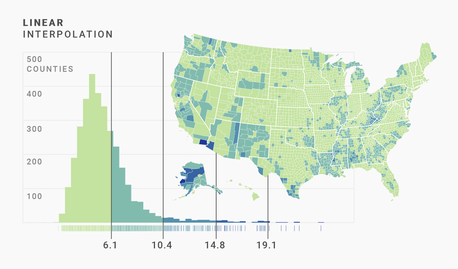
We can see that this approach doesn’t work awfully well in our map. Most counties are colored the same — with the lightest color — because the first step includes more than half of all counties. In fact, 70% of the counties are colored in that same light green.
This is still a decent map if we want to draw attention to those unfortunate counties where lots of people are unemployed. These outliers stand in high contrast to the rest of the pretty-same-looking yellow-greenish counties. But we can’t really see any strong geographical patterns here. We want more regions to be darker.
While it doesn’t work well for our data, it’s probably the most intuitive way to cut a color scale. I recommend always choosing a linear interpolation when you start designing a map — and indeed, that's what Datawrapper gives us by default.
Another intuitive, but more readable way is to use rounded values. Here too, Datawrapper cuts the data into similar-sized segments. But it neglects the exact math to give us pretty, round, easy-to-digest values:

This interpolation also works best for fairly even distributions without crazy outliers — and hence not for our data. It seems we'll need to use more complex interpolations to see the regional differences in our counties with low unemployment:
Our map would be better if more counties were filled with the medium and dark blue colors that are almost unused so far. That’s the idea behind quantiles: To distribute the colors evenly to our regions.
Quantiles cut data into segments with the same number of values. A median is a quantile with two segments: 50% of the values are higher than the median, 50% are lower than the median. That’s why the median is also called the “50th percentile.”
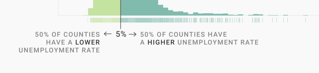
You can also think of the median this way: Our dataset has 3219 counties. If we go through our rug plot from left to right and get the unemployment rate for each county, we’ll find that the 1610th county (the one in the middle) has an unemployment rate of 5%. That’s the median. Half the counties have a higher unemployment rate than 5%, half the counties have a lower one.
Depending on the number of steps we choose, we can cut our data into three, four, five, or a bazillion segments.
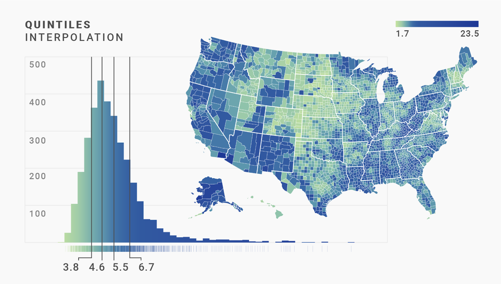
Our maps show five colors, so we’ll have five even quantiles — also called quintiles. The first quintile is the 20th percentile: 20% of the counties have a lower unemployment rate, while 80% have a higher one. Datawrapper does the math for us and will tell us that our first quintile is at 3.8%. Meaning, if we divide our number of counties by five (3219/5 = 643.8) and then check the 643rd county in our rug plot, we’ll find that it has an unemployment rate of 3.8%.
If we go another 643 counties to the right, we’ll get to one with an unemployment rate of 4.6% — that’s our 40th percentile, or 2nd quintile. And if we go another 643 counties to the right, we’ll get to our 60th percentile (3rd quintile!): 5.5%.
These cuts define the steps for our colors: The counties between the lowest value and the first quantile get our brightest color, the counties between the first and second quantile get our second-brightest color, and so on:

Woah, that’s quite different from the maps we created before! In the quantile interpolation, every color fills exactly the same number of regions (643 in our case). The darkest blue gets as much showtime as the bright light green. Quantiles show us the differences we were lacking in the linear and rounded maps. But they also make us think that 20% of counties have the highest unemployment rate, which is quite extreme.
Is there a compromise? Something that makes clear that there are only a few outliers, while showing differences in the other regions? (Me asking this question already implies that there is, so:) Yes, there is!
The “Natural breaks” interpolation does exactly that. It takes into account how our data is distributed. Here’s how: “Natural” cuts the data into parts so that the values within each part are as close together as possible.
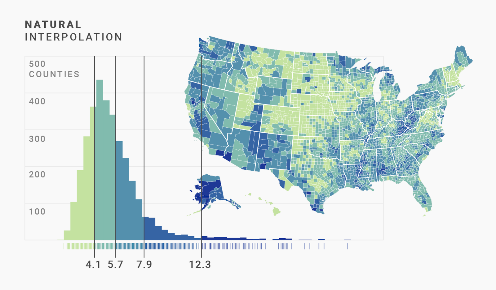
What does this mean exactly? Well, “Natural” creates groups so that the sum of the differences between the grouped values is always the same. At the peak of our histogram, we have a lot of counties with closely clustered values (4.6 │ 4.6 │ 4.6 │ 4.7 │ 4 .7 │ 4.8 │ 4.8 │ 4.8 │ etc.). The differences between them are tiny, so “Natural” groups a large number of them together (0.0 + 0.0 + 0.1 + 0.0 + 0.1 + 0.0 + …). Meanwhile, our outliers on the right side of the histogram are far apart from each other (12.5 │ 12.8 │ 20.1 │ 23.5), so only a few can “fit” into one group (0.3 + 7.3 + 3.4 + …).
That’s the magic of the “Natural” interpolation: If there are a lot of values close by, “Natural” groups more of them together; if there are fewer close by (our outliers), then it groups fewer together.
For our data, that seems to work well. We get quite a good color difference between regions around the median, but only a few regions show the darkest blue and are therefore clear outliers.
We can do even better, though: These not-round values (4.1 │ 5.7 │ etc.) are hard to read. Let’s improve this with the custom interpolation:
Custom interpolations are the “anything goes” of classed color scales. It lets you define the steps yourself:
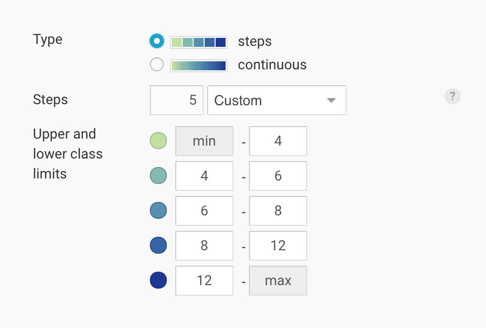
That’s a lot of power — and if Spider-Man’s uncle Ben taught us anything, it's that with great power comes great responsibility. If you have little experience with mapping, it’s safest to go with the other interpolation options.
In our case, we can use the custom steps to create a slightly less precise, but far more readable, color key for our data. To do so, we simply round the cuts of the natural interpolation: 4.1 → 4 │ 5.7 → 6 │ 7.9 → 8 │ 12.3 → 12.

The differences are barely visible (look at the top right corner to see a few regions that are colored differently). The map still gives us the same impression, while also giving us a nicer-to-read color key.
So far we've looked at interpolations for classed color scales. But we can also apply interpolations to unclassed (also called "continuous" or "linear") scales. You’ll find similar interpolation options in Datawrapper for unclassed color scales, but they’re not exactly the same:
Here’s how these options work.
The linear interpolation takes every value between the minimum and maximum values and assigns it a color between the brightest and darkest colors in a linear way.
For our data, we get the same problem as in the linear classed color scale: lots of counties have a similar bright color. Only the few outlier counties with very high unemployment rates will have a dark color.
So let’s try something else: Quantiles! Those are the cut points (like median, quintiles, percentiles) that divide our data into same-sized groups. When we talked about classed scales, we simply colored all counties in each of these quantile groups with a certain color. But in unclassed scales, each county has a slightly different color, even within one quantile group. Here’s how mapping tools make that work:
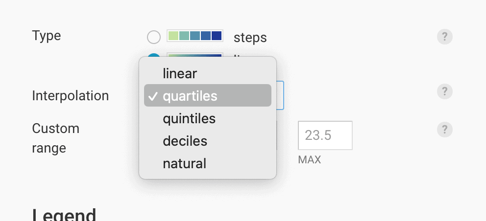
When we select a quantile in Datawrapper (median │ quartiles │ quintiles │ deciles), the tool divides our values in equally-sized chunks and then distributes them to the color scale.
Let’s try that with the median first. Half of the counties — 1610 — have an unemployment rate of 5% or less, so that’s our median. We can mark that halfway point in the data.
Now comes the magic trick to get more counties to appear darker: We put the median county at 50% of the color gradient and stretch the lower data values to cover the entire range from our brightest color to that center color. Then we stretch the higher data values from that center color to our darkest color:
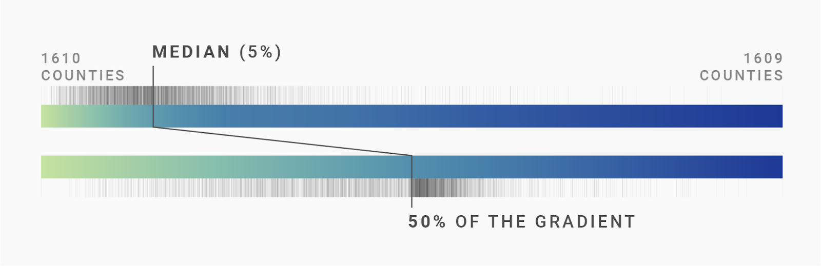
Here’s how that looks on the map and in the histogram. You'll see that instead of stretching the rug plot as we did above, we stretch the gradient in the following histogram and in the color key in the upper right:
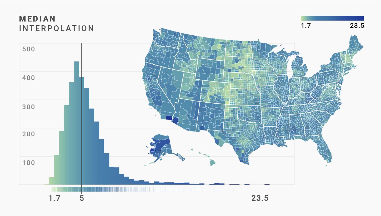
Nice, we successfully “diversified” the colors used for filling the counties! Our map looks darker now than before. Half of the counties are filled with colors from the right half of our color scale. In the linear map we created earlier, only 3% of the counties had colors from the right half of our color scale.
That said, most of the regions are now colored in a very similar blue. That blue applies to all the values close to the median. We didn’t increase the number of counties that use our darkest blue by much.
What can we do to make that happen? We can diversify more. Instead of dividing our values and gradient into two, we can divide both into four. Dear reader, please meet: the quartile interpolation.

For this interpolation, we also chop the values. We still see our median, or “50th percentile.” But because we cut our data into four instead of two pieces, we also added the 25th percentile – the “first quartile” – located at 4% unemployment. That means that 25% of our unemployment rates are lower than 4% and 75% of values are higher. And we also get 6.3% unemployment as the 75th percentile (meaning, 75% of counties have a value lower than 6.3%).
To create the quartile interpolation, we cut our gradient into four pieces and stretch the values between our quartiles to fit these four pieces:
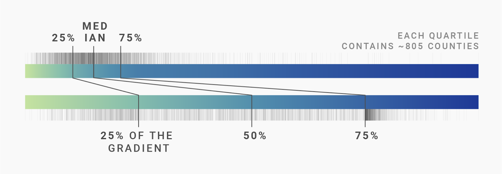
We definitely got more counties now that have a dark blue! Sweet.
But we can go even further. “Quartile” divides the color scale in four parts, but Datawrapper also offers us “Quintiles” (five parts — we already met them in the last chapter) and “Deciles” (ten parts):
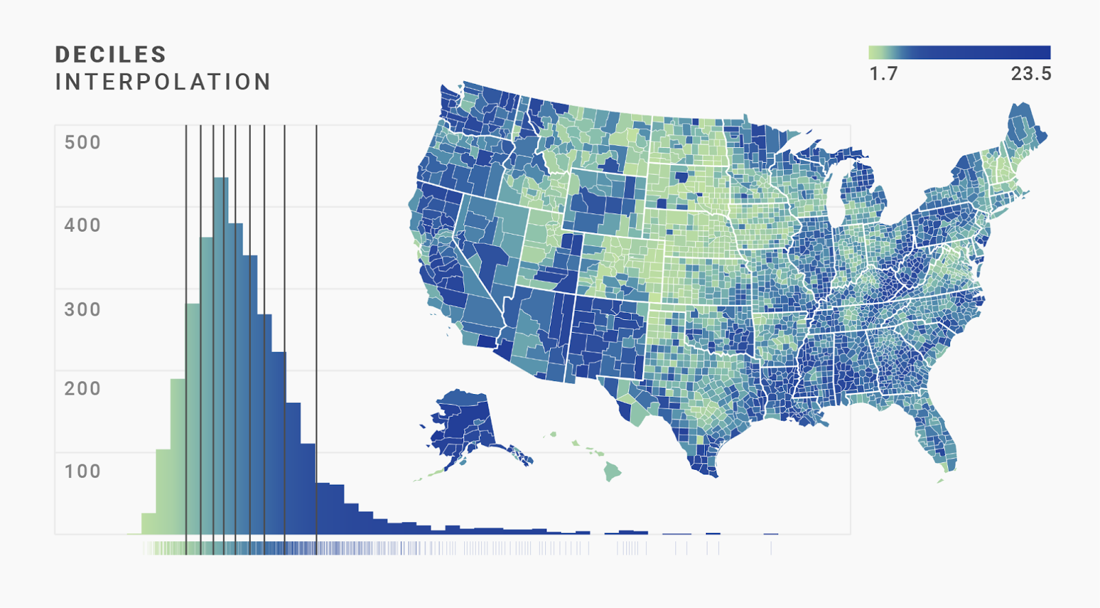
The difference between quartiles, quintiles, and deciles isn’t huge when we map this kind of data. (It might be different for your data, though.) Yes, the blues are a bit darker in the decile interpolation than in the quintile or quartile interpolations. But that doesn’t help us to see more geographical patterns.
When we look at all these maps, we see the same dilemma we had with the classed scales: In the linear and median maps, most regions have a similar color. The quartile, quintile, and decile interpolations show readers more variance — but also make them think that there are no outliers, just lots of counties with a high unemployment rate.
Again, the Natural interpolation comes to the rescue. Once the cuts are made as described in the "Natural" section of the last chapter, the values between them are stretched to fit the five gradient segments — exactly as in any quantile interpolation:

Here’s a comparison of all interpolations for our data using the continuous color scales that we’ve looked at. First, the gradients:
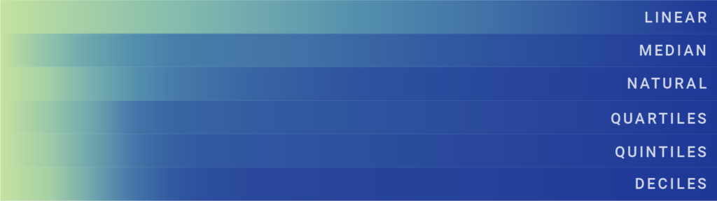
As mentioned, there’s no big difference between Quartiles, Quintiles, and Deciles for our data set, besides that the blue is sooner at its darkest in the Deciles interpolation. The Natural interpolation sticks out by using the bright green for a long time before moving to blue — but then using a darker blue earlier than the Median or Linear interpolations.
On our map, the differences between the interpolations play out like so:
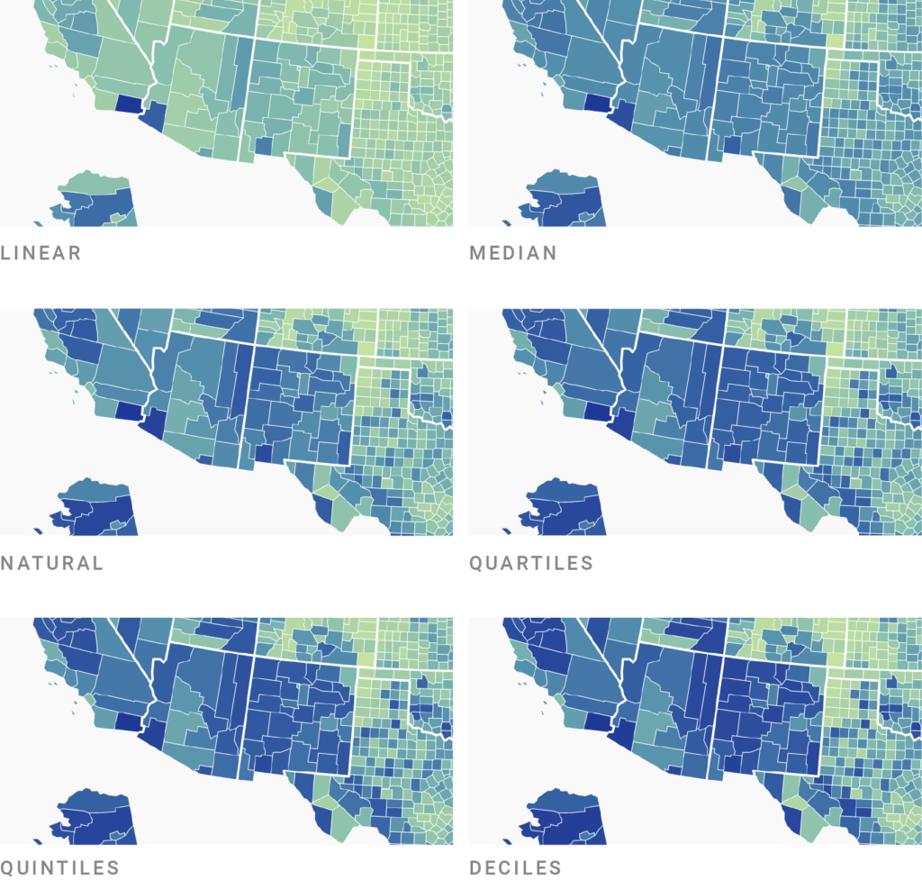
Take a minute to compare some counties with each other. Which map would you prefer to see when you’re looking for information about the unemployment rate of U.S. counties?
So far, we've looked at quite a few interpolations. Which one should you use?
For our unevenly distributed data, the linear interpolation is the most honest one because it shows the values on a linear scale and draws immediate attention to the outliers. But maybe that’s not what the article where we’re placing the map is about. Maybe we actually want to talk about the geographical patterns: low unemployment rates in states like Texas, Kansas, and Nebraska, or high unemployment in the Black Belt of the South. To show these patterns, we’d need a different interpolation.
The more cuts we add for equal counts (like quartiles, quintiles, or deciles), the more our map will use very dark colors, increasing the overall level of contrast. That makes it appealing to always use the maps with the most cuts: It just looks more dramatic.
But it also makes our readers think that the differences are stark in areas where they’re actually not stark at all and that they're less stark in areas where they actually are very stark. To illustrate that, let’s zoom into the continuous Deciles map:
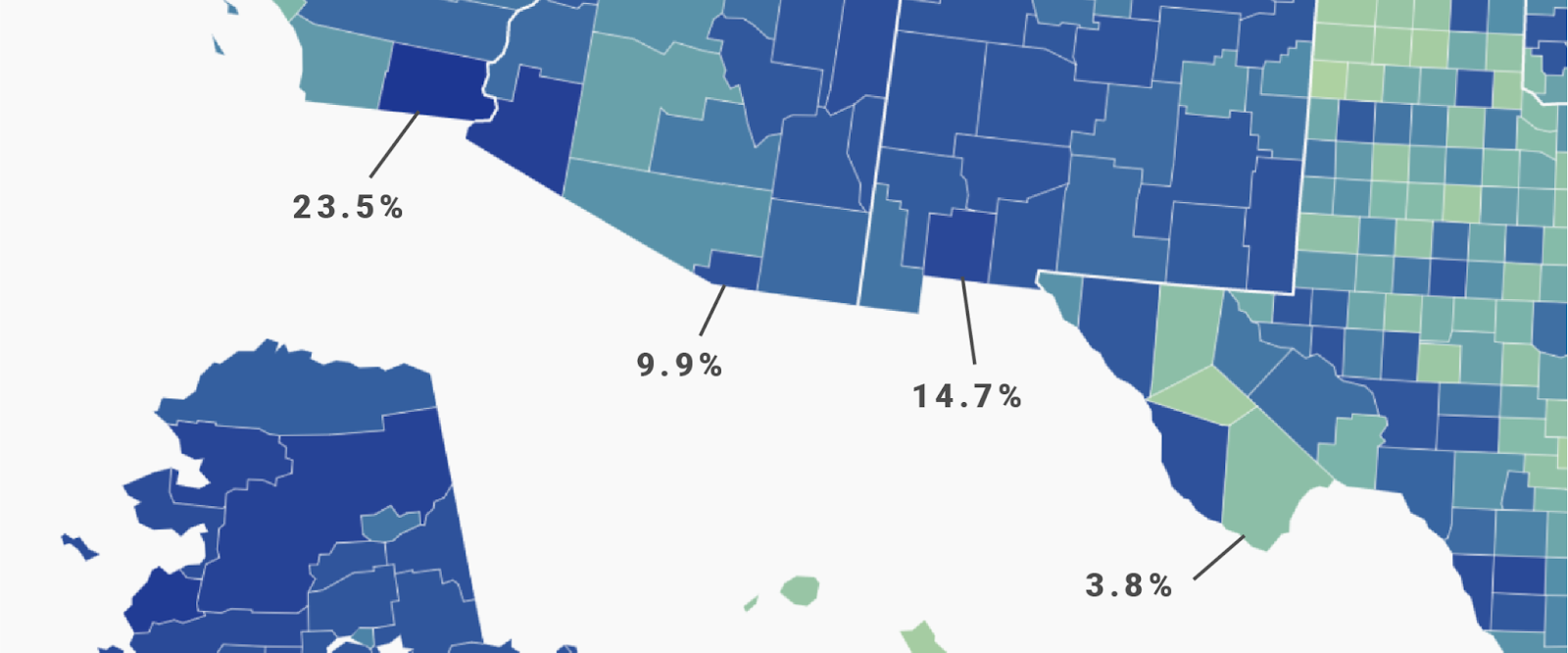
The blues of the counties with an unemployment rate of 23.5% ⬤ and 9.9% ⬤ — a 13.6 percentage point difference! — are very similar. On the other hand, the color difference between 9.9% ⬤ and 3.8% ⬤ is huge. The unemployment rates of those two counties are only 6.1 percentage points apart, but it looks like the difference is bigger than between the two first counties ⬤⬤.
Then again, maybe the difference in the data feels bigger, too. 23.5% and 10% unemployment rates both feel "high," while an unemployment rate of 4% feels “low.” The difference between 4% and 10% might be more important for some readers than the difference between 10% and 23.5%.
Choosing colors for choropleth maps is a great example that shows that “All maps are wrong, but some are useful” (paraphrasing George Box). It’s important to find a good compromise between drawing attention to the facts that you want to draw attention to and showing the data in a way that represents its actual (or felt!) distribution.
To play around with the interpolation yourself, hover over one of the embedded maps and click on "Edit this chart" in the top right corner. This will bring you straight into the Datawrapper editor, where you can change the interpolation in the Refine tab.
Comments