Watch the recordings of Unwrapped, our conference
August 12th, 2024
5 min
Datawrapper lets you show your data as beautiful charts, maps or tables with a few clicks. Find out more about all the available visualization types.
Our mission is to help everyone communicate with data - from newsrooms to global enterprises, non-profits or public service.
We want to enable everyone to create beautiful charts, maps, and tables. New to data visualization? Or do you have specific questions about us? You'll find all the answers here.
Data vis best practices, news, and examples
250+ articles that explain how to use Datawrapper
Answers to common questions
An exchange place for Datawrapper visualizations
Attend and watch how to use Datawrapper best
Learn about available positions on our team
Our latest small and big improvements
Build your integration with Datawrapper's API
Get in touch with us – we're happy to help

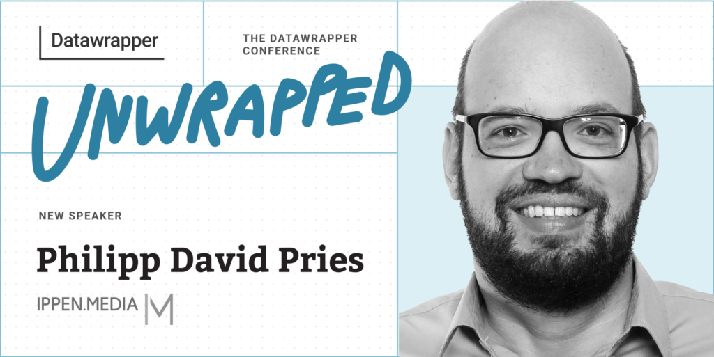
We’re excited to announce that Philipp David Pries from IPPEN.MEDIA will speak at our Unwrapped conference about “Locator Maps: Exploring new territories.” If you want to take your locator map creation skills one step further, watching this talk is a great place to start.
Philipp created his first Datawrapper chart, about turtles, ten years ago. Since then he has steadily increased not only his positive feelings towards this animal species, but also his love for diverse data visualizations. Philipp now leads a five-person data journalism team at IPPEN.MEDIA, one of the largest German publishers including publications such as Frankfurter Rundschau and Münchner Merkur. Map data projects of all kinds are his greatest passion. When his team recently created a map based on a new turtle-related data set, he experienced a sort of full-circle moment.
Time to ask him some questions:
Locator maps can be used for so much more than labeling cities, regions, and countries. With some tricks and tweaks, you can create insightful maps and visually pleasing infographics on complex topics. In my presentation, I'll cover a variety of ways for creative storytelling, including grid maps, unique map keys, additional diagrams, and map layers. I'll also demonstrate advanced possibilities with CSS and custom geodata.
Definitely importing line and area markers into locator maps. The built-in OSM is a very helpful source for many geospatial base data. But for more technical or niche data, I love the GeoJSON import of self-produced shapes and coordinates, for example, via QGIS. Within the 2MB limit, the possibilities are virtually endless. This is how we were able to map topics like the destruction in the Gaza Strip, species extinction, the spatial distribution of barbershops in Germany, and much more.
In the early days, individual embed code snippets were still floating around in our newsrooms – as was probably the case in many other offices. All of our data visualizations are now being used as so-called data assets. They can be integrated into home pages and apps using drag and drop, and all journalists within our organization can also easily search for them in our content management system. Automatic recommendations when writing articles will follow soon.
Our goal is to build the most insightful and aesthetically pleasing data visualizations possible, to inspire and reach users in a variety of ways. We want them to experience a multi-part data vis journey. From the beginning on, the graphic should catch the user's eye. In the first minute, they should already be able to grasp something informative or inspiring from it. After that, the user can explore further: further insights, further discoveries, helpful context beyond the core topic.
We're looking forward to Philipp's talk at Unwrapped! Until then, you can find more about him on LinkedIn and X. To sign up for Unwrapped and hear Philipp and other great speakers, visit our conference website.
Comments