This article is brought to you by Datawrapper, a data visualization tool for creating charts, maps, and tables. Learn more.
A bad chart got better – and then bad again

Hi, this is Lisa! At Datawrapper, I’m in charge of communications. Today I’m looking at a less than ideal Olympic chart and trying to improve it.
The other day, I saw this Twitter post: “This is a masterclass (yet again) in @IrishTimes on how NOT to present information,” Dublin-based research consultant Dr Eemer Eivers wrote. “Quick glance & you’d be sure 🇮🇪 has tumbled DOWN the medal tables since 2000. FFS. This is criminal level breaking of the rules of how to share data.”
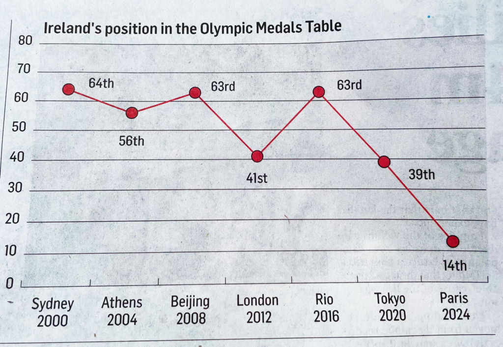
Wow, strong words. The chart does have two fairly obvious design flaws: It shows the top ranks at the bottom, suggesting that Ireland did worse in 2024 than it did in 2016; and it shows an illogical “0” rank.
But let’s not be harsh. Data visualization is hard. The chart gets a few things right: The data itself is interesting; and adding the host cities to the years is a nice touch, as is labeling each data point.
“Let’s quickly fix that,” I thought, got the data and opened Datawrapper:
Unfortunately (for the readers of The Irish Times), I found three more flaws while preparing the data:
- In 2004, Ireland didn’t win any medals (and therefore didn't appear in the medals table). Irish show jumper Cian O'Connor had a gold medal around his neck in Athens, but apparently his horse failed a doping test.
- In 2008, Ireland was ranked 64th, not 63rd, according to Wikipedia.
- In 2024, Ireland ended up on rank 19, not 14.
“Okay, but how do they compare?” I asked myself, and added some context data to the chart:
"Okay, but why didn't the original chart show any data before 2000?" I wondered.
Here’s why:
It’s hard to compare rankings when the number of ranks is so different. In 1964, 35th place gave Ireland the fewest medals of any nation that won at least one – while in 2020, 39th place meant that only half of the medal-winning nations did better than Ireland.
"Okay, I'll just distribute the medals equally in each year," I thought, did some math, and ended up here:
This chart shows the percentage of medal winning nations that did better or worse than a nation. It looks like Ireland has actually never done better than this year! It was in the top 25% of medal winning nations, something it has never accomplished before.
But is that last chart overkill?
Probably.
At the keynote of the Datawrapper conference Unwrapped a few months ago, Amanda Cox said: “You can show all the data. The question is: Do you need to?” In this case, I would argue, there is no need. The more complex chart isn’t worth the increased effort it takes to read it. Like the original chart, it’s not ideal – just less obviously so.
The story is that Ireland did well in the Olympics. The fixed chart at the top does a good job of showing just that.
If you’re interested in more charting wisdom and lots of tricks for using Datawrapper: We uploaded all Unwrapped talks for you to rewatch this week. Take a look! And if you want to see more Olympics related data vis, check out our last three Data Vis Dispatches (1, 2, 3). We’ll see you next week with a Weekly Chart from our developer Pascal.


Comments