

Radish to romanesco: A year in vegetables
February 20th, 2025
4 min
This article is brought to you by Datawrapper, a data visualization tool for creating charts, maps, and tables. Learn more.
Hi! This is Elana, co-CEO of Datawrapper and lead of the team responsible for the development of visualization features. Today I’m trying out something a little new.
I recently came across a video that used lego to visually walk viewers through the usage of the Earth’s land. The app it was promoting, Fork Ranger, offers guidance in making more sustainable food choices.
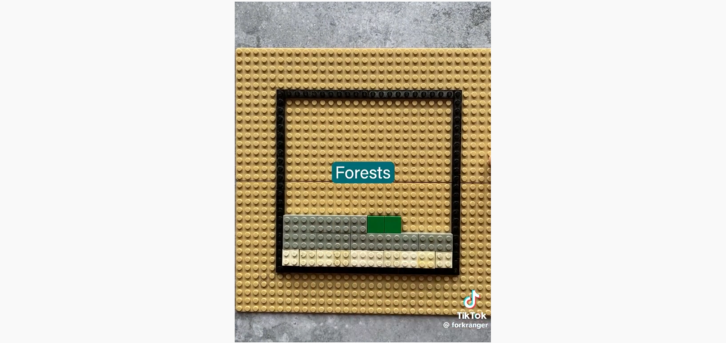

I found the use of lego as a visual aid compelling, and the topic cast me back about ten years to an equally insightful conversation on the same topic, which lead me to eventually give up meat.
I wanted to see if I could recreate this narrative lego effect in Datawrapper.
My first attempt was an annotated custom scatterplot. It was ok, but I wasn’t quite satisfied — it was missing that deliberate buildup that the lego video did so well. So I decided to take it one step further. Leveraging an experimental beta feature for using code to dynamically update the settings of an embedded chart, I created an interactive story out of my scatterplot:
There are a few pretty big takeaways here. For one, the fact that agriculture takes up almost half of habitable land. Humankind has, over the past 1000 years, turned 120,000 square kilometers of wild habitat into farmland — an area equal to the USA 13 times over.
That, of course, makes agriculture the absolute number one cause of deforestation and our planet’s diminishing biodiversity. The primary culprit here is land used in the name of producing meat and other animal products, which accounts for 80% of all agricultural land. The majority of that is grazing land, but even a solid 38% of cropland is devoted purely to growing food to feed the animals we eat.
That’s particularly staggering when put in the context of what we actually get back for this huge use of land. Namely, just 17% of the world’s calories and about a third of its protein.
In fact, it takes around 100 times as much land and results in 60 times more greenhouse gas emissions to produce a kilocalorie of beef versus a plant-based alternative.
Taking a look back, we can see how agriculture has rapidly engulfed the wild habitat over the past 200 years, consuming almost half of it by 1985.
It’s also noticeable that this growth slowed down significantly in the past 80 years. That’s down to recent agricultural innovations that massively increased the efficiency of the land, allowing it to provide sufficient food for everyone even as the world population continued its rapid growth.
Of course, those efficiency gains do also come at a cost — to the soil, the diversity of crops, the quality and variety of produce, the wellbeing of livestock, and otherwise.
And no matter how efficient we are, so long as humankind’s ever-growing appetite for meat doesn’t slow down, it will continue to cause disproportionate and relatively easily avoidable harm to a planet increasingly pushed to its limit.
It’s a regular Datawrapper scatterplot (this one), embedded on this page using the script embed option. Script embeds offer an experimental beta feature for using code to update the underlying settings of the visualization. In this particular example, three things in the chart get programmatically updated with each step in the story:
It's worth mentioning that so far this is an undocumented experimental feature, which is not guaranteed to work for all settings!
If you use JavaScript to select the web component element, you'll then be able to call the methods that it exposes. Currently, the web component exposes just one experimental method: patch, which can be used to dynamically update the settings of the chart. For example:
// select the visualization component
const vis = document.querySelector('.datawrapper-script-embed > *');

// call its patch method, with the path to the setting you want to update, and the desired new value.
// (this example updates the chart description)
vis.patch('metadata.describe.intro', 'This is a new chart description.');
In fact, if you run the above snippet in the developer console, you'll see that description appear in the lego chart!
To get a better sense of the chart properties, our developer docs are a good starting point, as is using the API to examine the properties of a visualization that you’ve edited manually.
If you're interested in learning more about this topic, the data here all comes from Our World in Data, which has a wealth of very detailed and comprehensive sources that helped inform this article, including:
See you next week, when you’ll be hearing from my coworker Pascal!


Comments