


New: Keep your account secure with two-factor-authentication
March 27th, 2024
3 min
This article is brought to you by Datawrapper, a data visualization tool for creating charts, maps, and tables. Learn more.
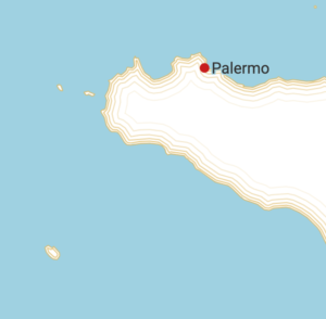
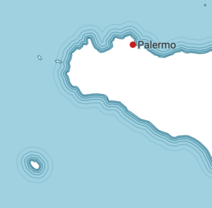
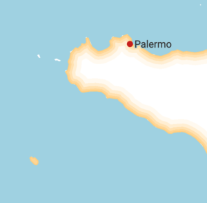
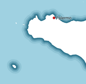
We’ve got a new feature to tell you about today that we’re excited about: You can now add line and area vignettes (also called waterlines, buffer lines or filled buffers) to area markers.
You can use them to highlight a region, country, city, etc. (like we’ve done above with Piemonte and Lombardia), or to make parts of your locator maps nicer-looking (like we’ve done with Corsica).
You will be able to create four kinds of vignettes with Datawrapper: Inside lines, outside lines, inside areas and outside areas.
Here’s how you can use them in our locator maps:
To create lines and areas outside or inside your area marker, you’ll first need an area marker. Get it from a tool like Gimme Geodata, GeoFabrik, geojson.io or directly from OpenStreetMap.
Create a new locator map, upload your GeoJSON in the first step and select the resulting area marker. Then click on “more options”. Now you can turn on the option “Add vignette to marker”:
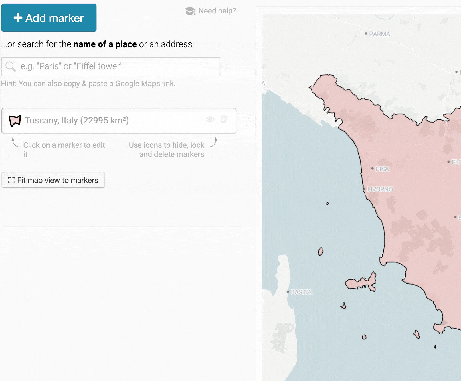
If you’re creating area vignettes, the resulting area markers will have the same fill color as your uploaded area marker. And if you’re creating line vignettes, the resulting line markers will have the same color as the outline color of your uploaded area marker. So here’s a pro tip: Change the fill and outline color first, then create vignettes.
Try it out for yourself right now: Scroll up to the map, hover over it and click on the appearing “Edit this chart” in the top-right corner to jump directly into our locator map tool.
So why would you need vignettes in the first place? We’re sure you’ll find some great use for it over time. But there are two main reasons why vignettes are used historically: To highlight regions and to indicate water areas. Let’s have a look at both:
Inside area vignettes – also called buffer fills or filled buffers – were used in historical atlases to highlight regions and to make their borders easier to detect. We got our inspiration from “Droysens Allgemeiner Historischer Handatlas” (Droysen’s Historical Atlas) from 1886:
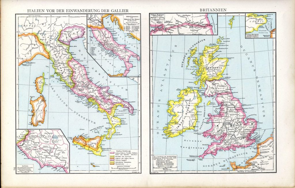
But as early as 1570, cartographer Abraham Ortelius used subtle inside area vignettes to separate continents from each other in what is considered to be the “first modern atlas”.
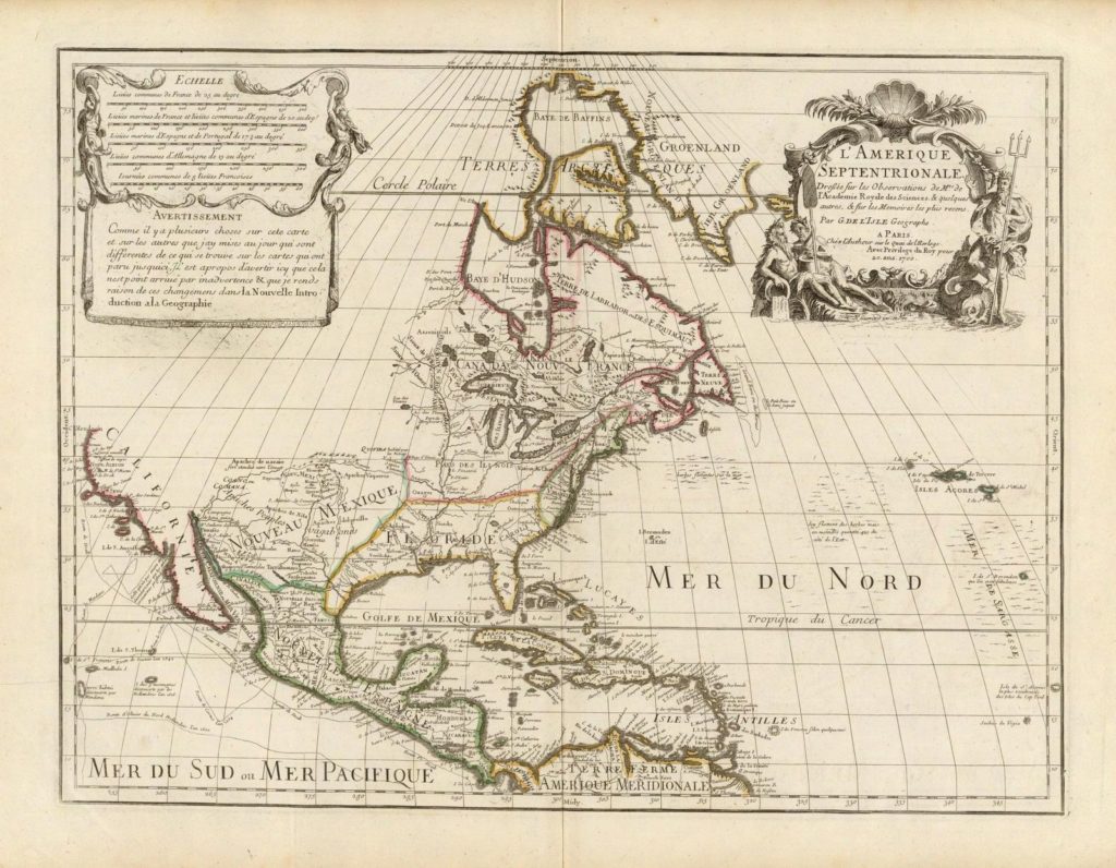
And cartographers didn’t stop until the 20th century. In 1700, French cartographer Guillaume de Lisle used vignettes in his map of “L’Amerique Septentrionale” (“North America”) – or at least of what was known of it back then:
Cartographer Heinrich Kiepert used more saturated colors when he created the map “Aegyptus, Phoenice et Palaestina” for his “Atlas antiquus: Twelve maps of the ancient world for schools and colleges” that was published shortly after his death in 1903. The colors would be too bright to be used for the whole region, but as vignettes, they work well:
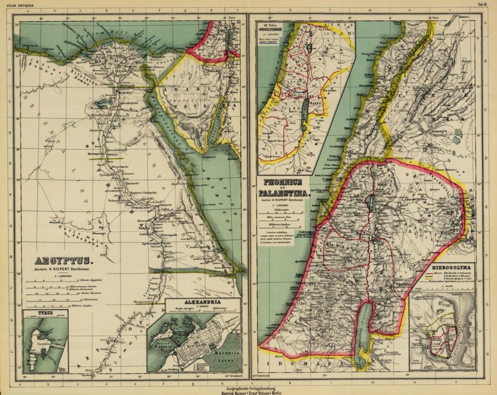
In all of these maps, the inner area vignettes not only highlight the borders, but make it possible to clearly see the features inside a region. These features are drawn black on white.
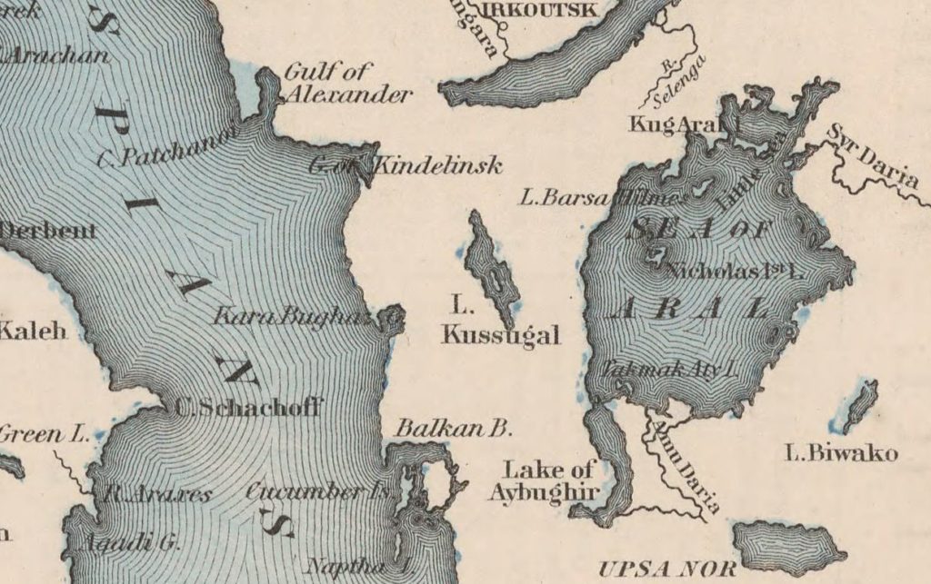
These days, we don’t find so many inside area vignettes in our atlases anymore – unfortunately. Instead, whole regions are filled with colors, like in this part of the map “Comparative Size of Lakes and Islands” by G.W. Colton from 1855. The colors are less bright and the contrast of the labels within regions is lower:

What we can see in this map, however, are fine lines surrounding the islands. Starting today, these are now available to Datawrapper locator maps, too. When adding a vignette, simply choose “line” and “outside” as options. Let’s see why you might want to use them:
Outside line vignettes – also called waterlines, vignette lines, buffer lines or wave lines – are lines that most cartographers draw parallel to the shore, creating the impression of waves. They are used around islands (see above map) or inside lakes, like here in another part of Colton’s visualization:
Cartographer Daniel P. Huffmann mentioned two reasons why we should use these lines in his 2010 article “On Waterlines: Arguments for their Employment, Advice on their Generation” (PDF).

And might we add a third point: Outside line vignettes are beautiful.
But lines and areas are just two kinds of vignettes. There are many more, as Kenneth Field shows in his book “Cartography.”. He gave us permission to publish his illustration of different kinds:
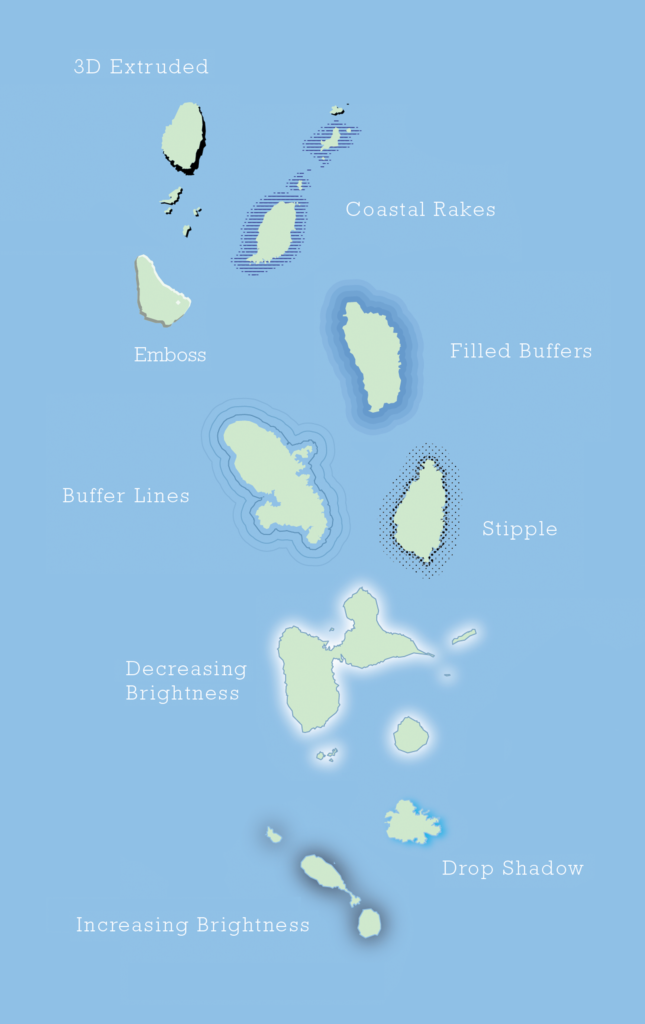
Courtesy of Kenneth Field, Esri Inc. from “Cartography.”, published by Esri Press and available from online retailers. The illustration was drawn by Wes Jones and adjusted for this article.
To make it easier to use the two kinds of vignettes we added (lines and areas), we will eventually make highlighted areas available as area markers. This means you’ll be able to easily select countries and other regions to style them – with fills, outlines or the new vignettes – without uploading them.
We’d love to see more maps with highlights and waterlines out there, and we hope that making it simpler to do so in our locator maps means that you will consider adding them where it makes sense. We’re excited to see what you’ll come up with! As always, if you have any questions, please don’t hesitate to get in touch with us at support@datawrapper.de. We’re happy to hear from you.


Comments