New: Small multiple column charts in Datawrapper
February 18th, 2025
6 min
Datawrapper lets you show your data as beautiful charts, maps or tables with a few clicks. Find out more about all the available visualization types.
Our mission is to help everyone communicate with data - from newsrooms to global enterprises, non-profits or public service.
We want to enable everyone to create beautiful charts, maps, and tables. New to data visualization? Or do you have specific questions about us? You'll find all the answers here.
Data vis best practices, news, and examples
250+ articles that explain how to use Datawrapper
Answers to common questions
An exchange place for Datawrapper visualizations
Attend and watch how to use Datawrapper best
Learn about available positions on our team
Our latest small and big improvements
Build your integration with Datawrapper's API
Get in touch with us – we're happy to help
This article is brought to you by Datawrapper, a data visualization tool for creating charts, maps, and tables. Learn more.
We are delighted to announce that you can now create Locator Maps using Datawrapper! 🎉🎉🎉
If you never heard about locator maps before, that’s what geographers call these typically simple maps that show where something is located.
In newsrooms, locator maps often are a little bit like bar charts: a lot of stories could benefit from them and it still often takes a specially trained person to make them. Which is why we thought we should add it to Datawrapper.
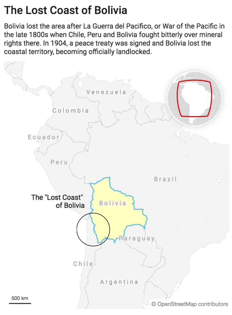
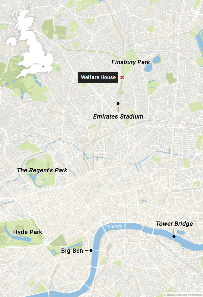
Before we let you dive into the editor yourself we’d like to go through a couple of the key features our locator maps offers:
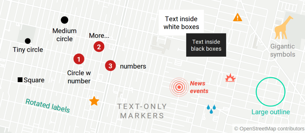
Most importantly, you add point markers to the maps that support various customization options (symbol, color, typography, alignment, rotation). In the upcoming versions we’re going to add more marker types such as lines and area markers.
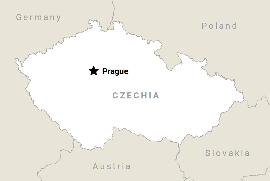
You can highlight one of thousands of built-in administrative regions, ranging from entire countries to individual city districts. This helps to make clear what region the map is focussing on.
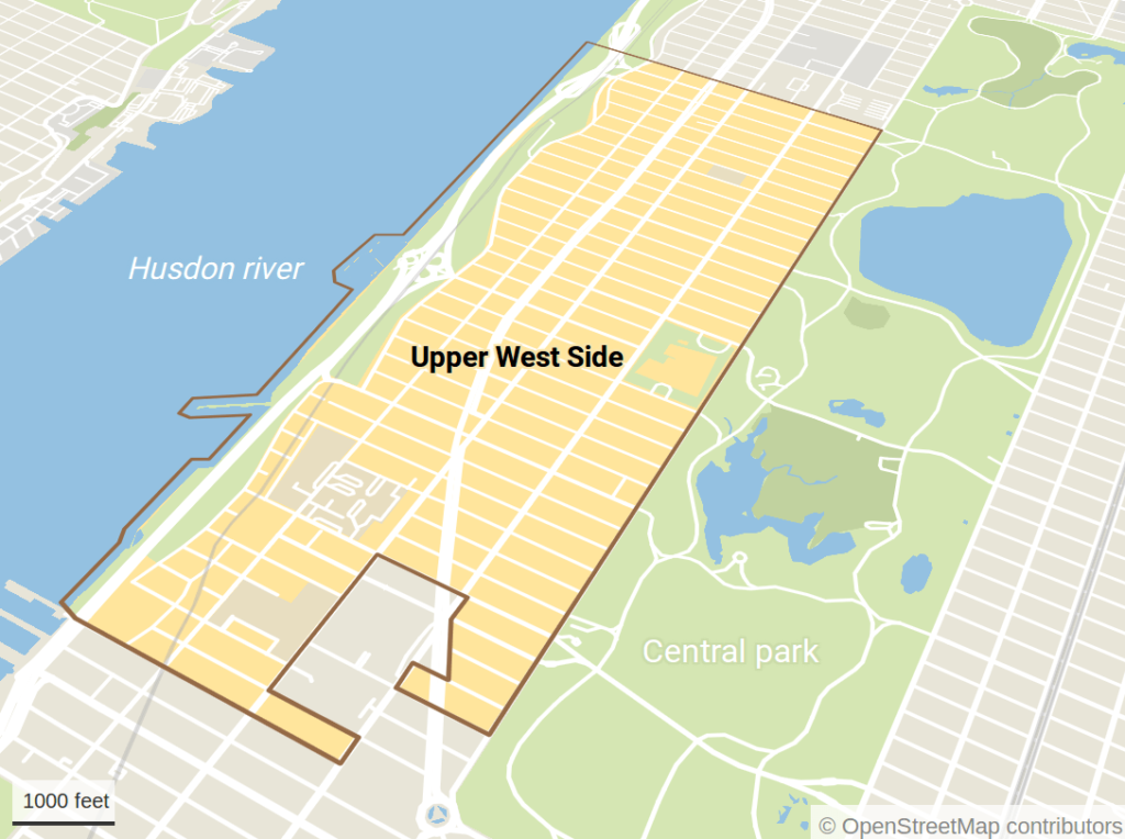
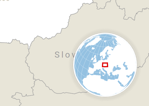
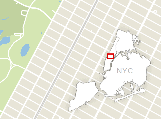
Inset maps are useful for showing the larger geographical context of a map. We offer two kinds of inset maps: The globe inset is useful for more zoomed out maps, while the region inset works best when the map audience is familiar with the selection region.
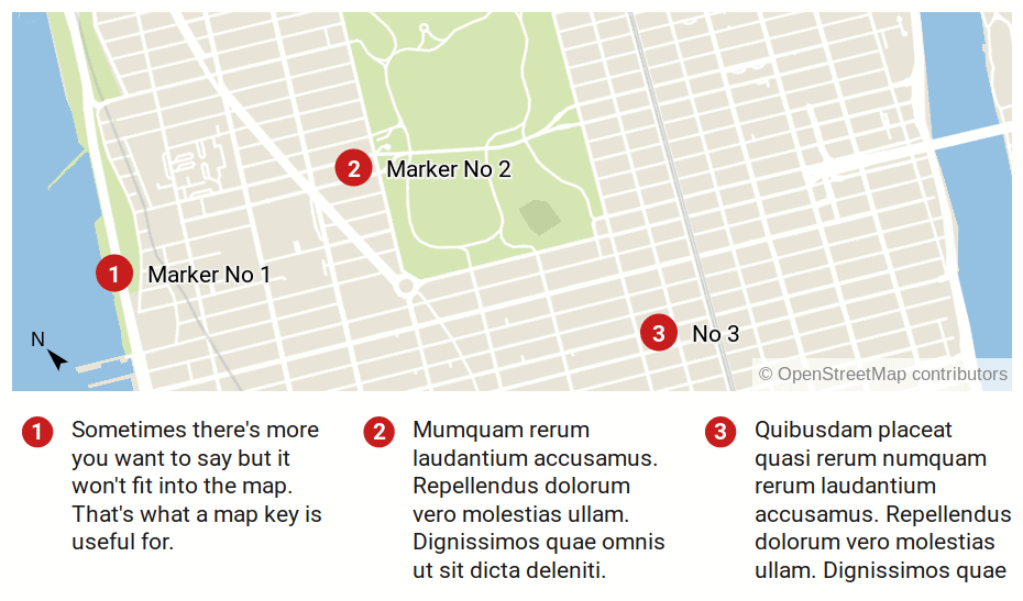
Sometimes there’s more you want to say but it won’t fit into the map. That’s what a map key is useful for. You can chose between two different layouts.
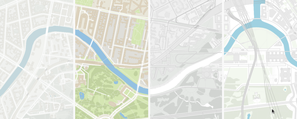
You can pick from four default map styles we’re offering in the free version. Also each style can be further customized by toggling different layers on and off. If you’re interested in a custom map style for your organization, get in touch with David.
We wrote a completely new map editor to make this process as easy as creating bar charts. You start with the map markers, then change the look of the map and then you annotate the map. Click here to create a locator map or watch our demo video below:
We added a series of tutorials to our Datawrapper Academy that explain the different features in more detail:
Let us know if you have questions via support@datawrapper.de or below in the comment section!
Comments