New: Keep your account secure with two-factor-authentication
March 27th, 2024
3 min
Datawrapper lets you show your data as beautiful charts, maps or tables with a few clicks. Find out more about all the available visualization types.
Our mission is to help everyone communicate with data - from newsrooms to global enterprises, non-profits or public service.
We want to enable everyone to create beautiful charts, maps, and tables. New to data visualization? Or do you have specific questions about us? You'll find all the answers here.
Data vis best practices, news, and examples
100+ articles that explain how to use Datawrapper
Answers to common questions
An exchange place for Datawrapper visualizations
Attend and watch how to use Datawrapper best
Learn about available positions on our team
Our latest small and big improvements
Build your integration with Datawrapper's API
Get in touch with us – we're happy to help
This article is brought to you by Datawrapper, a data visualization tool for creating charts, maps, and tables. Learn more.

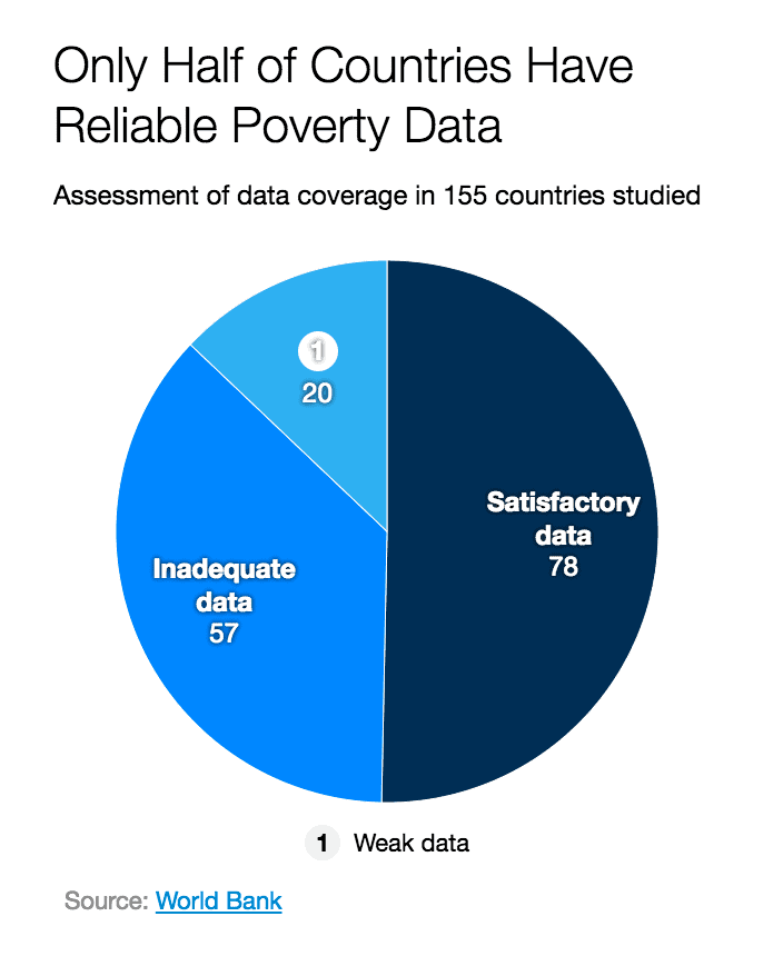
Column and pie charts are versatile, but they’re also easy to do wrong. To make sure charts created with Datawrapper stay clear, concise and informative, we’re always working on making them as smart as possible. Today, we are launching two improvements, specifically for the labels in these chart types:
The improvements are enabled by default for all newly created column and pie charts. If you have any other suggestions for improvements, reach out at @datawrapper on Twitter or get in touch via support@datawrapper.de
Comments