Watch the recordings of Unwrapped, our conference
August 12th, 2024
5 min
Datawrapper lets you show your data as beautiful charts, maps or tables with a few clicks. Find out more about all the available visualization types.
Our mission is to help everyone communicate with data - from newsrooms to global enterprises, non-profits or public service.
We want to enable everyone to create beautiful charts, maps, and tables. New to data visualization? Or do you have specific questions about us? You'll find all the answers here.
Data vis best practices, news, and examples
250+ articles that explain how to use Datawrapper
Answers to common questions
An exchange place for Datawrapper visualizations
Attend and watch how to use Datawrapper best
Learn about available positions on our team
Our latest small and big improvements
Build your integration with Datawrapper's API
Get in touch with us – we're happy to help

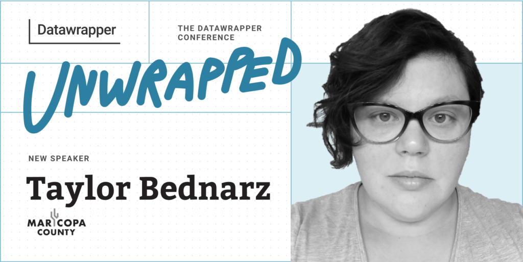
We’re excited to announce that Taylor Bednarz from the Maricopa County Department of Public Health (a county in Arizona, USA), will speak at our Unwrapped conference about “Rapid deployment of a public COVID-19 vaccine data webpage using Datawrapper.”
Taylor Bednarz is the senior data visualization epidemiologist with the Maricopa County Department of Public Health. Focused on building data viz capacity within the department, Taylor spends most of their days developing trainings, compiling resources, or consulting on projects. Taylor helped to update, streamline, and improve the County’s public COVID-19 vaccine data webpage using Datawrapper.
Time to ask them some questions:
During the COVID-19 pandemic, providing accurate and timely data to the public was essential for building trust within the community. Using Datawrapper’s standard charts, annotations, and overlays, along with a bit of HTML, Maricopa County Department of Public Health (MCDPH) rapidly deployed a COVID-19 Vaccine Data webpage reporting immunization uptake among Maricopa County residents overall and by sex, age, race, and ethnicity. MCDPH will share how Datawrapper made it easy to adapt visualizations and create several iterations of the webpage to better suit community needs over time.
In the past, we crafted nearly all our visualizations in Excel. When the COVID-19 vaccine became available, we knew we would need to provide accurate and timely data to address questions about vaccine uptake. We sought a less resource-intensive way to share these data with the public. Enter Datawrapper.
I recommend Datawrapper whenever my colleagues need to create crisp, clean visualizations in a hurry. It’s an excellent tool for analyses, as you can quickly see the shape of your data in a variety of layouts. I find Datawrapper to be particularly useful for staff to build confidence in their data viz capacity as they can create beautiful visualizations with just a few clicks.
My personal mission in data viz is to break down the barriers between the data and the people. This is one of the reasons I love using Datawrapper – I can easily create, share, and collaborate on visualizations without needing an expensive license or extensive training. Features offered by Datawrapper, such as in-chart annotations and HTML text formatting, allow us to provide more context that can help people interpret our data.
We're looking forward to Taylor's talk at Unwrapped! Until then, you can find more about them on LinkedIn. To sign up for Unwrapped and hear Taylor and other great speakers, visit our conference website.
Comments