This article is brought to you by Datawrapper, a data visualization tool for creating charts, maps, and tables. Learn more.
Visualizing my musical journey

👋😊 Hello, I’m Antonio, a software developer here at Datawrapper. For my first Weekly Chart I decided to analyze the kinds of music I’ve been listening to in the past years.
I first started actively listening to music and building my catalogue as a teenager, after my best friend gave me a link to his MP3 collection. It included electronic and alternative music by artists like Daft Punk and Gorillaz. I instantly clicked with his taste and used the collection as a base for my own musical journey, adding new genres like the drum and bass group Pendulum and dubstep artist Skrillex. Since November 2011, I’ve been using last.fm to track my listening, which means that by now I have over a decade of data on my musical habits. So I guess you could say I’ve been working on this Weekly Chart for over eleven years!
Each week, last.fm generates a personalized listening report, where you can reflect on how your habits have changed and how your stats compare to your friends’. However, we aren’t limited to last.fm own analysis of the data. They also offer an API, which powers an ecosystem of interesting third-party tools you can use to generate different types of rankings and visualizations. That API made an appearance on this blog last November, in a last.fm-powered Weekly Chart by Doce, which included a calendar heatmap visualizing every song that they’d listened to in 2022.
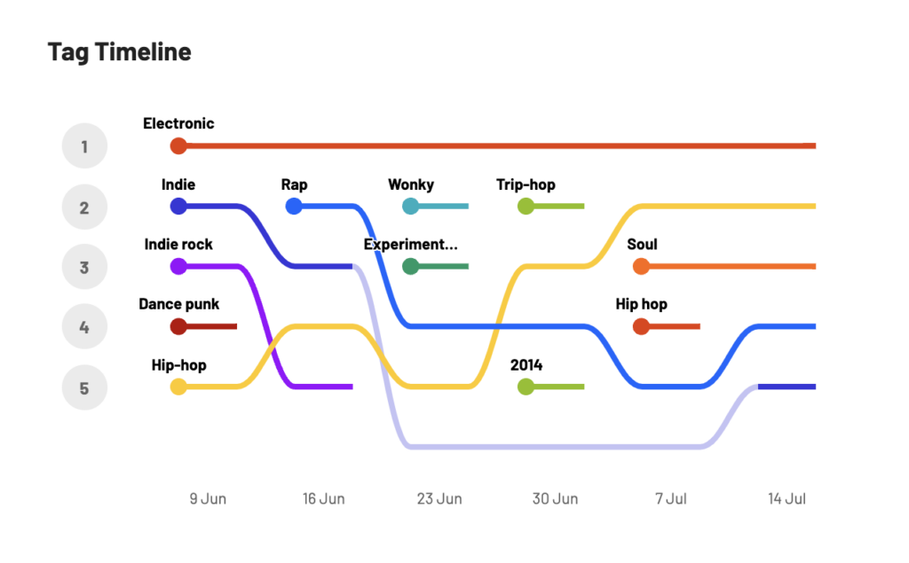
One particularly interesting visualization in the normal weekly listening report is the “Tag Timeline.” Tags are a way for users of the site to categorize tracks, albums, and artists; most of the time, users tag music with a genre they ascribe it to. Your timeline shows a ranking the top five tagged genres that you’ve listened to in the past six weeks. Due to the nature of music genre categorization and community-based tagging, the data ain’t perfect, but it’s still very interesting!
I wondered how a longer timeline would look, beginning from the year I first started building my music library. After some exploration, coding, and a couple of last.fm API requests, I can proudly present my first weekly chart:
It was really interesting to see my historic listening habits laid out like this. I had a feeling that hip-hop would take the top spot over electronic around the time I started obsessively listening to Tyler, the Creator, which turns out to be true. This chart also confirmed my suspicion that I’ve started to be more open to different types of music: it starts firmly focused on electronic genres, gets more diverse in 2014-2019 with hip-hop, indie and R&B, and this year even has psychedelic rock appearing in eighth place.
But I’m also reminded of how confusing music genres can be: KAYTRANADA, Flume and LCD Soundsystem are all tagged as electronic, but their music is all so different! And I honestly don’t know what the difference between indie and alternative is supposed to be. One interesting subgenre I wasn’t really aware of listening to is “trip-hop,” which Wikipedia describes as “a psychedelic fusion of hip hop and electronica with slow tempos and an atmospheric sound, often incorporating elements of jazz, soul, funk, reggae, dub, R&B, and other forms of electronic music, as well as sampling from movie soundtracks and other eclectic sources.” Acts I listen to like FKA Twigs, Brock Berrigan, and Little Dragon were tagged with this genre.
Getting the data
Sadly, last.fm doesn’t seem to provide an easy way to download your profile’s whole dataset at once. But thankfully, there are several third party tools you can use instead! I used Last.fm data export v2.0 by ghan64 which, after a bit of waiting, allowed me to download a CSV file of all my “scrobbles” (this is what last.fm calls each record of listening to a song). It was already 37.8 MB! This dataset didn’t include any tags yet, so I used last.fm’s artist.getTopTags API endpoint and some JavaScript to fetch the most frequently assigned tag for each artist in my dataset. I merged certain tags (like “hip-hop” and “hip hop”) and decided to ignore others that don’t describe the music itself (like “seen live”) or are very specific (like “musik um sich allein zu betrinken”).
To create the ranking, I wrote a script that goes through every track I listened to and counts how many times its artist’s genre tag came up that year. I then sorted the counts and chopped off everything after the 30th rank. In the end I printed out the ranks for each year as a CSV file.
Creating the chart (and how you can make one too!)
Now I had a dataset I could throw into Datawrapper to easily see the results I was looking for. I used a line chart to create the timeline and defined a custom vertical axis range so that the top rank (1st) would be at the top. Setting the line interpolation to “curved” gives a similar vibe to the original weekly tag timeline provided by last.fm. After I got the overall rankings, I went back through my last.fm profile to find out which specific songs and artists I was listening to each year, which let me add some annotations that give a bit of context for the rank changes.
For those who also use last.fm and are interested in what their historic tag timelines look like, I’ve open-sourced the script I used to get this data ready for Datawrapper. Check out the Github repo last.fm-historic-tag-ranking and follow the instructions in its Readme file. If you have any questions, feedback, or ideas for other last.fm powered charts, feel free to hit me up at antonio@datawrapper.de!
I hope you enjoyed this very personal Weekly Chart! I learned a lot and had tons of fun building it! 😄 Check back next week for a fresh new Weekly Chart built by our writer Rose.


Comments