


New: Automatically label data points in line charts
September 18th, 2024
3 min
This article is brought to you by Datawrapper, a data visualization tool for creating charts, maps, and tables. Learn more.
Grids and axes turn a blank page into a data space and provide the context we need to navigate it. We consider grids to be one of the most crucial features of a well-readable data visualization.
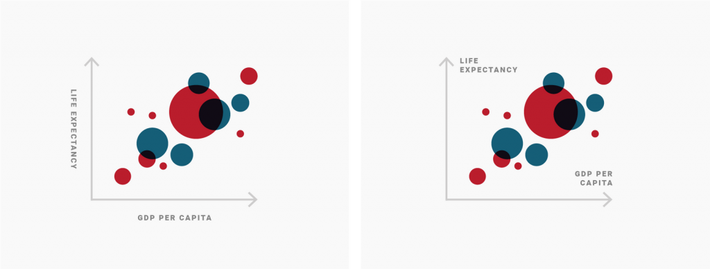
That’s why from the very beginning of Datawrapper, we’ve tried to provide the best grids and grid labels for our users. For example, we’ve avoided rotated grid labels for years now. They’re harder to read and take up more space than horizontal labels:
Now we’ve re-designed our grids from the ground up. The changes make date and time axis ticks better readable. (We’ve already rolled them out slowly over the last weeks – if you’re using Datawrapper a lot, you might have noticed them.)
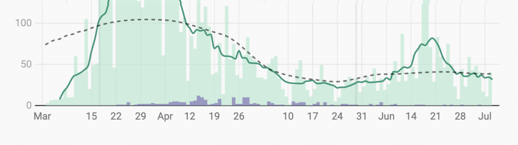
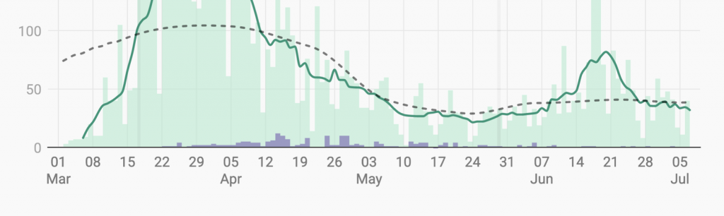
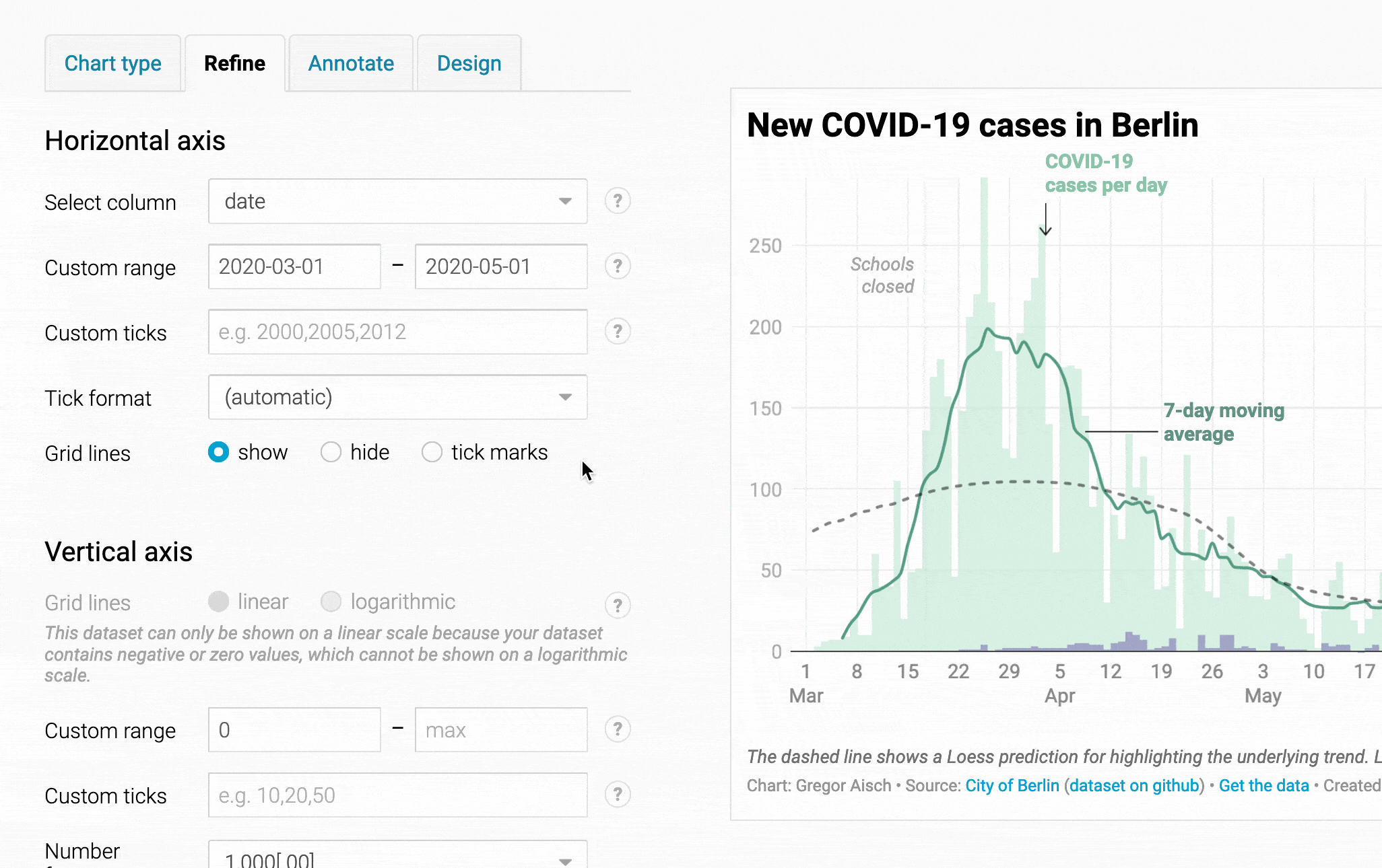
We now show date axis ticks with two layers (e.g., year and month, or month and day) in two lines instead of one.

Our old grids already supported multi-layer date formats like “April, 2, 3, 4”. But some of our users said they want to show the date for the first of the month, too. The problem was especially apparent when using weekly ticks, where the “April” label might not even be the first. We fixed this by moving the different layers into separate rows.
Up to now, each of our chart types had used its own date axis implementations, leading to subtle differences. Now, grids look and behave the same – no matter if in line charts, area charts, scatter plots, and column charts.
In our old grids, we were hiding overlapping tick labels on the x-axis. Now we’re trying to truncate them first.

If there are be too many axis ticks to even truncate them, we’re still hiding them. You can see that behavior in the following GIF.
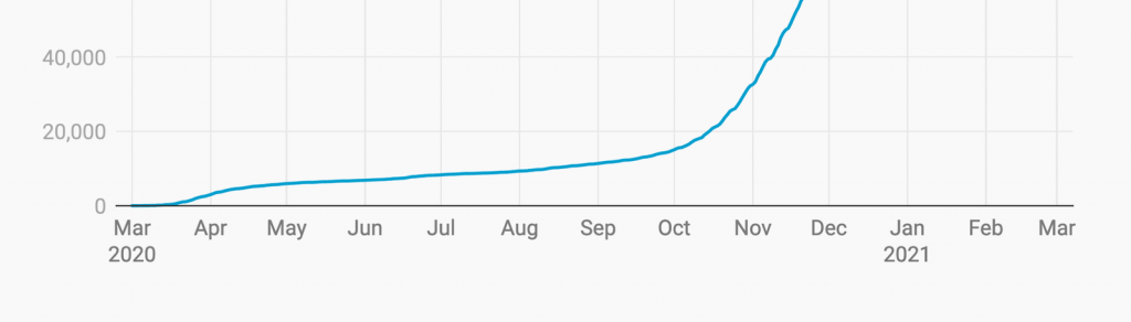
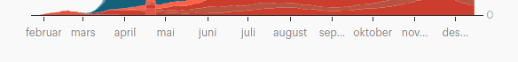
Our line and area charts have used the full-years date format (“2015, 2016”) as the default since we launched them years ago. That means that our users had to change the format whenever their dataset wasn’t spanning several years. Now we introduced a new (automatic) number format that tries to find the best format fitting your dataset.
(automatic) date format will often result in the best axis ticks. You can still always change the format, e.g., to a custom format.Besides these big changes, we also fixed a bug that sometimes would hide duplicate tick labels, even if a month legitimately showed up twice (e.g. as May 2018 and May 2019). And we made it easier for us to design custom design themes for customers with a custom or enterprise plan.
These changes are subtle, but we think they’re essential. It’s one more example of how we put a lot of thought and energy into details, so you don’t need to care about them when visualizing your data. If you have any questions or feedback about this new feature, write to us at support@datawrapper.de. We’re looking forward to hearing from you!


Comments