Watch the recordings of Unwrapped, our conference
August 12th, 2024
5 min

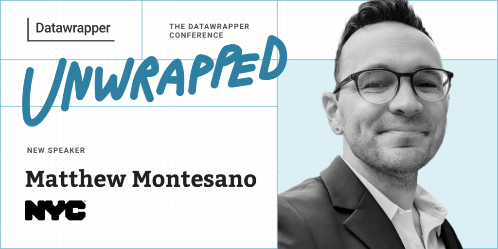
We’re excited to announce that Matthew Montesano from the New York City Department of Health and Mental Hygiene (NYC DOHMH) will speak at our Unwrapped conference about “A revolution in government data communication strategy.”
Matthew is a public health professional with over 10 years of experience working with local, state, and federal agencies to shape how they communicate data and build usable, engaging, and effective data communication products.
For several years, Matthew worked on the NYC Department of Health’s COVID-19 data websites, leading data visualization and building and maintaining webpages and data flows.
Currently, as the Director of Data Communication at the NYC Health Department’s Bureau of Environmental Surveillance and Policy, Matthew manages the Environment and Health Data Portal, one of the agency’s marquee data communications platforms. This work synthesizes user research, data visualization, and health communications to create a novel data communication website.
Time to ask him some questions:
A lot of government agencies face challenges releasing data in meaningful ways. Capacity, technology, and culture can pose barriers to designing and delivering data in ways that help people understand it: Design and development skills are uncommon in the public sector, and prioritizing those areas can be a blind spot for many agencies when they’re not common parts of the organizational toolkit.
But this work is crucial to data communications. Many government agencies, especially health departments, collect data about the public and create knowledge with public funds. This knowledge, therefore, should be public — meaning that agencies should shoulder the task of publishing it in ways that the public can use.
At the NYC Health Department, work incubated on the agency’s Environment and Health Data Portal led to agency-wide uptake of Datawrapper for COVID-19 data visualization and communication. This has lead to new agency-wide commitments to communication-focused data visualization — a commitment to publishing data in ways that the public can use.
We’ll talk about initial work to use Datawrapper on the Health Department’s Environment and Health Data Portal; how we used Github and vanilla Javascript to power a comprehensive dashboard for COVID-19 data using Datawrapper; and the strengths and limitations of this approach. And, we’ll cover how Datawrapper’s unique product helped focus agency strategy and product around making data easier to access, understand, and use.
When we first published tables and maps with COVID-19 case rates by ZIP code, in spring 2020, New York City was one of the first jurisdictions in the world to provide information at this level of granularity. New York City is the largest city in the U.S., and it was hit with a severe wave of COVID in the early days of the pandemic. The findings from the data were crucial for saving lives across the country and around the world.
While this map (with its current data) has changed significantly, the original maps from Spring 2020 showed a disproportionate impact on New York City’s poorest neighborhoods. These neighborhoods are shaped by a history of racist real estate policies that drive today’s patterns of poverty. Those original maps suggested lessons beyond the details of viral transmission, about the ways that our social and economic environments drive disease patterns.
For another example, here are two charts on the health effects of power outages:
These are part of a data story on ways that climate can affect health — particularly, how power outages can threaten people who rely on electric medical equipment. My colleagues’ analysis showed that hospitalizations and deaths spiked during and after major power outages. As climate change drives more frequent and severe weather, we see how infrastructure is a fundamental piece of public health.
On these charts, I really like the gray fill between lines to show a range of predicted values, the powerful red to provide a focal point on the observed effects exceeding the predictions, and the use of annotations to help pull the story together — all with a great economy of copy and a strong visual message.
It has to be clear and easy to understand. We’re really interested in the effectiveness of data visualizations, and that mainly boils down to: Can people understand them? Often this points to simplicity, but it doesn’t have to — we can incorporate complexity in thoughtful ways, as long as we have an explanation of our main messages, a hierarchy of information, and design techniques that reinforce that hierarchy, like focal points and annotations. We think it’s important to bridge the gap between our knowledge and our audience’s knowledge. Half a bridge isn’t a bridge.
I’m interested in exploring how data visualization can be used to promote health behavior change, integrating data communication into a broader health communication strategy. For example, there’s a theoretical model in health communications called the Extended Parallel Process Model. It involves showing somebody that they are at risk of a certain health outcome but then giving them the tools they need to protect themselves. It involves a careful balance of information — making somebody too afraid risks triggering resigned inaction rather than motivating action. I think that data visualization can be a tool to help this balance of information — it can provide an accurate sense of susceptibility and severity, and it can also provide that sense of relief in the effectiveness of action. Under what circumstances is this most likely to be effective? What types of data and visualizations can be effective, and what techniques may be ineffective or do the opposite of what we want? We know that people are interested in data, and that data can provide a foundation of trust if it’s communicated correctly. But I think that there’s still a big gap in knowledge and practice about how to use this in health communications contexts.
We're looking forward to Matthew's talk at Unwrapped! Until then, you can find him on LinkedIn. To sign up for Unwrapped and hear Matthew and other great speakers, visit our conference website.
Comments