New: Small multiple column charts in Datawrapper
February 18th, 2025
6 min
Datawrapper lets you show your data as beautiful charts, maps or tables with a few clicks. Find out more about all the available visualization types.
Our mission is to help everyone communicate with data - from newsrooms to global enterprises, non-profits or public service.
We want to enable everyone to create beautiful charts, maps, and tables. New to data visualization? Or do you have specific questions about us? You'll find all the answers here.
Data vis best practices, news, and examples
250+ articles that explain how to use Datawrapper
Answers to common questions
An exchange place for Datawrapper visualizations
Attend and watch how to use Datawrapper best
Learn about available positions on our team
Our latest small and big improvements
Build your integration with Datawrapper's API
Get in touch with us – we're happy to help
This article is brought to you by Datawrapper, a data visualization tool for creating charts, maps, and tables. Learn more.
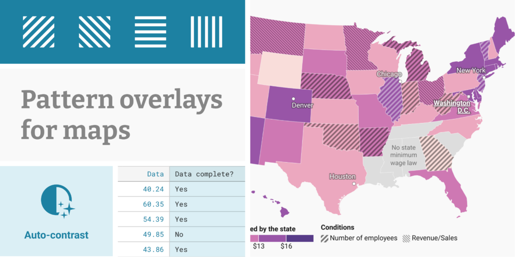
With Datawrapper, you can easily create maps that color regions according to data, such as unemployment rates or election results – so-called choropleth maps. They’re a great way to reveal regional patterns, or let users see how their home region compares to its neighbors.
But what if there’s more to a region than a single data point? Today, we’re introducing a new feature to our choropleth maps that allow you to tell a more nuanced story. On top of your color layer, you can now show categories as a pattern.
Datawrapper’s new pattern overlay is ideal whenever you want to explain to your readers that one or more map regions are special. This might be because the data in those areas is…
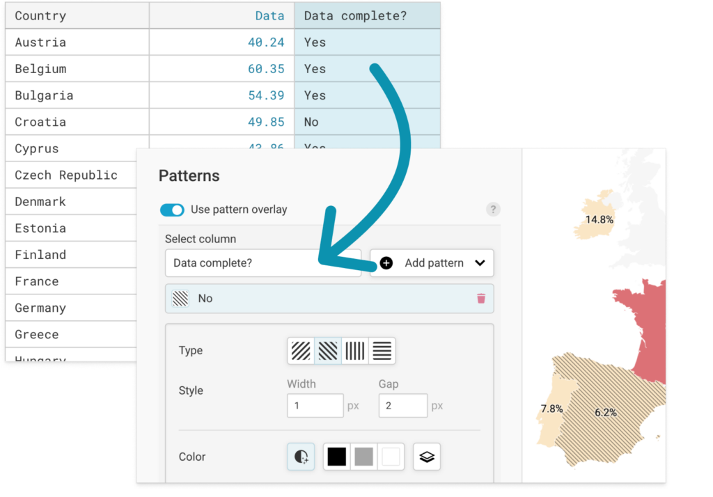
There’s no need to painstakingly select all the regions to which you want to apply a pattern. Instead, simply include a column in your dataset with the categories you want to display as a pattern, e.g. a column for Data complete? with a value of Yes or No for each region. Then select this column in our new pattern settings:
To make sure that patterns are visible in all of your regions no matter what color they are, we've added an auto-contrast option that’s on by default. It automatically adjusts the pattern color to the region color: your pattern will be darker on brighter regions, and brighter on darker regions:
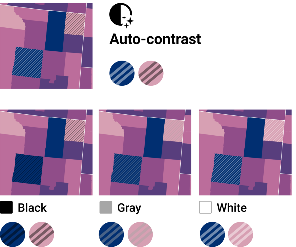
If your map colors don't vary too much in brightness, you may prefer to use one of the fixed color options (black, a medium gray, or white), or match the stripes to the background color of your custom theme.
The new pattern come with a useful set of configuration options, in case you need to distinguish between multiple categories. Choose from a selection of pattern directions…

…or make the inherent order in your categories obvious by varying the width or spacing of the pattern stripes:
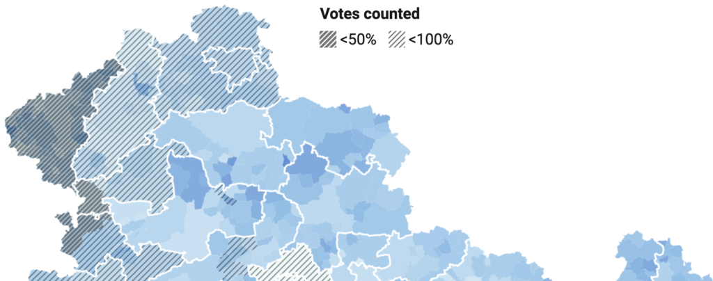
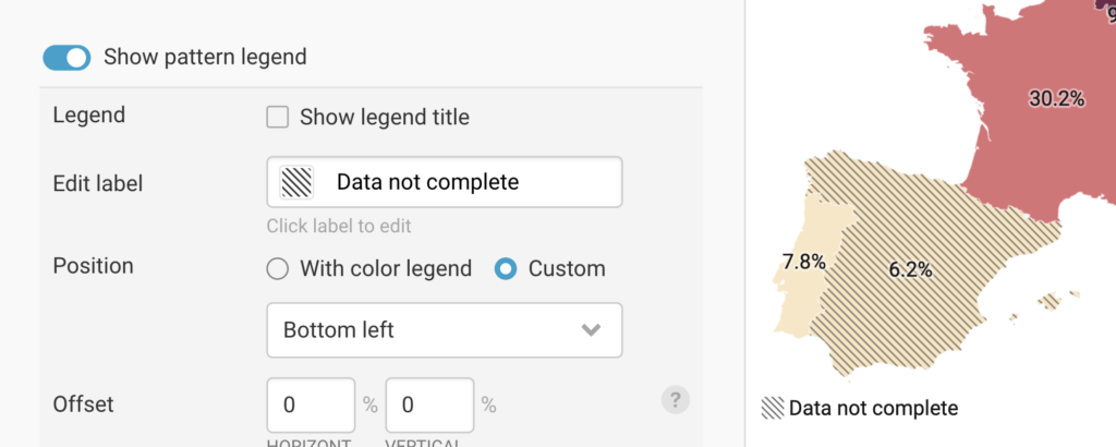
Your readers probably won’t know what your patterns mean without an explanation – that’s why every pattern is automatically added to the legend.
Not happy with it yet? Head to the legend settings to refine the label text, add a legend title, or customize the layout and position to make the most of the available space:
As with all our features, you can expect the patterns color to automatically convert in dark mode, export to PNG, SVG, and PDF, and be customizable via your custom theme.
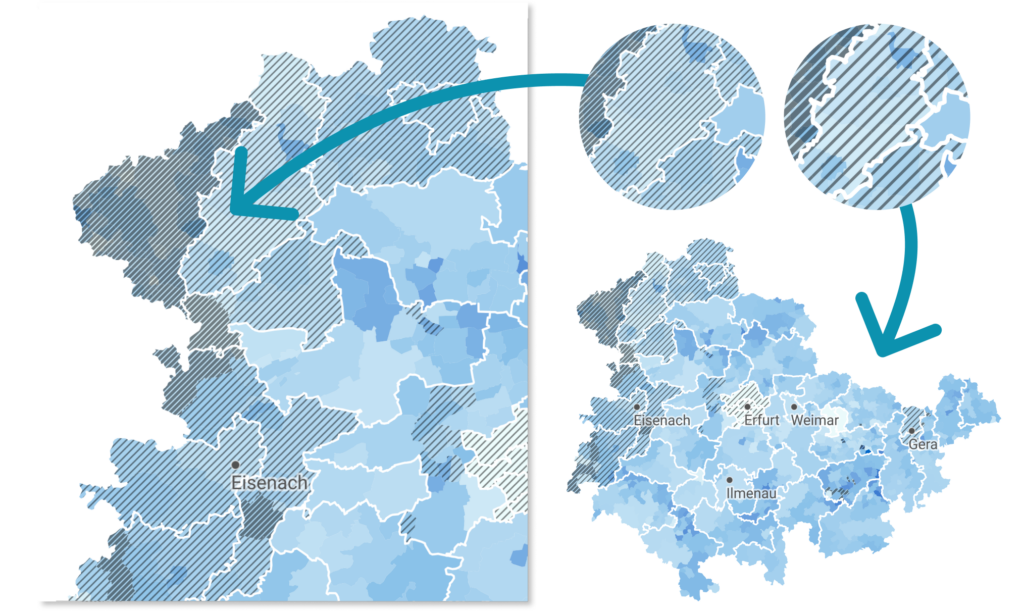
The patterns are also responsive: They scale up or down depending on your screen size, so they always look the way you want them to:
To learn more about Datawrapper’s new pattern overlay feature, visit this Academy article. We can't wait to see what you’ll create with it. Do get in touch with us if you have questions at support@datawrapper.de – we look forward to hearing from you.
Comments