This article is brought to you by Datawrapper, a data visualization tool for creating charts, maps, and tables. Learn more.
For the poor, retirement is short(er)

Hi there, it’s Rose! I write for Datawrapper’s blog. Today I’m rebuilding a chart about how long the richest and poorest people can expect to live.
If you’ve been following the protests over pension schedules in France, there’s a good chance you’ve heard this statistic thrown around: 25% of the poorest French men are already dead before reaching retirement age.
It’s a number that I, and many other people, first encountered in a chart published in Libération around December 2021. Here’s what their version looks like:
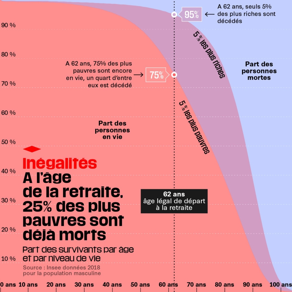
As the statistic it visualizes has been discussed in the press, brought up by politicians, and dissected by economists, I find that, over a year later, I’m still automatically picturing this chart every time it comes up. To me, that’s a sign of a data vis job well done. So for this Weekly Chart, I wanted to try rebuilding it myself and understanding what made this chart stick with me.
Normally, in an area chart, each shaded region represents one particular slice of the data. When the areas add up to 100%, the whole population is there: each point on the chart represents a person (in some category, at some time), and each person has their point on the chart. It’s very concrete.
But this one is a little different. It’s more like two area charts laid on top of each other — one dividing the living and dead among the poorest 5%, and another doing the same for the richest.
In the lightest colored region of my original chart are people who, in a very abstract statistical way, are alive “regardless” of their economic status. In the darkest region are people who would be dead “no matter their income.” The middle region, between the two lines, is where inequality comes in. If you’re living in the red chart — that is, if you make about €466 per month — then you’re above your mortality line and already dead. But if you’re living in the blue world, with a monthly income of €5,796, then you’re still alive.
It’s worth noting that all of this discussion has revolved around the numbers for men. French women live longer on average and have a smaller mortality gap between rich and poor at almost every age.
Obviously, these lines are abstractions that don’t perfectly correspond to any one person’s experience. (People move between income brackets; medical developments mean mortality rates keep changing over the decades of your actual life.) But they show the basic fact that, even when it comes to living and dying, rich and poor live in two different worlds — or on two different charts.
That’s all from me for today! See you next Thursday for an early Valentine’s Day chart from our visualization developer Elliot.


Comments