New: Automatically label data points in line charts
September 18th, 2024
3 min
Datawrapper lets you show your data as beautiful charts, maps or tables with a few clicks. Find out more about all the available visualization types.
Our mission is to help everyone communicate with data - from newsrooms to global enterprises, non-profits or public service.
We want to enable everyone to create beautiful charts, maps, and tables. New to data visualization? Or do you have specific questions about us? You'll find all the answers here.
Data vis best practices, news, and examples
250+ articles that explain how to use Datawrapper
Answers to common questions
An exchange place for Datawrapper visualizations
Attend and watch how to use Datawrapper best
Learn about available positions on our team
Our latest small and big improvements
Build your integration with Datawrapper's API
Get in touch with us – we're happy to help
This article is brought to you by Datawrapper, a data visualization tool for creating charts, maps, and tables. Learn more.
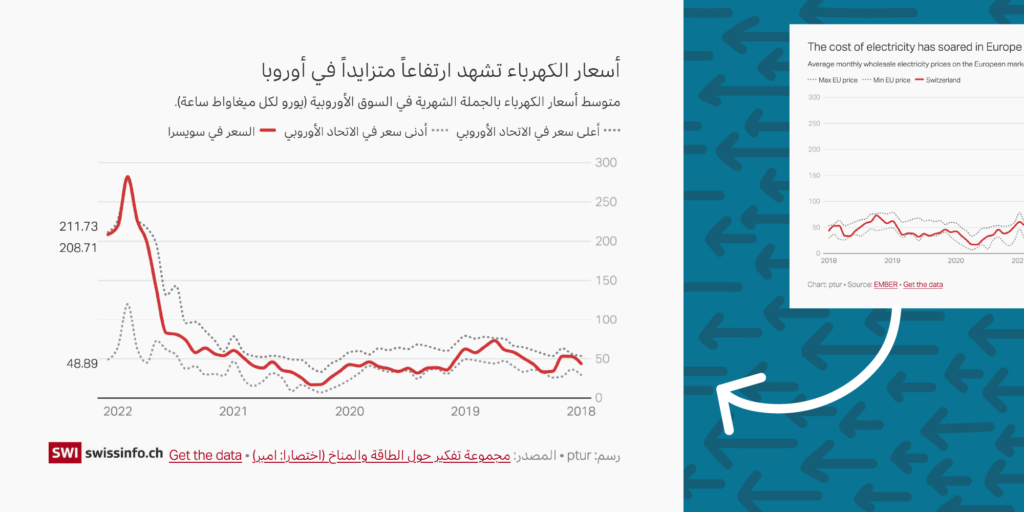
Datawrapper’s interactive charts, maps, and tables already support 49 languages through 63 output locales. With the right output locale, visualizations’ built-in text appears in your own language, and numbers are formatted the way readers in your country are used to.
But if you work with a language that’s written from right to left — such as Arabic, Hebrew, or Persian — then you know it’s not always so simple to create visualizations that work well with your script. So we’re especially excited today to announce new, comprehensive right-to-left support in all Datawrapper visualizations.
Right-to-left features are controlled by each visualization’s output locale. You can change the output locale in the Layout tab of Step 3: Visualize.
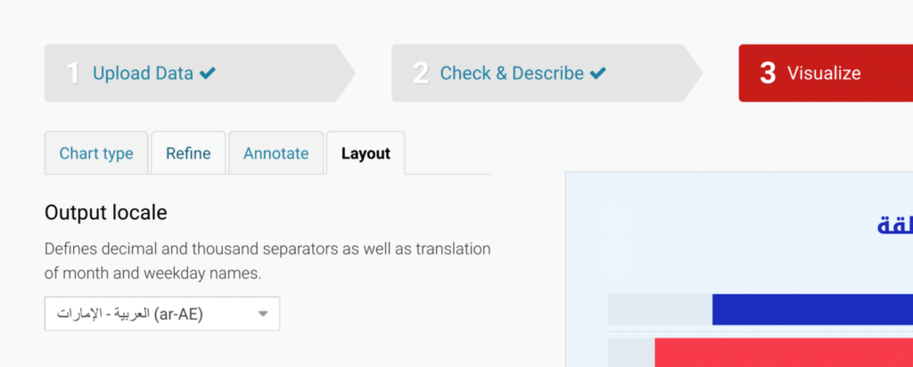
Select any Arabic (ar-AE, ar-SA, ar-DZ), Persian (fa-IR), or Hebrew (he-IL) locale to set your visualization’s orientation to right-to-left. Selecting any other locale will switch it right back to left-to-right. If your language isn’t on our list yet, no problem — write to support@datawrapper.de to help us add it!
Your visualization’s design and your editing experience will adapt for right-to-left languages in several ways. Here are the big ones:
You can already customize the alignment of many elements in Datawrapper visualizations, including text annotations, y-axes, color legends, table columns, and more.
If you’re translating a visualization, for example, from English to Arabic, you want to keep those choices consistent. That’s why, when you select a right-to-left locale, all customizable elements will automatically reverse their alignments as well.

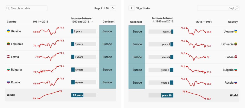
This starting point should make it easy to translate charts, maps, and tables without recreating your designs from scratch. Of course, you can continue to adjust all of these elements as you’re used to in right-to-left visualizations.
While you can reverse certain chart elements by hand, many Datawrapper visualization types have a deeper, built-in orientation that can’t be customized — like the direction of bars in a bar chart. In right-to-left languages, those visualizations will now read from right to left.
In all bar charts, labels sit on the right side and bars read from right to left. The same is true for dot, range, and arrow plots.
In line charts, area charts, column charts, and scatter plots, x-axes run from right to left.
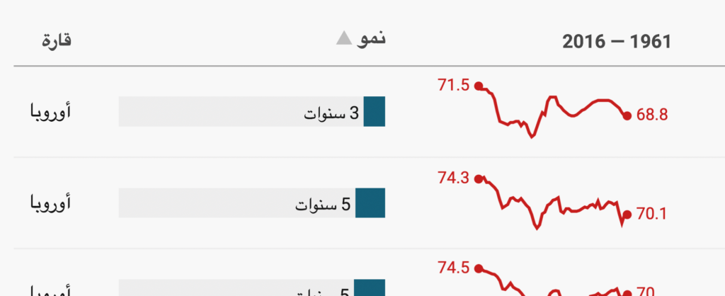
In tables, mini bar charts and sparklines are read from right to left.
Labels in locator maps for countries, cities, and streets are also now available in right-to-left scripts.
When you choose a right-to-left output locale, all text input boxes in our user interface will automatically switch to a right-to-left orientation. That includes fields for things like titles and descriptions, map marker names, and tooltips.
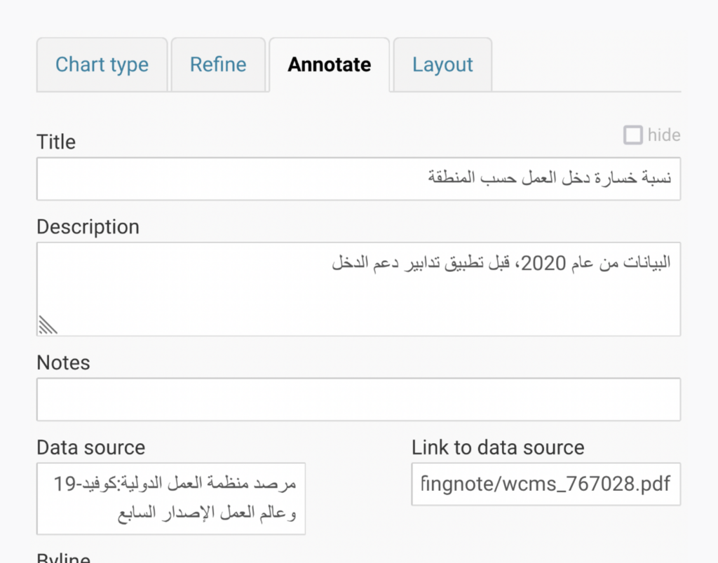
It’s easy to mix in numbers and Latin characters without scrambling the order of your text.

Right-to-left support is just one of the ways that Datawrapper enables multilingual visualizations. Here are some tips for making the most of our language features.
Your visualization’s output locale isn’t just about left versus right. An output locale controls the language of built-in text, such as bylines in the footer or month names on the x-axis. It also decides which country's number formatting standards to follow, like whether decimals are separated with a period (as in the U.S.) or a comma (as in Germany).
Even if all your visualizations have the same basic orientation, choose the correct output locale to make them look extra polished.
If you’re juggling multiple translations of the same visualization, you can stay organized by displaying their output locales in the thumbnails of your archive. Visit our Academy to learn how to turn on this setting.
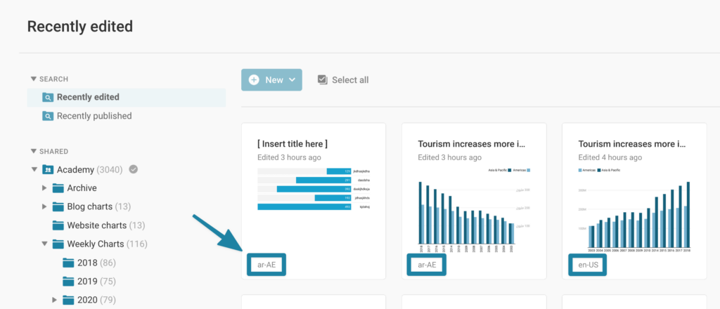
Do you want your footer text in Urdu? Or to label your axes with Lebanese month names? We’re always ready to add support for new output locales — send us an email at support@datawrapper.de to learn how to contribute translations.
We know many of you have been waiting for this feature, and we’re eager to hear your feedback! Share your thoughts at support@datawrapper.de or on Twitter @Datawrapper.
Comments