

New: Annotations in bar, range, and dot charts
November 1st, 2024
4 min
This article is brought to you by Datawrapper, a data visualization tool for creating charts, maps, and tables. Learn more.
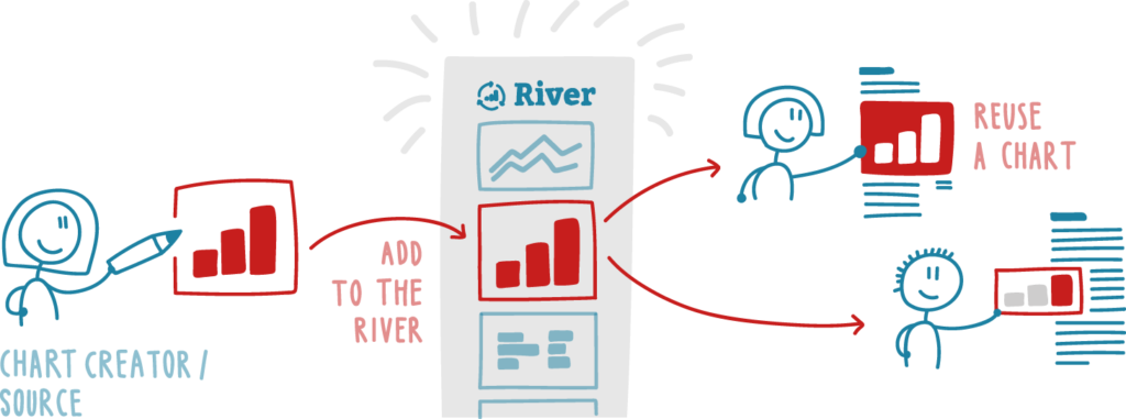
Today we release a platform that connects data sources with newsrooms. As a chart creator, you can now allow others to reuse your chart. For anyone looking for charts, we created the Datawrapper River. It’s a collection of charts that you can use in your own publication, for free.
Find it at river.datawrapper.de.
With Datawrapper River, data sources like statistics organizations have a way to publish their findings for easy reuse by potentially hundreds of news sites. Think of it as a wire service for charts. The option to reuse will save journalists considerable time. They now have a chance to strengthen reporting with underlying data and clear visuals or maps.
It’s an experiment we’re very excited about! We’ll explain our reasoning and how it all works in this blog post.
Before we go into details: None of your charts will turn up on Datawrapper River without your consent. So no worries about everyone seeing data not yet ready for the wide open! But if you are a source, you can enable reuse with one click in the publishing step. After adding an attribution, your chart will turn up on river.datawrapper.de.
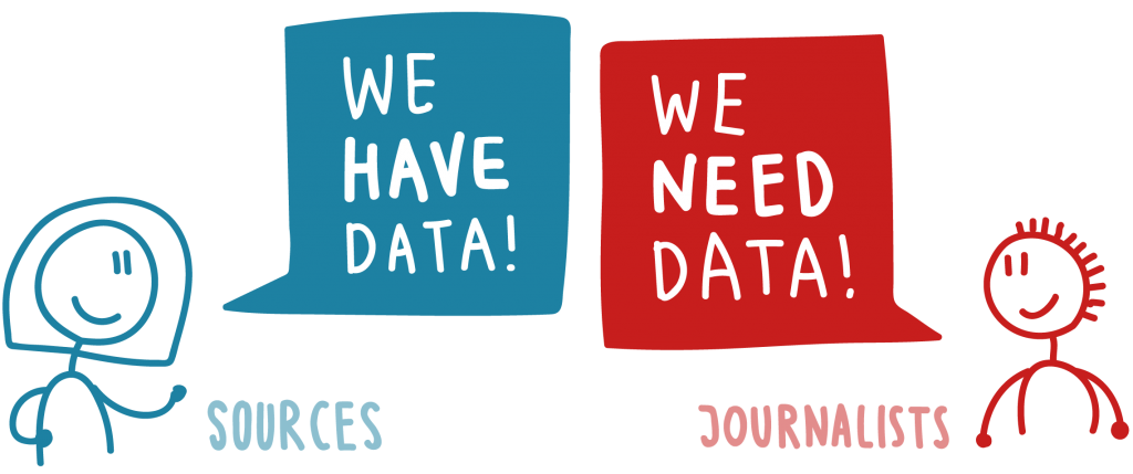
When creating charts, there are two worlds that need each other but haven’t found one another yet: data sources and journalists. Right now, it is very difficult for any data source to make journalists happy.
On the one side are the data sources: Thousands of dedicated people who work hard to collect data that matters. Think of national and international statistics organizations, NGOs, science teams. Think of Eurostat, Destatis, the World Bank, OSZE, WHO, IMF, and many others.
On the other side are the journalists: There is a clear growing need to use data as a source for reporting and they know it. Thousands of journalists would love to add data to breaking stories. They know that data can deepen reporting, bring in relevant comparison – that data can work like a “new camera”.

But there is a blocker. The data is there, somewhere. But journalists have to invest considerable time to create a chart out of it. That time is not available in most newsrooms. Journalists today work more, with fewer people, on more channels.
Let us briefly look at the process of data acquisition from the perspective of journalists: To understand data and to create good visualizations, some training and a lot of motivation are needed. First, there is the challenging quest to find the right data for a topic. You quickly find stuff through Google, but you have to dig long and hard for really good stuff. Often the data is hidden in a PDF. Partially available. Too old. There might be not enough data or too much (e.g. for all EU countries, when you only want to compare two countries). This is often highly frustrating and without experience it is not an activity you look forward to.
Let’s assume we found some really striking data. There is lots of work left. We have to perform specific steps to actually get a chart. Download the data. Open in Excel, Google Sheets or R. Clean, align, combine, check and confirm. Write a header, an intro for context, footnotes and localize to another language. Finally, publish.
With tools like Datawrapper and others, the situation is already much better than it was in the past. But the time invested per chart is considerable. Frankly, for many stories such as crime statistics, jobs/unemployment, house prices and many other categories, the effort is not worth it for a short article. Our observation is: For most journalists in most newsrooms, there is actually no time allocated to go data hunting. Even if you are well trained, the workflow takes time.
Sources might want to solve that problem by producing charts themselves. The upside is that the information is then already visible. The downside is that most news publications try to avoid publishing external content in a style that is different to their news brand. Often, this is a dead end.


Newsrooms might have a team of graphic editors or even visualization specialists. But these experts should work on special, one-off visualizations and investigative projects – not on day-by-day assignments to create bars, lines or other standard forms.
This is why we’re launching Datawrapper River: We want to make the workflow shorter. We aim to contribute to a better flow of data from source to the wider public via newsrooms.
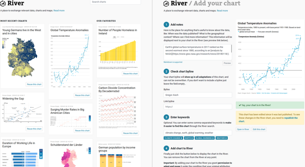
All reusable charts are collected on river.datawrapper.de. Here, you can browse through the newest charts or search for a specific topic.
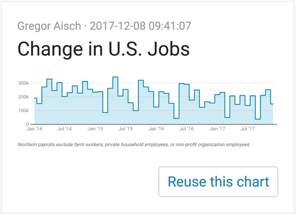
Clicking on “Reuse this chart” will bring you to step 3 of the chart creation process of a copy of the chart. The chart is yours now. It will appear in your chart folder, and you can change its chart type, headline, colors etc. However, you won’t be able to change the data or the attribution to the source. Once you’re done, you can publish and embed the chart in your custom chart layout, as you’re used to. It’s a free and fast process.
You can use charts from the River, but you can also add your charts to it. To do so, you need to be in step 4 (Publish & Embed) of the Datawrapper workflow.

Click on the link “Add your chart to our new River” to open a page that will ask you some questions. There you can add notes that will be shown to potential users of your chart, include your byline attribution and an extra link, and enter some keywords. You can also click directly on the “Add my chart to the River” Button at the bottom of the site:

Once you do that, your chart will be publicly shown on river.datawrapper.de and every other Datawrapper user can copy & publish (=“reuse”) your chart.
Datawrapper, from the very start, had one key goal and function: To make it simpler, easier and faster to publish charts. Last week, we reached a historic mark with this approach: Datawrapper users have created 1 million charts in total. We’ve always wanted our users to create charts “in minutes, not hours”. But that claim was only true by excluding the fuzzy and time-consuming process of having to find, clean and prepare the data. Datawrapper River is an optional way to use the tool, helping to overcome that problem.
Let us know if we’re on the right track with this. We thought a lot about what the River should be and how it should work. But in the end it is new territory for us. Your concerns, feedback, ideas and questions will help us make it a successful experiment.
If you still have questions, please visit the Frequently Asked Questions (FAQ) of the River or write to us at hello@datawrapper.de.


Comments