We’re hiring a Werkstudent*in Social Media & Communications
October 15th, 2024
4 min
Datawrapper lets you show your data as beautiful charts, maps or tables with a few clicks. Find out more about all the available visualization types.
Our mission is to help everyone communicate with data - from newsrooms to global enterprises, non-profits or public service.
We want to enable everyone to create beautiful charts, maps, and tables. New to data visualization? Or do you have specific questions about us? You'll find all the answers here.
Data vis best practices, news, and examples
250+ articles that explain how to use Datawrapper
Answers to common questions
An exchange place for Datawrapper visualizations
Attend and watch how to use Datawrapper best
Learn about available positions on our team
Our latest small and big improvements
Build your integration with Datawrapper's API
Get in touch with us – we're happy to help
This article is brought to you by Datawrapper, a data visualization tool for creating charts, maps, and tables. Learn more.

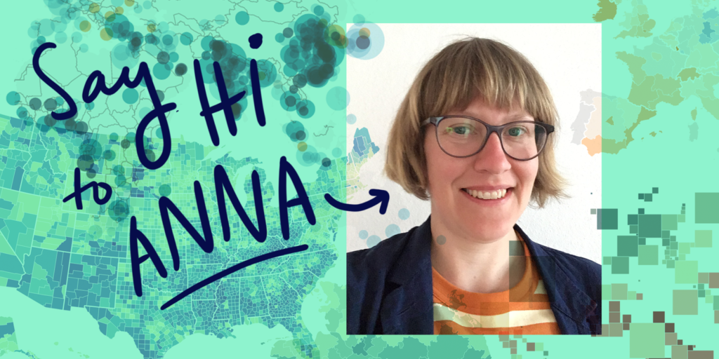
It’s time again for a new person to join the Datawrapper team! Since last week, we have Anna Thieme on board and we couldn’t be happier about that.
With Anna, we’re filling the position of the basemap creator. Meaning, Anna will take care of creating and updating maps for our mapping tool. She calls herself a “data gardener”; converting shapefiles to TopoJson, making sure projections and IDs etc are in order, etc.
You want us to add election districts for the next election? You find that a particular map has been outdated? You need the newest or historical census tracts? Get in touch with Anna at support@datawrapper.de. She works for three days a week exclusively for the map needs of our users.
To get to know Anna a bit, we asked her two questions:
The last 2 years I’ve been running my own catering company, making food for all kind of events from a juggling conventions to weddings, cooking with kids, etc. I had a little break from maps 🙂
Before that, I worked with geo data visualization of the cell phone network at NC Group. One project I worked in was to visualize and compare the upload/download quality of mobile data for different network providers: Data was collected from an app where users could test their own provider’s quality and at the same time contribute with data to the map. The end result was a web map where an average result from all measurements in areas 500 x 500 meters was displayed. I was working on the calculation of the results, managing of the database and rendering of the tiles used for the web map.
I’m from Sweden and I was supposed to do an exchange semester at the TU Berlin and then go back. But that’s almost 8 years ago and I still haven’t moved back. I finished my studies and started working here in Berlin.
In Sweden, I studied archaeology and it was through mapping excavation sites I became more and more interested in working with maps, so I changed my path of studies.
I find it interesting to work with an application that is used by journalists all over the world to visualize data in a straightforward way. I’m curious to follow which maps the users’ request and what they are used for!
If you need maps, Anna is the person to talk to. Ask her your questions at support@datawrapper.de.
Comments