

We’re hiring a Werkstudent*in Social Media & Communications
October 15th, 2024
4 min
This article is brought to you by Datawrapper, a data visualization tool for creating charts, maps, and tables. Learn more.
Datawrapper’s developers work in two teams, one focused on our app and one on the data visualizations themselves. The visualization team is always building new chart types and features for you to use — and it’s just gotten even stronger with the addition of Erle Monfils.
Erle is joining us remotely from Italy as a full-time visualization developer, so we asked her a few questions to get to know her better:
Hello, I’m Erle. I was born and raised in the Netherlands, but moved to Italy three years ago and have been living there ever since.
My close friends like to tell me my interests change every three years, and I can’t say they’re wrong. I did a bachelor’s in Ancient Greek and Latin, then a master’s degree in Cultural Anthropology and Development Sociology. During my studies I became obsessed with both dance and yoga, and I went on to teach yoga classes for five years, while also working as a project coordinator at a publishing house.
At a point during that time when I didn’t really know what to do with my professional life, I got introduced to the world of programming. I was blown away and wanted to learn everything. After having done several online courses in an extremely unfocused manner (I tried my hand at machine learning basics, canvas/p5.js, and building a robot), eventually I did a bootcamp to become a web developer. This landed me my first IT job as a full-stack developer.
After moving to Italy, I decided to focus on front-end development for a while, and got hired by a company that specializes in data visualization. There I learned a lot about data vis development, and got to work together with designers that came up with really beautiful and creative data visualizations. Eventually I decided it was time to move on, and then the opportunity to work at Datawrapper popped up.
I really enjoyed the idea of contributing to the work of data journalists, and was very impressed by the list of news outlets and public institutions that use Datawrapper. Another thing that attracted me was the fact that people from many different cultural backgrounds work at Datawrapper; I’ve never worked on such an international team before!
Lastly, in my previous software jobs I’d always done client work, often on relatively small-scale projects. I wanted to try making the switch to working long-term on a single product, and having ample time to make that product as great as possible.
As part of the visualization team, I’ll be responsible for the development of new features and fine-tuning of existing features for charts, maps, and tables.
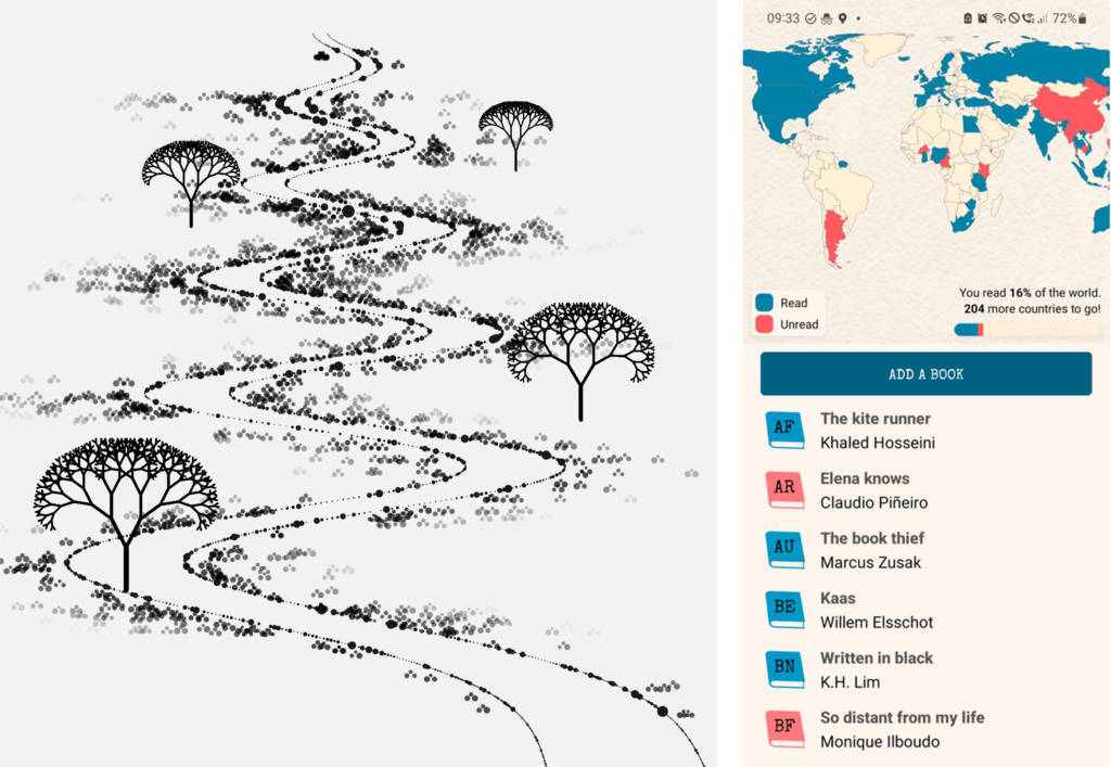
The first area that I started exploring as a budding developer was machine learning, and this made me super aware of the power of data. I then discovered the work of Nadieh Bremer and Shirley Wu (especially her Hamilton visualization, which I will always remember fondly). This made me interested in data vis, and specifically in how to create pleasing and beautiful experiences that make you want to know more about the data behind them.
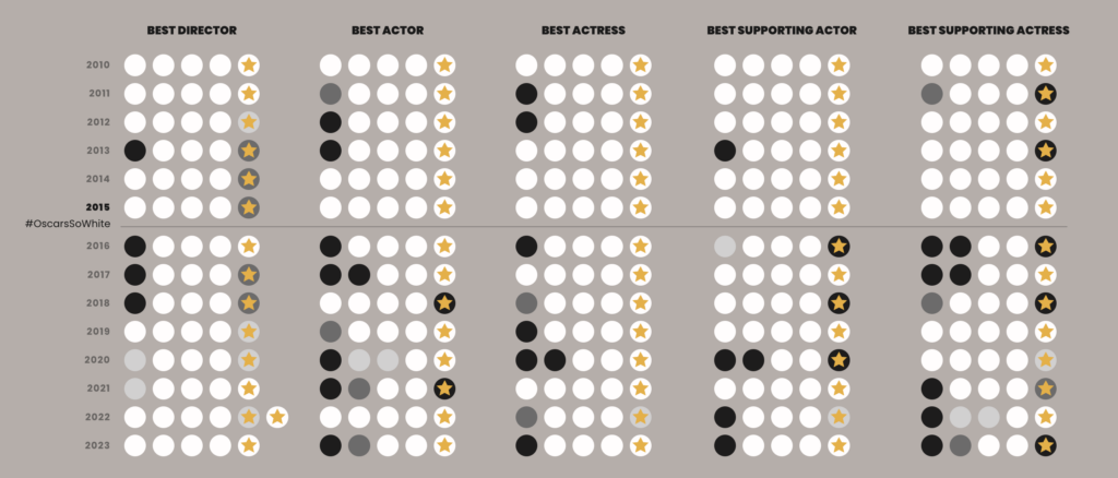
Later, with ChatGPT taking the tech world by storm and machine learning scandals (such as the Dutch child care benefits scandal) popping up everywhere, I started reading books such as Weapons of Math Destruction, More than a Glitch, and Invisible Women, that look very critically at big data while also taking a data journalism approach. Machine learning and ethical/sustainable AI are areas I would love to eventually integrate in some way into my professional life.
I’m really great at starting projects and never finishing them. But one ongoing project that I’ve enjoyed working on for quite a while is a twelve-part data vis series inspired by Data Sketches by Shirley Wu and Nadieh Bremer. As part of the project, I made this exploratory chart that visualizes the spoken presence of the main heroes and villains in the 1998 series The Powerpuff Girls:
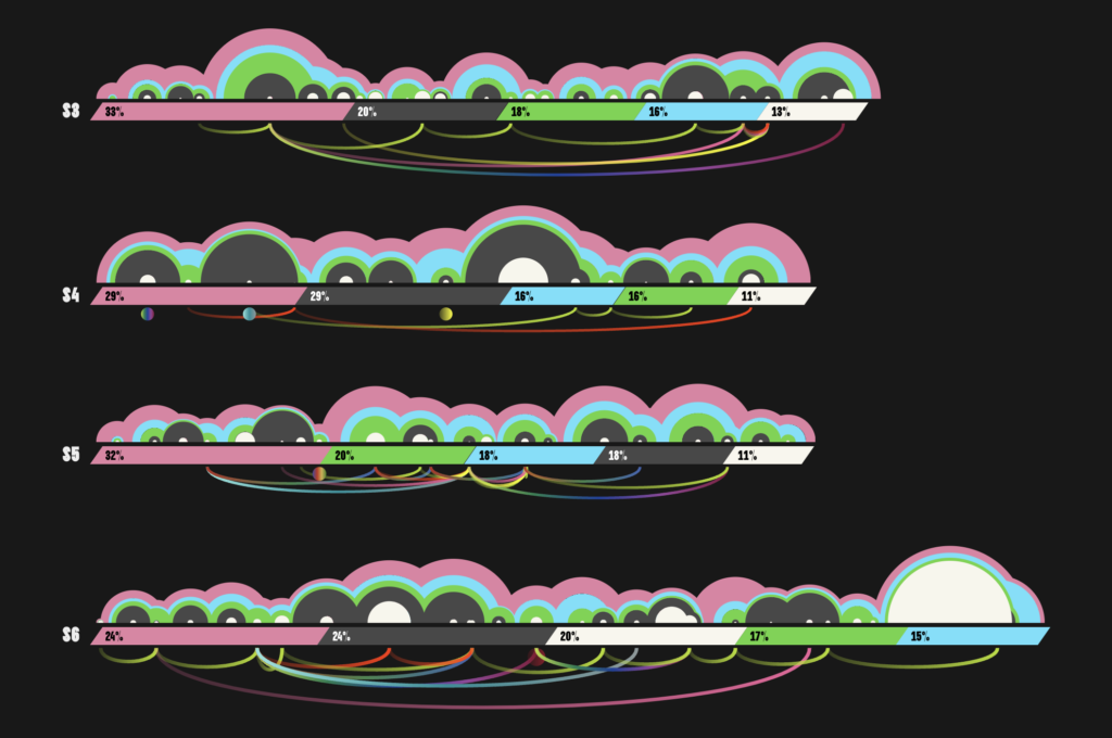
I went through the whole cycle — data scraping, cleaning, exploration, data vis design, and the final development — and it was an awful lot of work, but an equal amount of fun!
You can always wake me up for karaoke 😍
Thanks, Erle! You can find more about Erle on LinkedIn and her (work in progress) website.


Comments