We’re hiring a Werkstudent*in Social Media & Communications
October 15th, 2024
4 min
Datawrapper lets you show your data as beautiful charts, maps or tables with a few clicks. Find out more about all the available visualization types.
Our mission is to help everyone communicate with data - from newsrooms to global enterprises, non-profits or public service.
We want to enable everyone to create beautiful charts, maps, and tables. New to data visualization? Or do you have specific questions about us? You'll find all the answers here.
Data vis best practices, news, and examples
250+ articles that explain how to use Datawrapper
Answers to common questions
An exchange place for Datawrapper visualizations
Attend and watch how to use Datawrapper best
Learn about available positions on our team
Our latest small and big improvements
Build your integration with Datawrapper's API
Get in touch with us – we're happy to help
This article is brought to you by Datawrapper, a data visualization tool for creating charts, maps, and tables. Learn more.
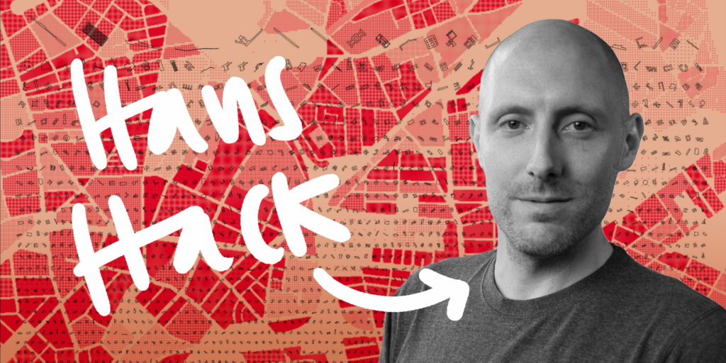
We’re very, very happy to introduce you to a new member of the Datawrapper team: Hans Hack. He’s a data visualizer, artist, tool builder and mapmaker who will work for us as a front-end developer 2.5 days a week.
Hans is an all-rounder. His data visualizations and map experiments are some of the most aesthetic we know. Not gonna lie, we’ve been fans for a long time. Find his portfolio at hanshack.com and read on to find out more about Hans and his decision to start working for Datawrapper:
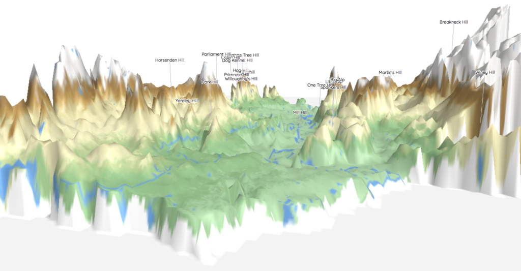
Hi there, my name is Hans Hack – yes that’s my real name😉. I’m an artist and web developer working in the field of data visualization with a strong focus on maps. I became interested in programming and maps when studying heritage conservation. Presenting and exploring research findings on maps was something that excited me. So I taught myself how to do it.
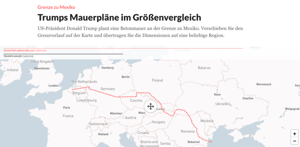
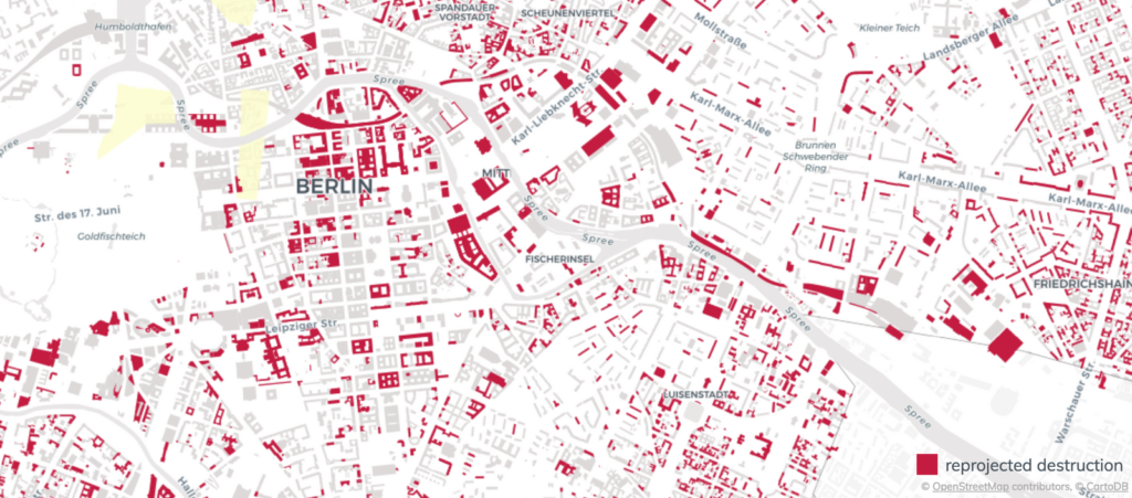
Since then I explore the world of maps, web development and data visualization. I have worked for museums, newsrooms, artists, graphic design studios and foundations. You might have come across my work in newspapers, magazines, exhibitions, conferences and the web of course.
I started working for Datawrapper because I like the small friendly team of people that have interests similar to mine. (It’s hard to find other places where you can talk about maps and data vis all day long…)
Also, I got asked to develop a really cool map tool. Stay tuned.
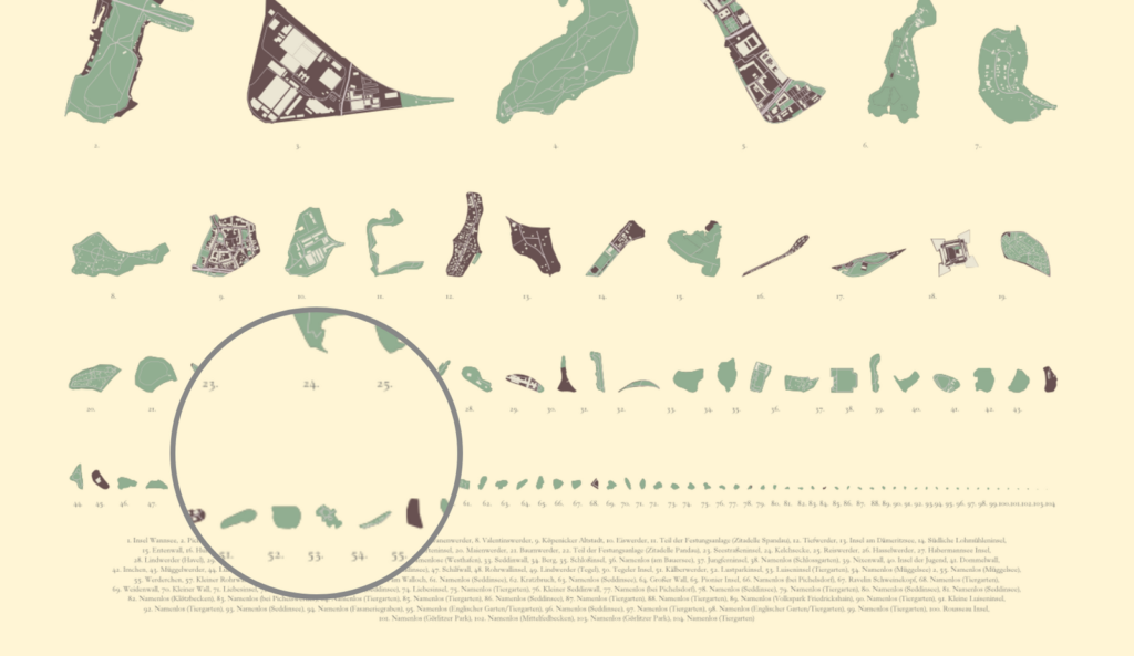
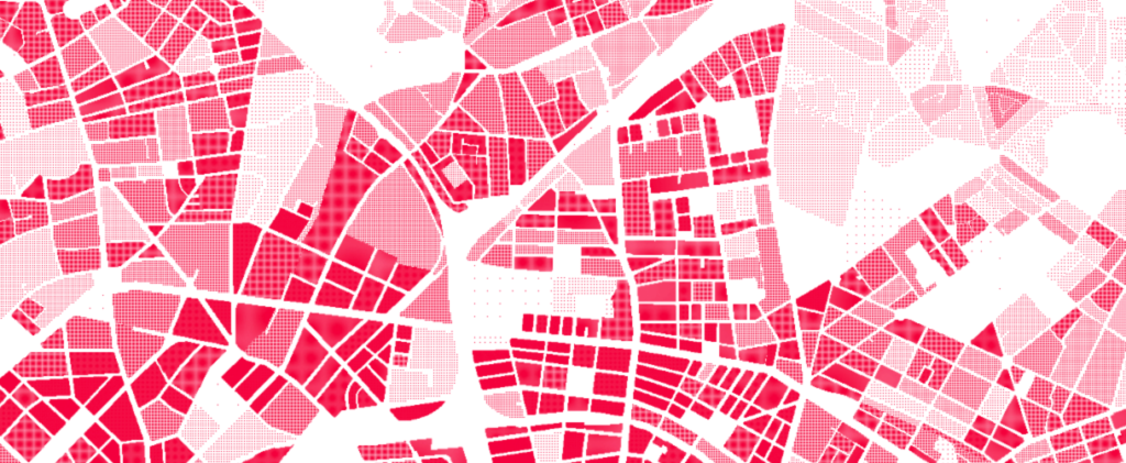
When I’m not working for Datawrapper, I work as a freelancer (feel free to contact me) and on side projects where I explore new data vis ideas. Also, I like giving mapping workshops and finding new inspiration for my work. So perhaps you may bump into me at some random conference, meetup or exhibition.
I would like to further explore ways that challenge the viewer’s perception of his/her environment. There are still many ways I haven’t explored yet and I’m excited to do this in the near future. A project that experiments with the idea of space is “Sorted Cities”, in which I sort building footprints by size.
Thanks to Hans for answering our questions, and welcome to the team! If you want to get in touch with Hans, find him on Twitter. Also, check out his work on his website hanshack.com.
Comments