This article is brought to you by Datawrapper, a data visualization tool for creating charts, maps, and tables. Learn more.
Say Hi to Ivan!


Almost three weeks ago, a guy named Ivan walked into our small Berlin office and then sent the following tweet.
We’re very happy to welcome Ivan, who will fill this web dev position. It’s overdue to introduce him properly on this blog – and since it’s hard to find information about him on the web, I had some basic questions for him.
Tl;dr: He actually studied Psychology; and that might or might not explain why he deleted almost 200 of his Facebook friends a few years back. Also, Ivan ❤ tea.
Hi Ivan! What’s your Background?
I studied psychology at university which is not directly related to my work as a developer. Some concepts come in handy however, for instance cognitive psychology and statistics. After graduation, I briefly worked in HR but quickly realized that it was not my calling. Around that time I became interested in web development and learned to programme by myself through a combination of online courses, books and doing hands-on projects.
My recent focus has been on front-end development, so I work a lot with JavaScript and CSS and am currently getting more into SVG.
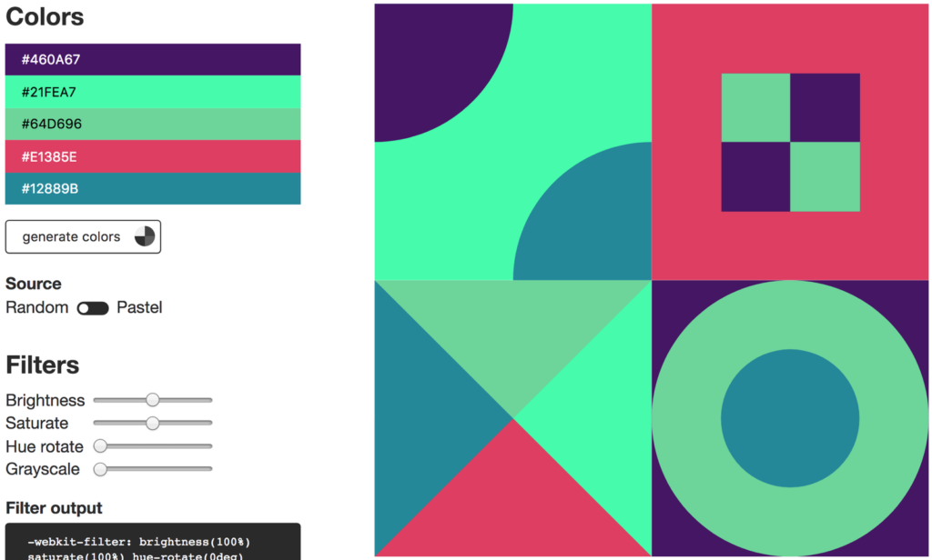
Ivan’s CSS Color Playground lets you play around with colors and then easily export them.
Why did you get into dataviz?
My interest in dataviz began a few years ago and coincided with the** rise in popularity of D3.js**. I was blown away by its flexibility, and it got me thinking about how dataviz can be used to improve and enhance storytelling in the digital format.
One of the initial attractions of dataviz work that I’m still highly motivated by is the range of concepts involved in this work: finding an interesting idea, collecting and wrangling data, designing all aspects of the visualization and of course the implementation.
What’s a project of yours you’re most proud of?
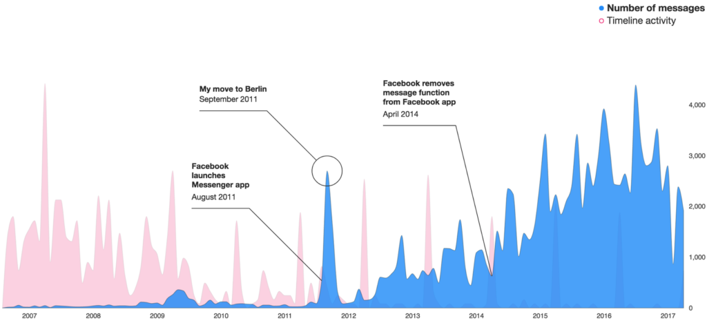
I haven’t yet completed many dataviz projects, but the one I’m most proud of has to be a project on visualizing my use of Facebook. It covered all the concepts I mentioned above nicely and was a lot of fun to make.
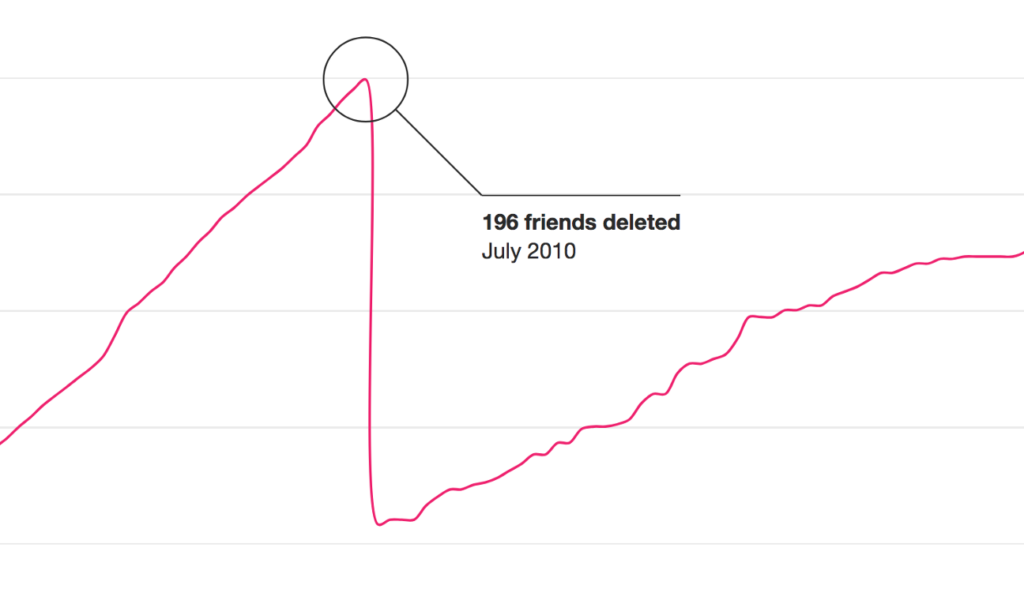
Ivan’s Facebook friends number over time. Extreme move in 2010.
What’s your favorite data vis book / video / tutorial?
There are many I could mention, but when I was starting out with dataviz I found that Scott Murray’s Interactive Data Visualization for the Web was amazing. I like Scott’s style a lot — he explains things comprehensively but stays engaging and casual throughout. I can highly recommend it to someone who wants to give dataviz on the web a go — the second edition of the book has come out recently.
What would be an area of data vis that you still want to explore?
I would like to learn R to enable me to test out and iterate on dataviz ideas rapidly. Furthermore, I want to try out Processing to use for some more unconventional approaches to data viz.
What’s your favorite data vis out there?
I couldn’t single out a favorite one because there are so many exciting projects out there, but a recent one that I found particularly captivating is the “Game of Thrones” Chart from NY Times. Its interactive aspect is fascinating, and the fact that it lets the user compare their results to the aggregate results of everyone else is a nice touch.
So why did you want to work at Datawrapper?
I was attracted to the idea of working on a product which makes it easy for anyone to produce a beautiful visualization on the web quickly. The technical complexities and challenges involved in working on a constantly evolving product were also very appealing.
In my previous role there was little scope for dataviz work, so working at Datawrapper is a perfect opportunity for me to fulfill my interest in this field.
And what’s the one thing people should know about you?
I make a damn good cup of tea. Plenty of milk and no sugar of course.
You want to know more about Ivan? Follow him on Twitter (@ilokhov) and check out his website: ivanlokhov.com.


Comments