

What to consider when choosing colors for race, ethnicity, and world regions
October 9th, 2024
11 min
This article is brought to you by Datawrapper, a data visualization tool for creating charts, maps, and tables. Learn more.
Like area charts and pie charts, stacked column charts are great to show total(s) and their shares – and like area and pie charts, they are only a good fit for very specific use cases. We’ll have a look at those here. Btw, we will only talk about stacked column charts this time (not bars), since there are a few differences how to use them well. If you feel inspired after the read, you can create both stacked column and stacked bar charts in our charting tool Datawrapper.
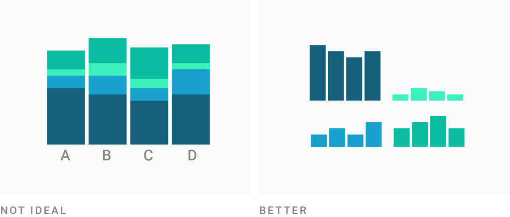
Stacked column charts work well when the focus of the chart is to compare the totals and one part of the totals. It’s hard for readers to compare columns that don’t start at the same baseline. If the focus of your chart is to compare multiple parts across all your totals with each other, consider split bars or small multiples instead.
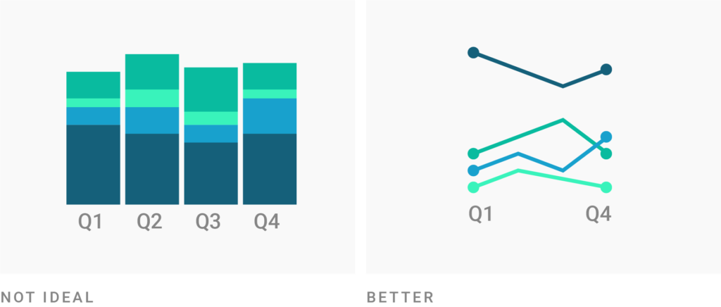
Stacked column chart can work well for dates, but should only be considered if the total of your parts is crucial. If the total of your parts is not important, a line chart is a better choice. It can be quicker decipherable by your readers.
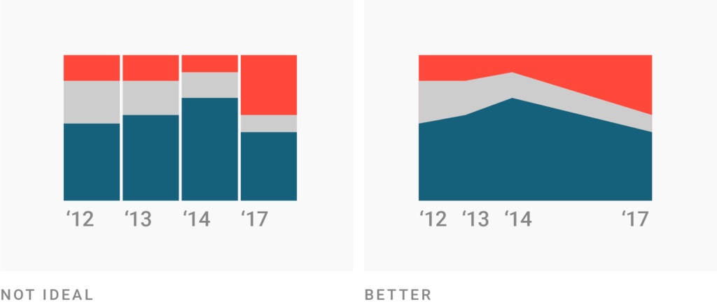
If you want to use stacked column charts for time data, make sure your dates have the same intervals. If you want to choose between area charts and stacked column charts, then the latter one is a better choice if you only have a few dates. Readers will be able to compare the parts of the totals better with each other than on an area chart. However, if the intervals between your dates are different, use an area chart (or line chart). They have x-axes with continuous scales that will show the date intervals correctly.
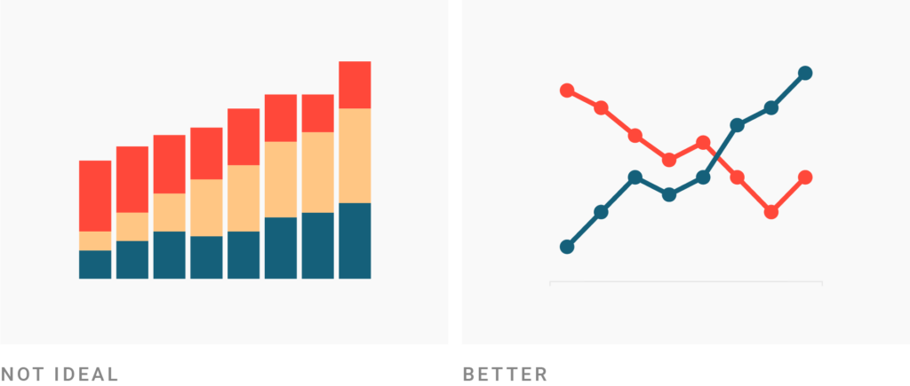
For time data, also consider a line chart if you want to show that one share overtook another one. Readers won’t see intuitively that the chart is about parts of a total anymore. However, you will communicate your message more clearly and don’t need to show all the shares of the total to do so.
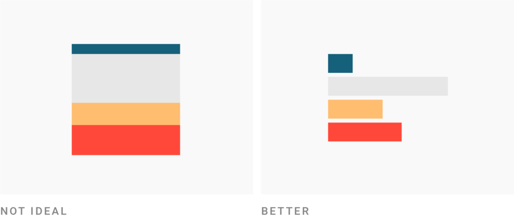
Stacked column charts are great to show the parts of multiple totals. If you only want to show parts of one total, consider a bar chart instead. It will use your available space better than a stacked column chart. In addition, readers will be able to compare the parts better with each other. If you only want to communicate one share of one total, consider if your chart is still necessary at all, or if your number should rather be communicated with text.
Stacked column charts work well for only a few totals. If you have more than approximately 10 categories (and not so many parts for each total anyway), consider a stacked bar chart, dot plots, tables, or other chart types that display data in rows. On a screen, the width of your charts is always limited by the device your reader uses, but the height is not.

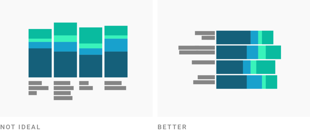
Stacked column charts work well when totals have short labels. Long labels won’t fit well below the columns of a stacked column chart, especially if you have many of them. Consider a stacked bar chart instead. (However, the labels for the parts of each total are displayed better in a stacked column chart than in a stacked bar chart.)
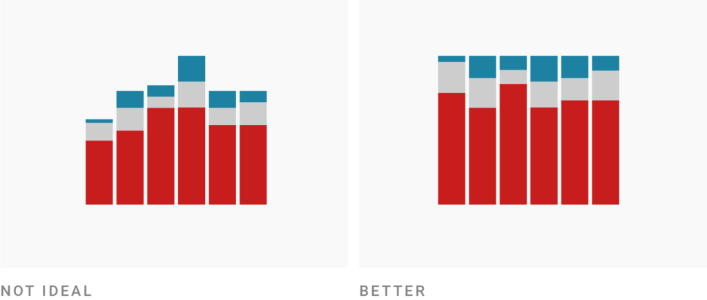
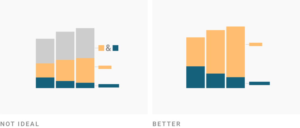
Bring the most important value to the bottom of the chart and use color to make it stand out. Your readers can compare values easier with each other if they have the same baseline.
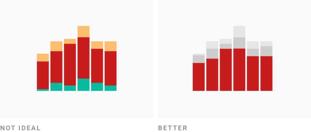
Consider stacking percentages (so that every total will sum up to 100%). This can be useful if the relative size of your parts is more important than their absolute size, and if your totals are not of interest to the reader. You will gain a second baseline at the top of your chart where you can place the second most important category in your data.
Make sure that you include all parts of the total in your charts – and only parts of the total. Don’t include the total in your chart.
Consider grouping tiny parts together into one bigger part (e.g. “others”) to clean up the overall look of the chart. You will lead your reader’s eye to the important parts of your chart. In addition, you will need fewer labels, which will help your readers to navigate themselves faster on the chart.

This chart demonstrates that stacked column charts can work well for dates. It also shows how the missing height limitation can be used to include many different parts. The direct labeling of these many parts would not be possible with a stacked bar chart. In addition, we can see how the two baselines at top and bottom were used to place the two most important parts; and how certain parts are grouped (e.g. “pie/donut/election” instead of having one part for all of them).
This stacked column chart includes a visual metaphor: The orange/red part is breaking the other columns apart over the years; growing increasingly.
To play around with this chart, hover over it and click on “Edit this chart” in its top right corner.
Most articles don’t make a difference between stacked column charts and stacked bar charts, so I’ll mention them here even if they just talk about stacked bar charts.


Comments