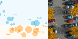
Can you raise an Olympic snowboarder in the tropics?
Hi, Rose here. My job is to write for the Datawrapper blog. But some people's job is to throw a javelin, and other people's job is to row a boat! Watching those people compete at the Olympics this week has gotten me thinking about how we all got to this point...
By the time a medalist stands on the Olympic podium, they've trained for years to reach the limits of human capacity — capacity to do one extremely specific thing. To get there, you need a few factors. You need unbelievably hard work. You need incredible mental determination. You need rare natural gifts. But you also need to find your thing. And unless you're born into some kind of athletic dynasty, finding a sport you excel at and like takes a certain kind of luck. The kind of luck where, at just the right time in your life, just the right person says to you, "Hey, have you ever heard of synchronized diving?" Or, "I think you'd be amazing at the canoe slalom." Or, "Come on, try out for curling!"
This week, I got to wondering how important this kind of luck is in the making of an Olympic athlete. Are we missing out on the next great skateboarder because no one ever handed them a skateboard? That one might be impossible to figure out, but there are some life circumstances we can measure — the weather, for example. Are we missing out on the next great snowboarder because it never snows where they live?
To investigate, I decided to compare the average home climates of Olympic athletes in winter and summer sports. The chart below shows every medalist from every modern Olympics, 1896–2014, plotted according to their country's average temperature in winter and in summer.1 Be warned that over 27,000 people have gone home with a medal over the years, so the chart and its tooltips may take a minute to load!
As usual, there are a few caveats you should take into account when looking at this data. First, seasons and temperatures can vary widely within a country, so nationwide averages don't match everyone's personal reality. Alaskans actually live in a much colder climate than they're getting credit for in this chart. Second, these national averages are based on land area and don't even reflect the general population distribution. For example, most Canadians live clustered in parts of the country that are warmer than this chart reflects. And finally, athletes are plotted here according to the country whose team they competed for, which isn't necessarily their own country of birth or residence.
But still, the trend is clear! Compared with the other group, winter athletes come from colder winters (-8.5° versus -1.5°) and summer athletes come from hotter summers (19.5° versus 16.8°). In fact, no country warmer than Australia has ever produced a winter medalist at all — including powerhouses like Brazil with 334 medalists in the summer events. On a broad level like this one, athletes' home climates clearly have a role in steering them towards their particular discipline. After all, you can't snowboard without snow.
Tips for creating this chart
These temperature averages were calculated at the country level — so if I had plotted them as-is, every athlete from the same country would have been right on top of each other. I needed to add some jitter, and I wanted to use that jitter to represent another interesting variable: the total number of medalists produced by each country.
I wrote a little function in R that jitters points to a uniform distribution within some ellipse. In this chart, the radii of the ellipses are proportionate to the square root of the number of medalists for each country. This means that the area of each ellipse is proportionate to the actual number of medalists.
Do you play any unusual sports? Or enjoy going swimming in the dead of winter? Leave a comment below or write me at rose@datawrapper.de. And get excited for next week and the first-ever Weekly Chart from our support engineer Margaux!


