

French people are losing confidence in the Paris Olympics
March 28th, 2024
3 min
This article is brought to you by Datawrapper, a data visualization tool for creating charts, maps, and tables. Learn more.
Building a better weather app
Hi, this is Gregor, CTO at Datawrapper, with a new Weekly Chart about weather forecasts!
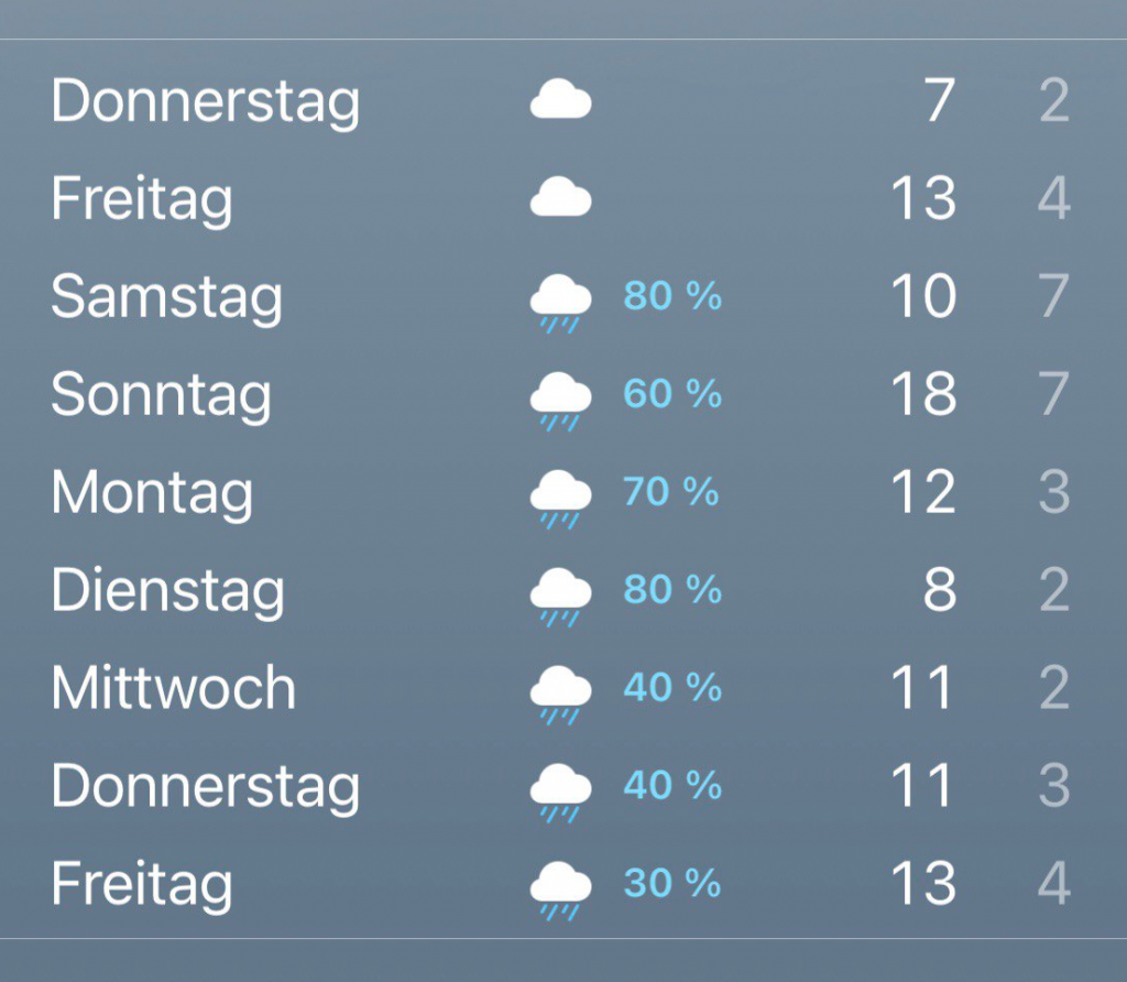
We’ve all been there: you check the weather app on your phone for the upcoming weekend and see nothing but clouds and rain probabilities. And it makes you sad; you cancel barbecue events and prepare for long hours of Netflix watching. And then the weekend comes — and the sun is out!
For a long time, I resorted to blaming the weather forecast for these situations. I thought they were just too bad to predict the actual weather. But it turns out it might be a data visualization problem after all! Here’s how most weather apps look, more or less (apologies for the German screenshot):
For a side project I’m currently working on, I had to dig into weather forecast data a little bit. And while doing so, I discovered a fantastic dataset by the German weather agency DWD called MOSMIX, which provides forecasts for thousands of weather stations worldwide.
Unfortunately, the data comes in a rather weird KML format that I didn’t want to parse myself, so I looked around and found this handy R package RMosmix, maintained by Austrian scientist Reto Stauffer. Being an R library, of course it comes with a default plot perfect for the data:

And what a beauty it is! There’s a lot going on in this information-rich plot, but for now, I just want you to focus your attention on the second row, which shows cloud cover (the gray area chart) and sun duration (the yellow bars). The row below shows rain as blue bars. And as you see, sun and rain are not mutually exclusive. There are days where it rains in the morning, and then the sun comes out in the afternoon. It’s no easy task to condense days like these into a single icon. And by doing so, weather apps tend to paint us a more dim and cloudy outlook for days that might end up being half sunny, thereby depressing us more than they need to!
That’s why for this Weekly Chart, I had the idea to try out a different, more optimistic version of a weather forecast app. Instead of a single weather icon, I want to use two columns, one for the sunshine duration and the other for rain! Who cares about a little bit of rain when there are six hours of sunshine during the day?
I started by making a quick sketch to try out the concept and decided it was worth a shot.
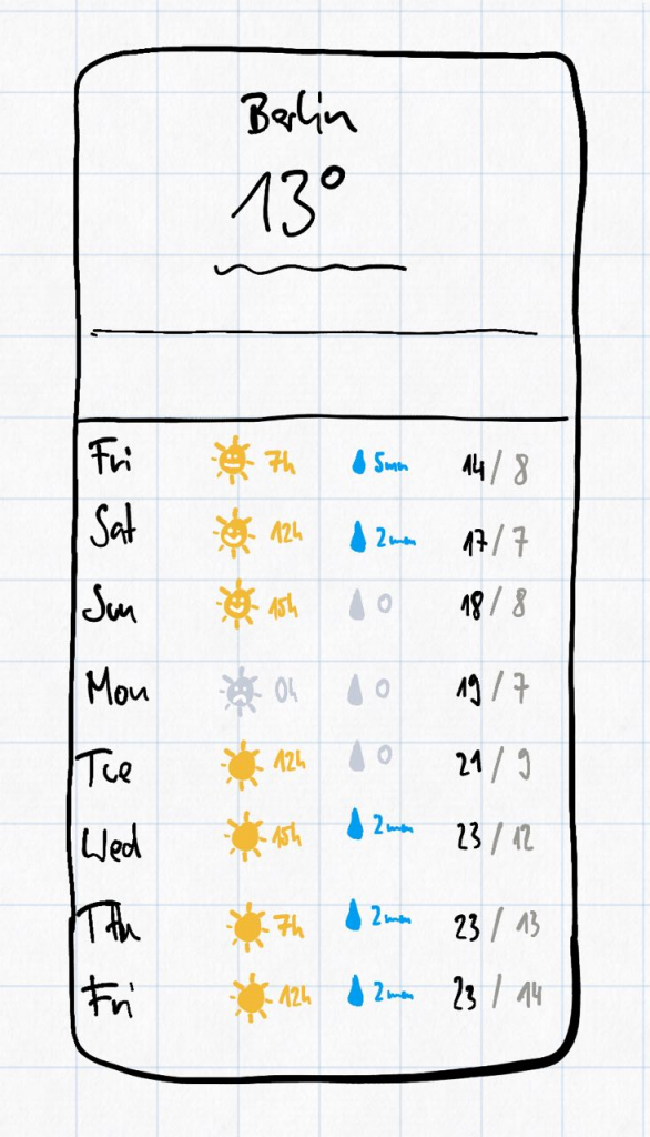
To get the actual data set up, I wrote a short R script using the before-mentioned R package, which pulls the forecast for a given station and aggregates estimated sunshine hours, precipitation amount, and minimum and maximum temperatures for each day. Of course, I used our table visualization to show the data.
So, without further ado, here’s my weather forecast table in Datawrapper:
I haven't yet set up the infrastructure to automatically update the data, but I'll let you know in a comment below once I get around to doing it. It would be nice to repeat this for all 5400 stations included in the MOSMIX data, but unfortunately, for most cities outside Europe, there is no data available for sunshine duration (which might be why the weather app isn't using it).
Let me know if you have other ideas or comments below. I want to end this blog post with a German aphorism fitting the topic :)
Mach es wie die Sonnenuhr:
Do like a sundial and only count the sunny hours
zähl die heitren Stunden nur!
That's it for this week! Next week my recently-hired colleague Rose will debut her first Weekly Chart in this spot.


Comments