
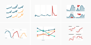
What to consider when creating small multiple line charts
February 7th, 2024
8 min
This article is brought to you by Datawrapper, a data visualization tool for creating charts, maps, and tables. Learn more.
Dos & don’ts of table design
Last week, we released our new table tool: You can now create tables with sparklines, bar charts, images, links, merged cells and fixed rows in Datawrapper. And all of that responsive and in your brand style. To help you use tables, I wrote the following guide – but we hope that it will prove helpful whether you use Datawrapper or not.
Data is strictly speaking not visualized in tables. Nevertheless, tables are often either found close to data visualizations, are used instead of them, or are created by the same people. Here we will explore when to use a table instead of a chart and how to improve table designs. We will do so for tables in a storytelling context. Scroll to the end of the article if you’re interested in designing tables for pure exploration.
Use tables if you want to enable readers to look up specific information. Readers will be able to find the data that applies to them – their location, age, income range, etc. – often faster in a table than in a text or a chart. In fact, most people won’t read a whole table (especially if it’s made out of more than 3 rows) and instead only look at the data they’re interested in. This data might not just be numbers, but structured text data like names, teams, states. If this data is currently embedded within a block of text, consider using tables in the future.
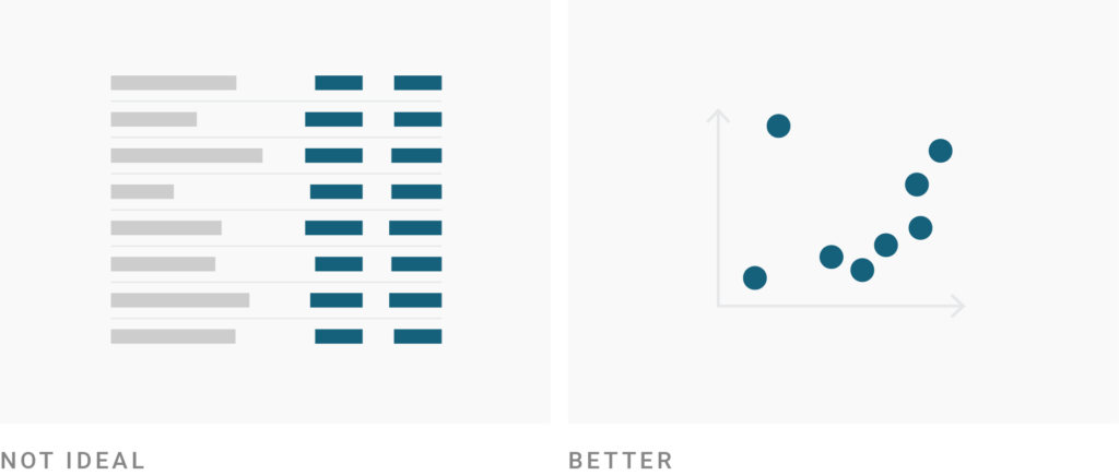
Use charts instead of tables if you want to give an overview of your numerical data or show a pattern. Tables are read in a sequential way: first the first row, then the second row, etc. If the table is long, readers might give up before they get to the most important values. Charts, however, show an overall picture. It’s hard to not notice outliers, the biggest value or the smallest value. They are easier to spot in a chart and more likely to be remembered.
Use tables if precise numbers are important. That’s often the case when readers don’t just want to get informed but want to act on your data. A table then becomes a decision tool – to find the best interest rate, the best price, the best job, the best business strategy. Precise numbers matter for such decisions, so consider showing them to the reader.
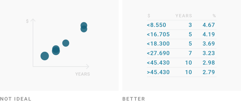
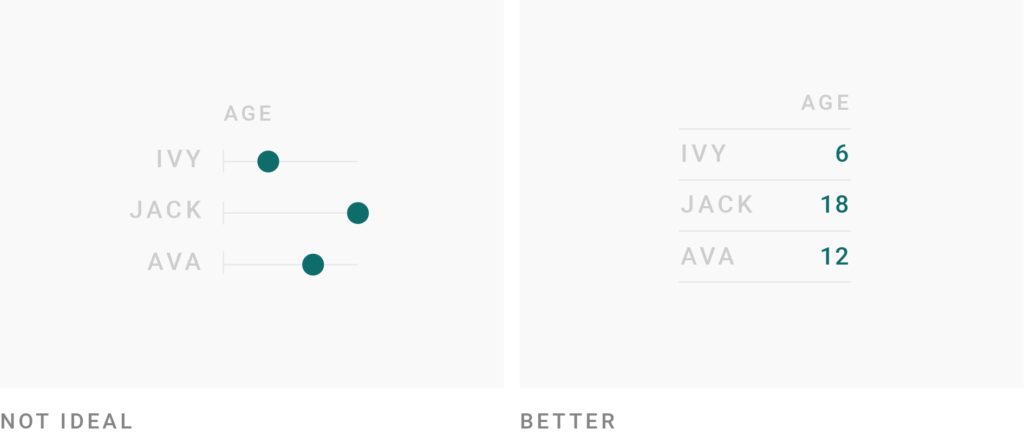
Tables are great for data we’re used to reading. Consider showing data in a table instead of visualizing it every time your reader might have a strong idea about the data. It’s strange to see age visualized, for example. Most of us wouldn’t think “oh, that’s three times as old” when they learn that one person is 6 and the other is 18 years old. We have different (and rather strong) associations with these ages. Another example for data many of us prefer to read with actual numbers instead of visual elements is drink sizes, like 0.33l, 0.25l, 0.5l.
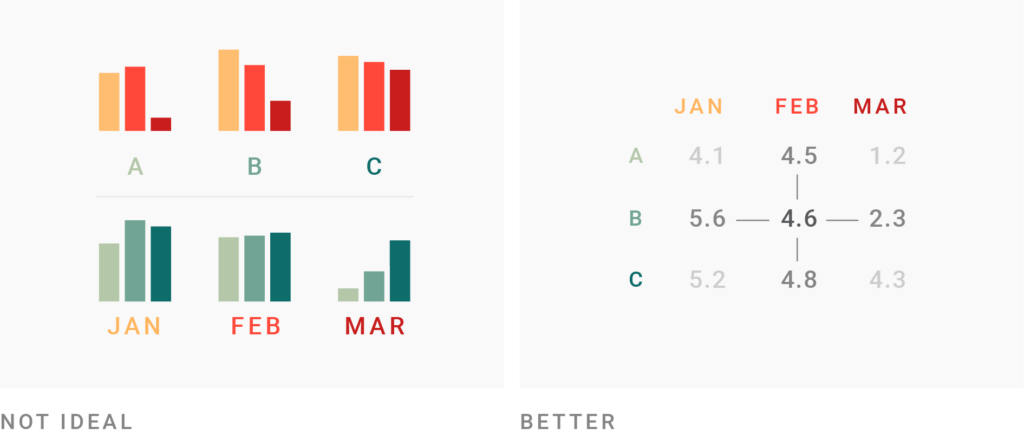
Tables work better than charts if your readers should compare data in two directions. In most chart types, we need to decide in which direction readers should be able to compare: For example, is comparing all regions in one month more important than comparing all months for one region? In a table, you offer both. However, consider that readers will need to do some maths in their heads to compare values and will likely miss interesting trends and outliers.
Tables are great for showing ranks. Ranks are special numbers: 1 doesn’t mean half as good as 2, but “somehow better”. Visualizing ranks might support that false reading. Every time you want to show ranks, tables will likely be the top choice.

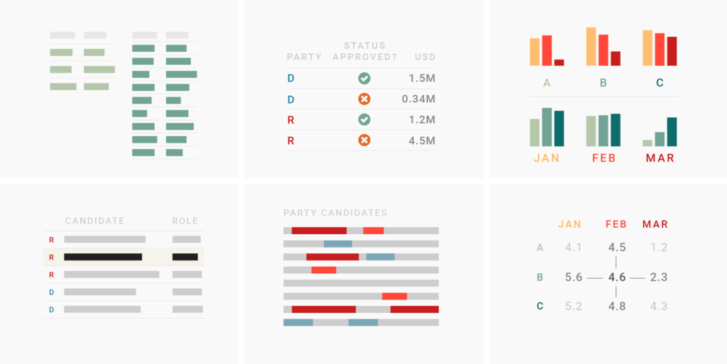
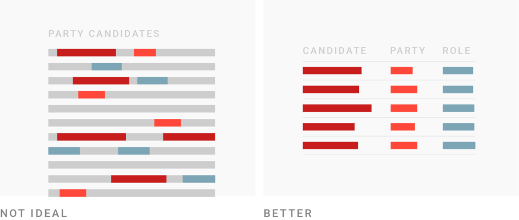
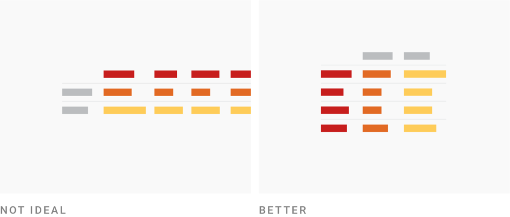
Consider narrowing (down) your columns. It’s tempting to include all the data you have in your table. But keep in mind that the fewer columns your table has, the more readable it becomes (especially on mobile phones). Ask yourself: What’s the essential information? Consider displaying columns on desktop screens but not on mobile. Also, consider ways to narrow your columns: Use icons and abbreviations, bring repeating words in the column header and use a shorter number format or rounded numbers (like 1.3m instead of 1.300.000 and 0.1 instead of 0.1129302. )
Consider structuring your data so that your table has more rows than columns. Another possible way to reduce the number of columns is to swap rows and columns. Humans find it easier skimming through the information that’s vertically aligned, not horizontally; especially if the data is sorted (think of dictionaries). So data in columns is great for skimming.
Consider grey stripes for long tables with many columns. If you can’t avoid many columns, stripe every second row with a light grey (also called “zebra shading”). This will reduce the risk of readers accidentally jumping between rows while trying to read a value in the first and the fifth columns of the same row. However, consider that zebra shading is likely unnecessary or even confusing when your table shows data in only a few columns.

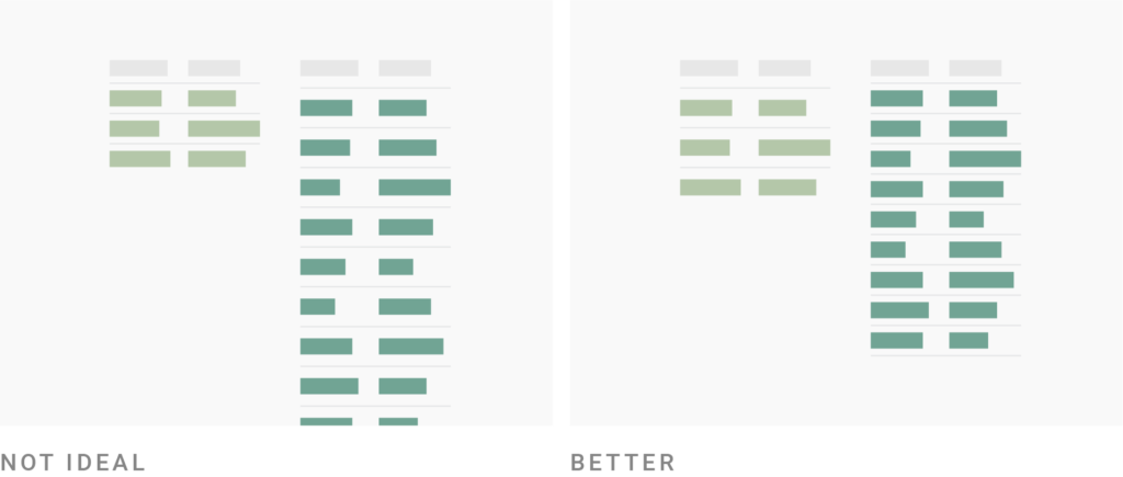
Consider adjusting the row height to the number of rows. If you show only a few rows, a wide layout is more pleasant to the eye. If your table has a lot of rows, consider a compact layout that shows more data in the same available space. Readers will have an easier time comparing values across rows, and it’s more likely that the whole table fits on one screen/page.
Consider pagination for long tables. A good rule of thumb is that the table should be shorter than a desktop screen if you don’t want readers to miss the fact that your article continues below it. Turn on the pagination feature of a long table to make readers aware that they haven’t reached the end of the article yet.

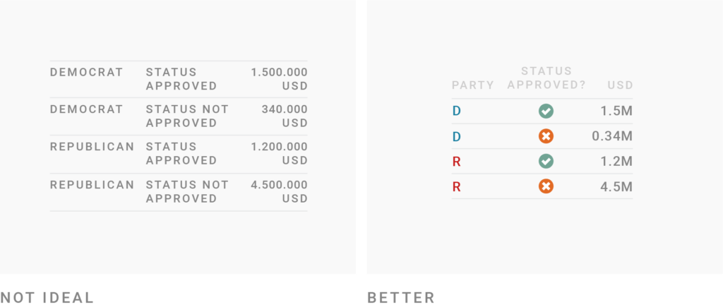
Use colors to lead the reader’s eye to interesting information & help them navigate the table. Color is a powerful tool to make more important information stand out: Use it to highlight columns or rows that readers shouldn’t miss. Also consider using different colors for different categories (like parties) to help the reader navigate your table; or consider coloring the highest and lowest values in a column. The less space colors fill in, the brighter & more different they should be to be distinguishable. So when coloring text, consider bright colors like this, this or this. But when coloring whole cells, rows or columns, choose pastel background colors like ████ or ████.

If your table contains information which is more relevant to some readers, but less relevant to others, consider making your table searchable & sortable. Maybe your table contains data about companies that your readers work at, locations they live in or the products they use. If that’s the case, readers will want to look for their “own” data first. Make it as easy as possible for them. A solution that will take away only a bit of space is a search field. Enabling readers to sort columns is another way to let readers decide how to best use your table.

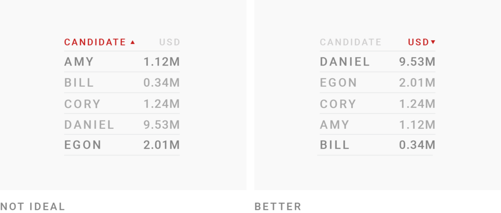
Put some consideration into how your table is sorted. It’s tempting to just sort the first column alphabetically. But often, that approach won’t bring the most interesting data to the top. In which row does the most important value hide? Consider showing this one first. It might also be helpful to sort data according to an “invisible” column, eg to show cities with the biggest population first, without showing the actual population. The longer your table, the more thought you should put into the order of your data; especially if your table data is paginated and therefore most of it is hidden. Enable custom sorting if you’re not sure – but consider that custom sorting can make some tables unreadable.
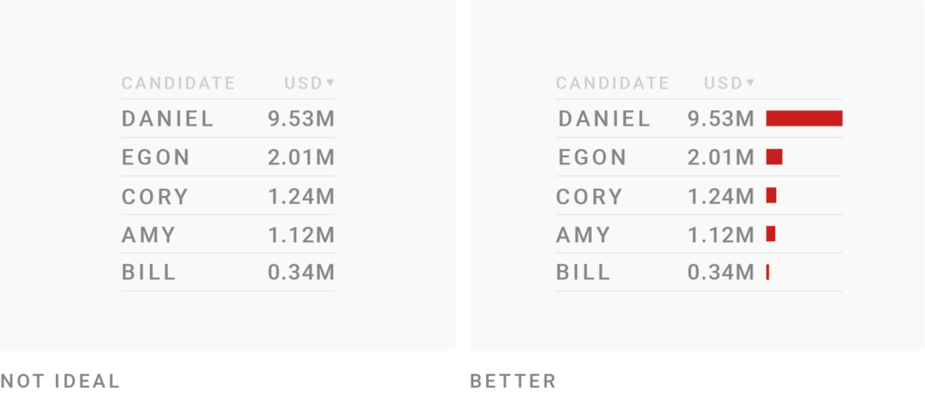
Consider visualizing your data with bar charts. Often, we can combine the best of both worlds – the readability & sortability of tables, and the quick overview of our data that charts offer. But showing your data as bars will often make your columns wider than a normal number column. So consider showing bars not for each of your number columns, but only the most important one(s).
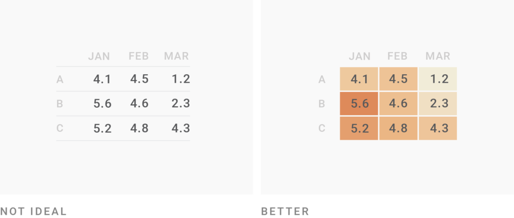
Consider visualizing your data with heatmaps. A space-efficient way to visualize your data are heatmaps: The higher a number, the darker/more saturated the cell background becomes. If you have more than one column with the same measurement, applying one color gradient to all columns is most intuitive. If you show different heatmaps in one table, use different color gradients to separate them clearly.
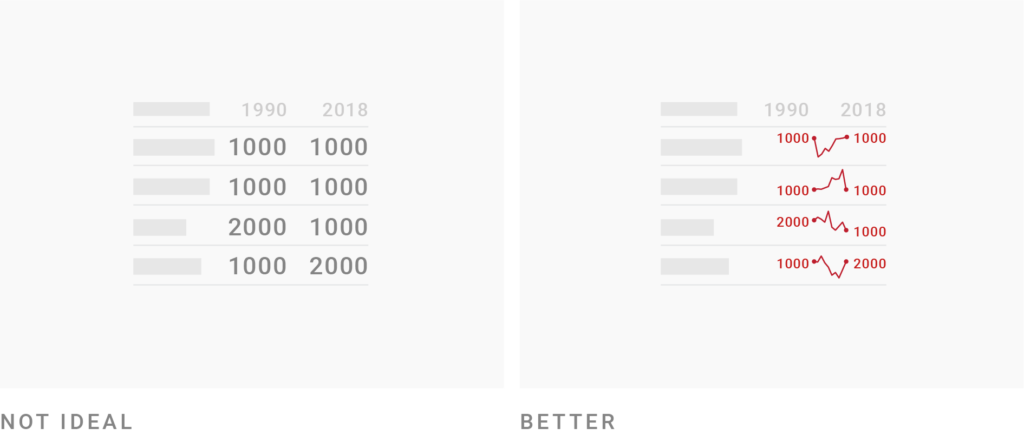
Consider showing development over time instead of just data from two or three time points. For example, instead of showing just two years, you can show how something developed in-between with mini line charts called “sparklines”. Because of the limited space, the y-axis range is different for each sparkline by default, so keep in mind that they only show a general trend but are not comparable with each other. If a consistent y-axis range is important for your data, consider a line chart instead.
FiveThirtyEight mastered the use of tables, so here are three of them:
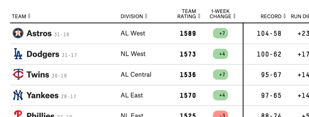
FiveThirtyEight: 2019 MLB Predictions Adding the team logos to the team names makes skimming the table easier. Also shows how different formatting (bold, background color, different font sizes) can make a table more interesting looking:
FiveThirtyEight: How unpopular is Donald Trump? Shows the use of heatmaps. There are two here; in different colors to distinguish them clearly:

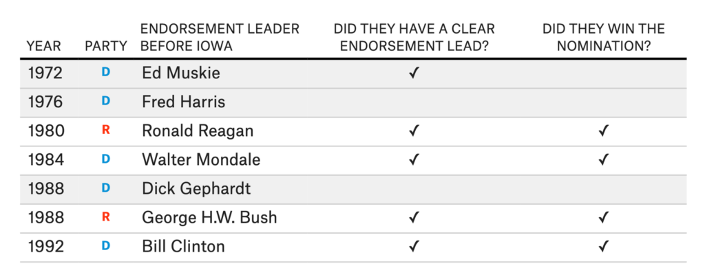
FiveThirtyEight: The endorsement leader usually wins A simple table that shows a lot of information in the table header. Note the color coding of the parties and the subtle grey background:
Comments