
What to consider when creating small multiple line charts
February 7th, 2024
8 min
This article is brought to you by Datawrapper, a data visualization tool for creating charts, maps, and tables. Learn more.

Text is maybe the most underrated element in any data visualization. There’s a lot of text in any chart or map — titles, descriptions, notes, sources, bylines, logos, annotations, labels, color keys, tooltips, axis labels — but often, it’s an afterthought in the design process. This article explains how to use text to make your visualizations easier to read and nicer to look at.
Show information where readers need it
01 Label directly
02 Repeat the units your data is measured in
03 Remind people what they’re looking at in tooltips
04 Move the axis ticks where they’re needed
05 Emphasize and explain with annotations
Design for readability
06 Use a font that’s easy to read
07 Lead the eye with font sizes, styles, and colors
08 Limit the number of font sizes in your visualization
09 Don’t center-align your text
10 Don’t make your readers turn their heads
11 Use a text outline
Phrase for readability
12 Use straightforward phrasings
13 Be conversational first and precise later
14 Choose a suitable number format
Let’s start:
Show information where readers need it. Place the words that explain your chart elements as close to those elements as possible.
Why? Imagine if every object in a museum were labeled only right next to the door. You would need to walk back and forth between the label and the exhibit over and over. And by the time you walked back to the exhibit, you would probably have forgotten most of the explanation.
The readers of your data visualization won’t need to move their feet, but they’ll need to move their eyes back and forth between your description and your axis labels, or between your color key and your lines. Don’t make your readers eye-travel that much. Always try to make it as convenient as possible for your readers to understand your visualization.
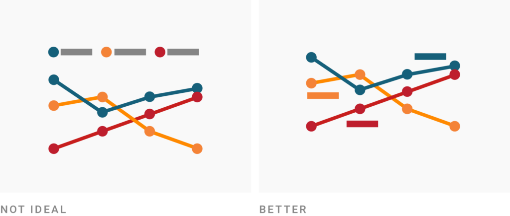
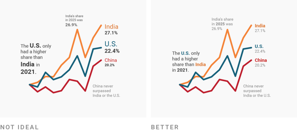
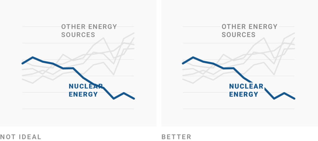
One big part of doing so is to remove the color key and directly label your categories. In Datawrapper, that happens by default for line charts, pie charts, and donut charts on desktop devices. On mobile devices, the space is tighter, so the color key will be shown at the top. You can also use annotations to add direct labels by hand.
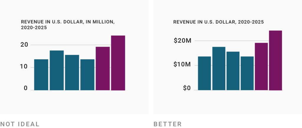
The goal of placing explanations as close to the data elements as possible also applies in smaller details. Make it obvious which units your data uses. Don’t just put units in the description, but also in axis labels, tooltips, and annotations.
Also, there’s no need to use multipliers (“in millions,” “in thousands”) in the description. While this is better than placing a long 20,000,000 next to the axis, it’s not necessary to let readers do the math. Instead, consider using number formats like 20b, 20m, or 20k. I’ll talk about them more below.
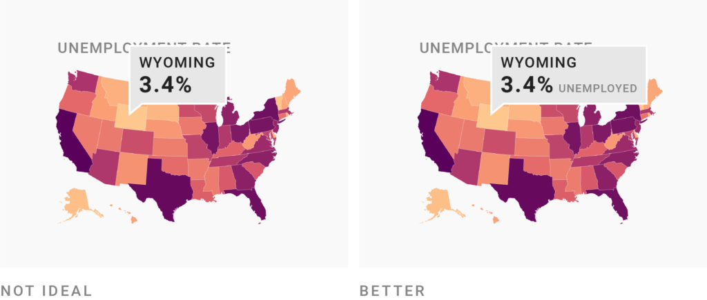
Not just axis labels should repeat what your visualization shows — tooltips should, too.
Tooltips that show up when readers hover over an element are great to inform them about the exact underlying value(s) of each data point in your visualization. But consider not just stating the numbers in tooltips, but also the category (like “3.4% unemployed” instead of “3.4%,” or “+16% revenue” instead of “+16%”). This way, you can teach and remind people of what your chart or map actually shows. To learn how to edit tooltips in Datawrapper, visit this article.

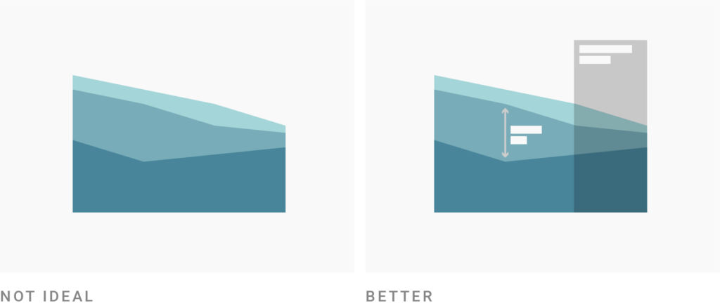
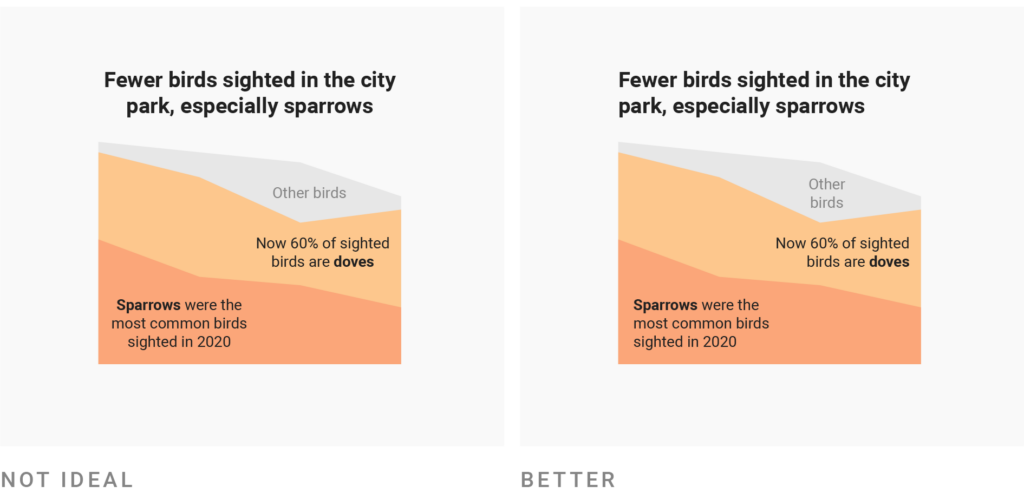
Another small trick for showing the information where it’s needed is to move your axis labels to the other side of the chart (from the left to the right or even from the bottom to the top). If those regions of the chart are filled with more or more important data elements, this makes it easier to roughly calculate their height or width.
For example, in the right-hand chart above, it’s a bit quicker to see that the last orange bar is a bit over 40 units tall.
Ok, enough with the small tricks. Here’s a big one: Use annotations. Annotations are an extremely powerful tool in your visualizations. If you’re creating an explanatory chart or map, it will likely be better with annotations in it.
Thanks to these pointers and explanations, readers will get more out of your chart. But I’ve also found that annotations make charts and maps more visually appealing. As a reader, I get intrigued by little notes that promise something interesting. Your readers might too.
Use font families, font styles, font sizes, and text colors that make it as easy as possible to read your most important text. To figure out what’s easiest to read, ask yourself: What are readers used to? On the web (e.g., in this very article), that’s sans-serif, regular, sentence case, neither overly narrow nor wide, >12px, (almost) black text. This is the text that people feel most comfortable reading.
You can learn more about how to achieve this in our article “Which fonts to use for your charts and tables.”
Sometimes you might feel the need to use very narrow text or to reduce the size of (some of) your text because otherwise it “won’t fit” — but there is almost always another solution. For example, you can just not show the small text and use tooltips instead:
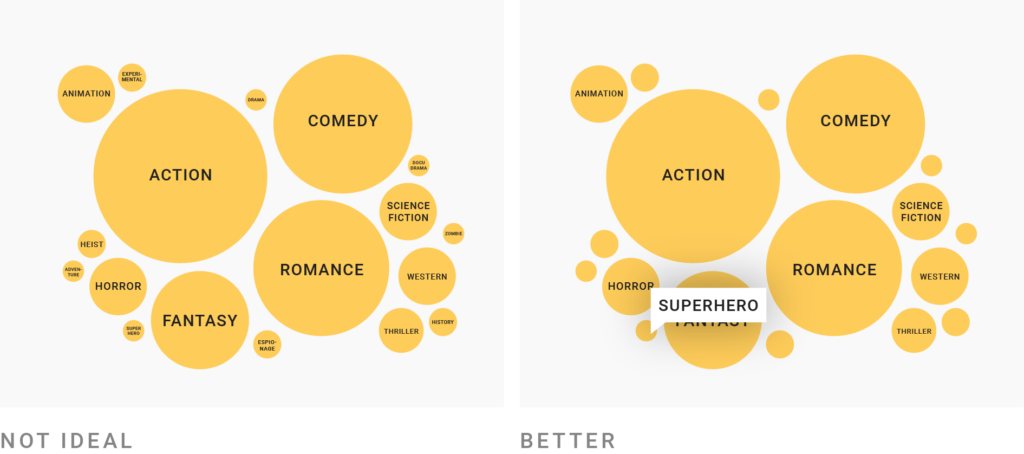
This New York Times graphic does exactly that. Compare it with this bubble chart. Which one looks more appealing to read?
Other tricks are to increase the size of your whole visualization when possible or to shorten sentences (see below). On mobile screens you can also hide the least important annotations, or move them below the visualization. Both are possible in Datawrapper.
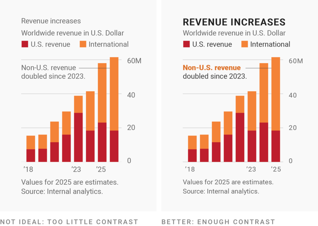
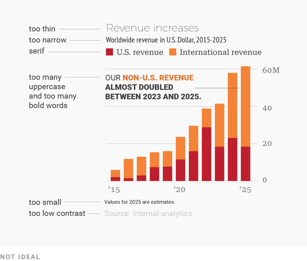
Design is all about deciding what readers should see first, second, third, and last. The biggest and boldest text with the highest contrast against the background should be reserved for the most important information. That text will be read first. Often, that’s the title of your visualization. Small, thin, and gray text should be reserved for less important information, like the description or source.
It can help to first make all the text in your visualization small, thin, and gray. Then ask yourself: “What is really important? What text should readers not miss under any circumstances?” Emphasize this text with bigger text sizes, wider strokes (bold instead of regular or thin), and/or higher-contrast colors, and keep the rest de-emphasized.
While leading the reader’s eye with font sizes, widths, and colors might feel like a new superpower, don’t overdo it. Lots of different font sizes in particular can quickly look messy. For annotations and labels, try to use only two levels of hierarchy that are clearly different from each other — like a 12px gray and a 14px black. Then emphasize within the annotations using boldness.
Left- or right-aligned text looks tidier than center-aligned text. That’s because all lines start (or end) at the same x-position. This allows the text box to have a clear edge that can run parallel to other chart elements.
In the center-aligned version above, there are little messy gaps left of the words “Fewer” and “park.” In the left-aligned version, the title aligns neatly with the chart.
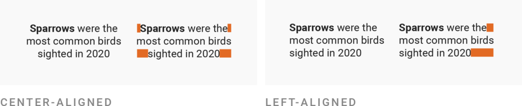
Both center- and right-aligned annotations are also harder to read, so don’t use them for lengthy text (everything above roughly 10 words). Readers will need a split second longer to find the beginning of the next line than when reading left-aligned text.
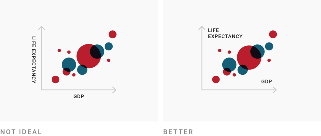
Instead of rotating axis labels, find another place inside your chart for them. In Datawrapper charts, axis labels are never rotated except in column charts with many columns and long category names.
Often, axis labels can be concisely rephrased — your data set might use more official-sounding labels than needed. Don’t use too-crazy insider acronyms, though. Make sure your chart is still readable for its entire target audience.

If your labels are still too long, consider using another chart type (like a bar chart instead of a column chart).
If your text sits on other elements — even just a subtle gridline — consider using a text outline. That’s a stroke around your letters, most often in the background color of your chart. Your text will be easier to read and nicer to look at. In Datawrapper, you can set outlines for text annotations, map labels, and locator map markers.
Every time you phrase something, be it a title, description, or annotation, ask yourself: What’s the easiest way to say this? Don’t just copy and paste the official description of the data set you’re visualizing. You can probably do better.
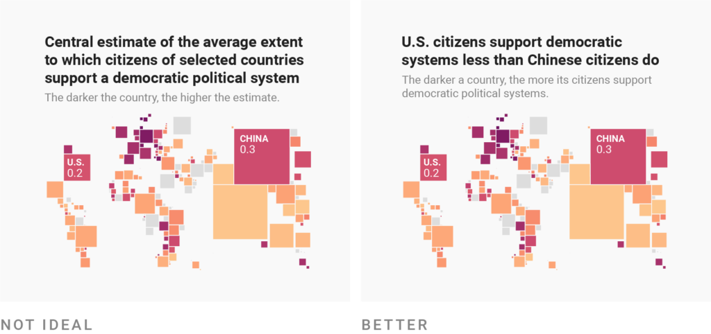
A trick to get to a good description is to imagine describing your visualization to a friend. You probably wouldn’t say “It shows a variable that denotes the central estimate of the average extent to which citizens of selected countries support a democratic political system.” Instead, you’d explain: “The darker a country is on this map, the more its citizens support democratic political systems.” (You can see the map here.)
Maybe you’d continue: “Look, that’s interesting: U.S. citizens support democratic systems less than Chinese citizens do.” If that’s what you want your friend (and your whole audience) to see, consider using it for your title or at least for an annotation.
Good phrasing takes time, but it’s time well spent. Take the 20 minutes to come up with easier-to-understand wording and you’ll help hundreds of people be less confused.
For the text that people will read first, use colloquial wording. “Is higher than ever” can be a stronger choice in a title than “peaks.” “More x than y” might be better than “x surpassed y.” And if you’re visualizing for a mainstream audience, don’t use words like “median” or “standard deviation” in your title.
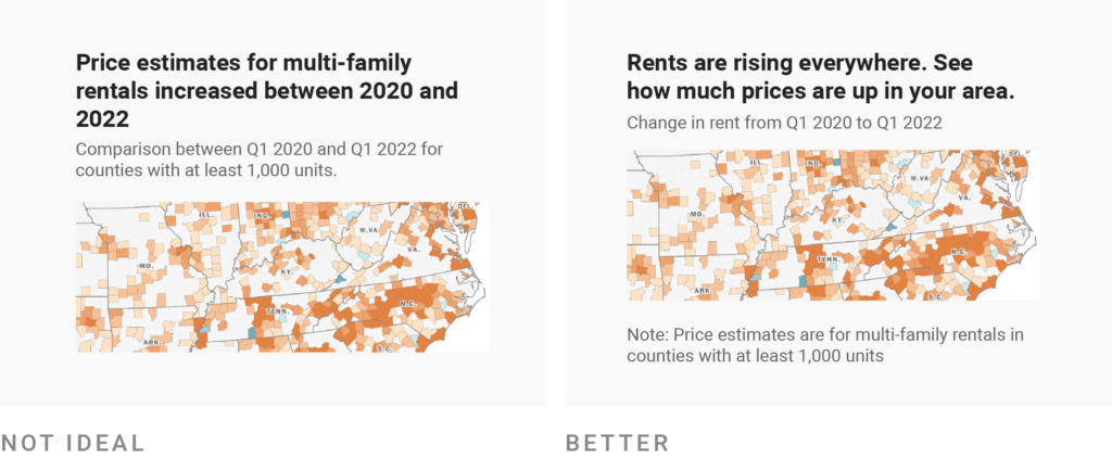
You can still state precisely what you’re showing — just move that precision to a less prominent text element, like the description or notes. The example above is taken from the 2022 Washington Post story “Rents are rising everywhere.” Instead of explaining all the details upfront, it places the information “Change in rent from Q1 2020 to Q1 2022” in the description. And only in small, gray text below the map do readers find out that “Price estimates are for multi-family rentals in counties with at least 1,000 units.”
Why does the Washington Post do that? Because precise wording can distract from the actual message. In their story, the main statement is that “rent prices are up.” More people will be able to remember that statement than that “price estimates for multi-family rentals in counties with at least 1,000 units increased between Q1 2020 and Q1 2022.” So be like the Washington Post: Give the main statement first and the precise data explanation later.
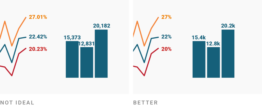
What’s true for your title and description is also true for numbers: Don’t add unnecessary precision when showing numbers. Very few readers will remember a number with lots of decimal places (22.42%) or thousands places (12,831) anyway. Quite the opposite: They might make your visualization overly complicated at first sight and hence unattractive to get into.
Besides formats that abbreviate your high numbers from 12,831 to 12.8k (or 12,831,283 to 12.8m), Datawrapper also offers number formats that remove a trailing zero. If you choose the format 0.[0]% in Datawrapper, it will turn 27.0 into a nicely readable 27%, while keeping the decimal place of 22.4%. You can learn more in our article “Number formats you can display in Datawrapper.”
If you think that readers might be interested in more specific numbers, you can still place them in tooltips, let readers download the data with a link, or mention the exact values in the surrounding article or annotations.
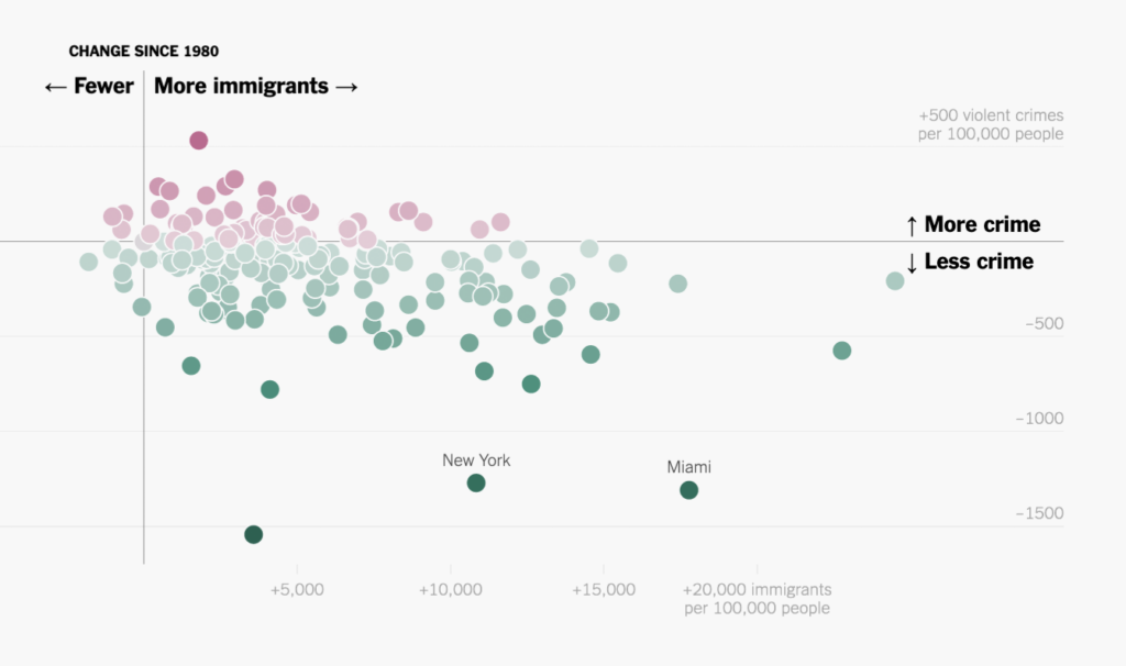
New York Times, 2018: The Myth of the Criminal Immigrant. Simple phrasing (“More/Less crime”) gets prioritized over exact phrasing (“+500 violent crimes per 100,000 people”) using bigger, bolder, higher-contrast text:
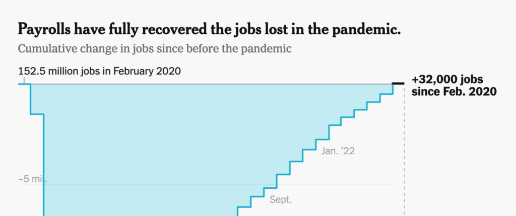
New York Times, 2022: U.S. Job Growth Unexpectedly Soared in July. Good example of direct labeling (“Jan. ’22,” “Sept.”) and repeating what people see (“152.5 million jobs in February 2020” instead of “152.5 million,” and “+32,000 jobs since Feb. 2020” instead of “+32,000”):
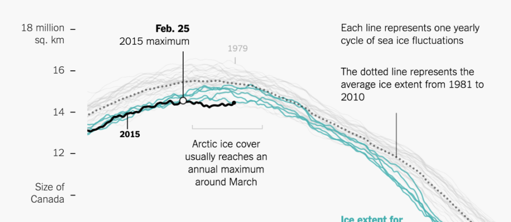
New York Times, 2015: Arctic Ice Reaches a Low Winter Maximum. Note the use of annotations to add extra information (“Size of Canada,” “Arctic ice cover usually reaches…”), explain chart elements (“The dotted line represents…”), and point to outliers (“Feb. 25: 2015 maximum”):
Comments