New: Small multiple column charts in Datawrapper
February 18th, 2025
6 min
Datawrapper lets you show your data as beautiful charts, maps or tables with a few clicks. Find out more about all the available visualization types.
Our mission is to help everyone communicate with data - from newsrooms to global enterprises, non-profits or public service.
We want to enable everyone to create beautiful charts, maps, and tables. New to data visualization? Or do you have specific questions about us? You'll find all the answers here.
Data vis best practices, news, and examples
250+ articles that explain how to use Datawrapper
Answers to common questions
An exchange place for Datawrapper visualizations
Attend and watch how to use Datawrapper best
Learn about available positions on our team
Our latest small and big improvements
Build your integration with Datawrapper's API
Get in touch with us – we're happy to help
This article is brought to you by Datawrapper, a data visualization tool for creating charts, maps, and tables. Learn more.

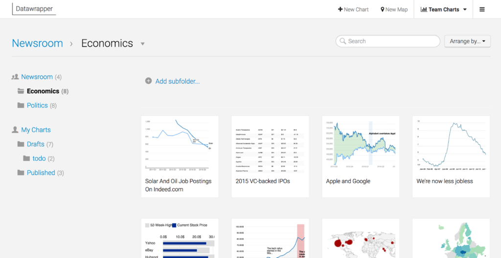
Creating charts is one challenge; organizing them is another one. Especially if you work as part of a team or create multiple charts per week, you need a good overview of your ever-extending chart portfolio. We want you to have this good overview. Starting today, all your private charts and all the charts from your team share one home, in which you can use folders to organize them.
You can find this new overview when you click the button “Team Charts”/ “My Charts” in the upper-right (which button you can see depends on if you’re part of a team). If you’re already logged in, here’s a direct link.
There are four changes, which come with four benefits for you:
If you’re part of a team[2], you had two buttons in the Datawrapper menu at the top so far: “My Charts” and a button with the name of your team. You always had to switch back and forth to see charts made by you and your organization. With today’s change, both buttons get replaced by a “Team Charts” button. If you click on it, you’ll find all the charts that you and your team made; resulting in a better overview of all charts in one place.

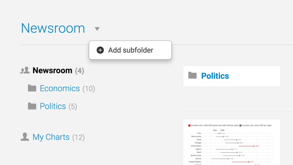
So far, you could filter your charts based on our categorizations, like chart type or date (and you can still do that). But maybe you have needs that go beyond that. Maybe you’re a bilingual newspaper and want to sort your charts in “French Charts” and “English Charts”. Maybe you want your charts sorted by department. Or by newspaper, if you’re part of a big newsgroup that owns several ones. Or you need your charts organized according to your processes: “In Review”, “Social Media worthy” etc. With the new folder function, you can create and name folders as you want (and rename and remove them, if you don’t want them anymore). They make individual systems possible.

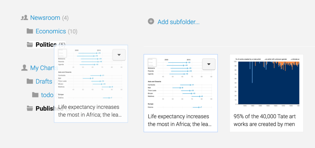
Here’s a big change for you if you’ve been using Datawrapper as part of a team: A private folder. If you create a new chart, it will still appear in the team folder by default. But starting today, you can move it into a private folder named “My Charts” only you can access (you’ll find this folder below your team folder). That means that you can drag any charts (e.g. your drafts) to your private folder, work on them, and move them back to the team folder once you’re happy with it. More privacy for you, less clutter in the team folder: Win-Win.

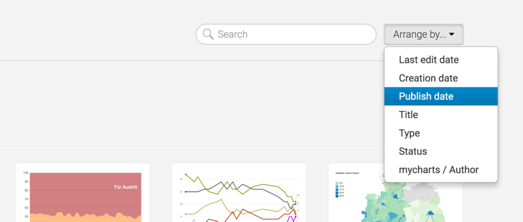
In the old charts view, you could filter your charts based on status (“Published”, “Draft”), date and chart type. We kept these options. But we understood that “date” is a flexible concept: Maybe you created your last chart half a year ago, edited it five weeks ago and published it yesterday. So now you can sort by creation date, edit date and publish date separately. We also added two new arrange options: You can sort your charts alphabetically (by chart title). And by author – so that you find your charts quickly even if you’re in a packed team folder.

We hope that the new “My Team”/ “My Charts” site lets you organize and find your chart faster and more adept to your workflow. If you have any questions or comments about this new feature, please don’t hesitate to ask us: support@datawrapper.de
We’re always happy to hear from you.
Comments