Join our webinars: Getting started with Datawrapper, and a Maps Deep Dive
June 20th, 2023
3 min
Datawrapper lets you show your data as beautiful charts, maps or tables with a few clicks. Find out more about all the available visualization types.
Our mission is to help everyone communicate with data - from newsrooms to global enterprises, non-profits or public service.
We want to enable everyone to create beautiful charts, maps, and tables. New to data visualization? Or do you have specific questions about us? You'll find all the answers here.
Data vis best practices, news, and examples
250+ articles that explain how to use Datawrapper
Answers to common questions
An exchange place for Datawrapper visualizations
Attend and watch how to use Datawrapper best
Learn about available positions on our team
Our latest small and big improvements
Build your integration with Datawrapper's API
Get in touch with us – we're happy to help

Hello, hallo, ahoj!
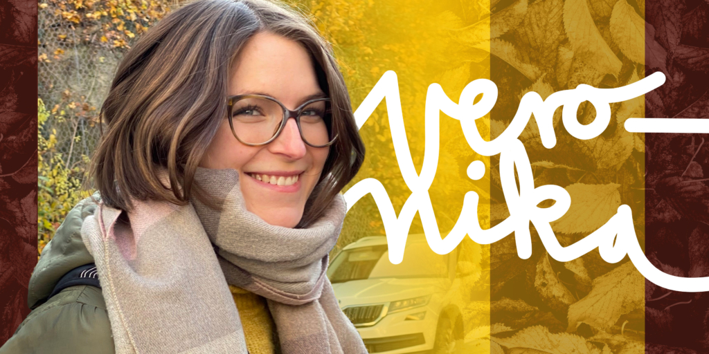
It’s a truly quirky honor to introduce myself to all of you — my name is Veronika (she/her) and I’m Datawrapper’s new data vis writer, filling this role. I’m joining Lisa and Rose in the Communication team in Berlin and I’ll be helping them write about all the exciting things that happen at Datawrapper, like this one!
According to the Communication team’s ancient tradition of self-led interviews (hear here from Lisa and Rose), I’m going to go ahead and ask myself a few fairly existential questions.
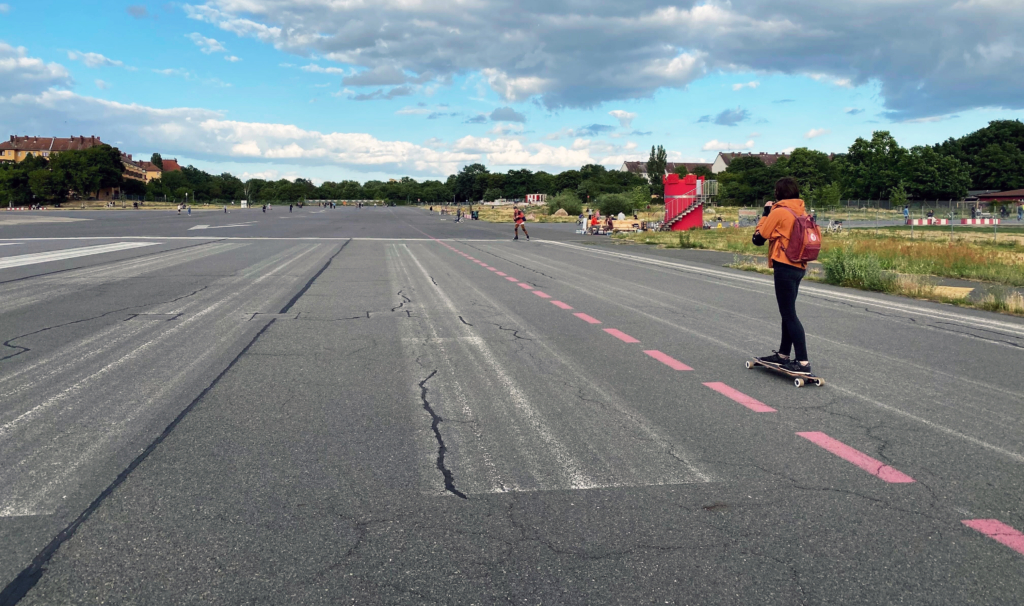
I’m Veronika. I like to write, read, obsess about details, paint, and (to my own recent surprise) sometimes even run. I’m Czech and although I like to visit my country often (Prague is only a scenic train ride away), I’ve lived in four different countries in the past five years. When I moved to Berlin last fall (I’m yet to run into Olafur Eliasson, my all-time favorite artist), I had no idea Datawrapper’s office was only a few blocks away.

I come to Datawrapper from the aptly named slow news newsroom Tortoise Media where I worked with data every day, helping build sustainability indices of some of the world’s largest companies (like this one or this one). There I learned the importance of details and the difficulties of trying to fit reality into a standardized spreadsheet or chart.
My journey up to here has been lined with writing and data, from my first internship to a short stint as a journalist in Sri Lanka to formally learning about data journalism in London (thanks to this cool program) to teaching what I learned the very next year at my alma mater in Prague.
Here’s a Datawraper chart I made two years ago when I taught a data journalism course at Charles University:
In the past years, I’ve become fascinated by the potential of data-driven storytelling: journalism born out of datasets, human anecdotes presented in the context of statistics, a neatly packaged bundle of information that can tell a story at a glance.
I was particularly inspired by Alan Smith, Head of Visual and Data Journalism at the Financial Times, who once gave a guest lecture at my uni. He talked about the FT’s readers becoming more interested and attuned to data visualization thanks to the team’s effort to educate their audience (via The Chart Doctor at the time, more recently for example in The Climate Graphic: Explained newsletter). That’s why I love Datawrapper’s mission to make chart-making and reading easier for everyone.
I expect to write. A lot. I’ll most likely collect great data visualizations for our Dispatches, help my coworkers with their Weekly Charts, weave together long blog posts, and chat with you on social media. I’m especially excited to hear and share stories from our customers, see what they’re up to and where Datawrapper comes in.
I look forward to learning more about good design principles and color theory — partly for work and partly to improve my watercolor paintings. (Selfish, I know.) I’d also like to explore my academic interest in the link between people’s exposure to charts and maps and their ability to understand them. (Nerdy, I know!) I hope that Datawrapper might give me some insights into both.
I’m looking forward to meeting you! If still curious, you can have a look at my website here, catch me on @v_halamkova or veronika@datawrapper.de 👋
Comments