The world could be your oyster, but it depends on your passport
October 10th, 2024
4 min
Datawrapper lets you show your data as beautiful charts, maps or tables with a few clicks. Find out more about all the available visualization types.
Our mission is to help everyone communicate with data - from newsrooms to global enterprises, non-profits or public service.
We want to enable everyone to create beautiful charts, maps, and tables. New to data visualization? Or do you have specific questions about us? You'll find all the answers here.
Data vis best practices, news, and examples
250+ articles that explain how to use Datawrapper
Answers to common questions
An exchange place for Datawrapper visualizations
Attend and watch how to use Datawrapper best
Learn about available positions on our team
Our latest small and big improvements
Build your integration with Datawrapper's API
Get in touch with us – we're happy to help
This article is brought to you by Datawrapper, a data visualization tool for creating charts, maps, and tables. Learn more.

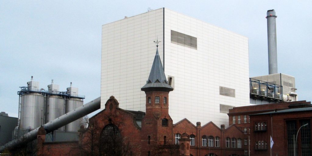
The coal-fired power plant near my place. It’s 120 years old. Photo by Dirk Ingo Franke, CC
Hi, this is Lisa – I wrote the Weekly Chart before my coworkers took over with their awesome articles. This week, I’m back to talk about power plants.
There’s a coal-fired power plant around the corner from where I live, here in Berlin. You can see it in the photo up there. Sometimes I can watch how a ship full of coal comes down the adjacent canal. It stops next to a big crane, which loads the black chunks onto a conveyor belt before they vanish into the building. Then I go home and turn on the light. And for a moment I’m puzzled by us humans and how we learned to turn black stuff into white light.
Energy! Taken for granted, but a fascinating topic. I learned so much about it yesterday and today. It all started with a tweet by Katharina Brunner. She’s an awesome German data journalist, so go ahead and follow her. I’ll wait here.
Back? Top-notch. Katharina tweeted the following map of German power plants that she created with a data source mentioned in the newsletter “Data is Plural” by BuzzFeed News’ Jeremy Singer-Vine:
While I hovered over the circles, reading how much energy these power plants can create, I wondered: How does it all translate into the global warming everyone is talking about?
You might have noticed: We at Datawrapper tend to talk about global warming too. Gregor charted carbon emissions in July, while Simon broke them down by population two weeks later.
So let’s talk about it a bit more:
Carbon dioxide (CO2), responsible for two thirds of human-made warming by some estimates, comes mostly from the black dots on the map above: the power plants that use coal, oil, and gas to produce the energy that makes our smartphones ring in the morning.
According to this dot plot, one coal-powered kilowatt hour (kWh) will produce about 1kg of CO2, while a hydro-powered kWh (e.g. generated by a dam) will only release about 4g of CO2.
So wait, what’s a kilowatt hour? Well, my fridge uses approximately 100 watts per hour. It runs 24 hours a day, which results in 2400 watt hours – or 2.4 kilowatt hours.
2.4 kWh times 1kg of CO2 means: My fridge is responsible for approximately 2.4kg of CO2 per day. But that’s because the power plant at the canal provides it with energy made out of coal. Different energy source, different story: A hydro-powered fridge would lead to a release of only about 9.6 grams of CO2, 250 times less.
Let’s do this calculation one more time on a bigger scale: According to the map up there, my coal-fired power plant at the canal can produce 89 megawatts = 89000 kilowatts. This means the whole power-plant releases around 89 tonnes of CO2 per hour. A hydropower plant would output only 356 kilograms of CO2 per hour. In only one hour, that’s the difference in emissions per person between 250 people flying one-way from New York City to Dublin – and one person.
So that’s what we mean when we talk about renewable energy: Not emission-free energy sources. But energy sources that release carbon dioxide on a remarkably smaller magnitude. Grams instead of kilograms. Kilograms instead of tonnes.
Did I get something wrong? Let me know in the comments. Also, I can recommend downloading the data that Katharina used for her tweet here, to map the power plants of not just Germany, but entire Europe. You’ll see some interesting patterns, like that France relies mostly on nuclear energy (they even have a live chart about that!) and Switzerland on lots of little hydropower plants.
Comments