Election madness 2024 — one year in the Data Vis Dispatch
January 9th, 2025
3 min
Datawrapper lets you show your data as beautiful charts, maps or tables with a few clicks. Find out more about all the available visualization types.
Our mission is to help everyone communicate with data - from newsrooms to global enterprises, non-profits or public service.
We want to enable everyone to create beautiful charts, maps, and tables. New to data visualization? Or do you have specific questions about us? You'll find all the answers here.
Data vis best practices, news, and examples
250+ articles that explain how to use Datawrapper
Answers to common questions
An exchange place for Datawrapper visualizations
Attend and watch how to use Datawrapper best
Learn about available positions on our team
Our latest small and big improvements
Build your integration with Datawrapper's API
Get in touch with us – we're happy to help
This article is brought to you by Datawrapper, a data visualization tool for creating charts, maps, and tables. Learn more.
Same lines, different axes.
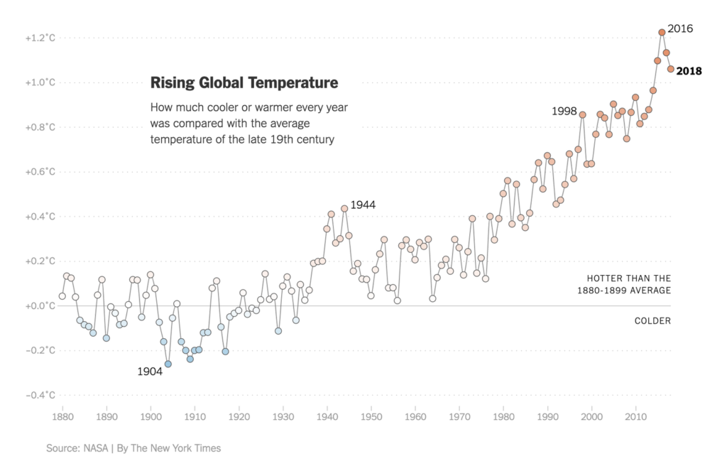
Last week, I showed a map of European cities and how they got warmer since 1960. Yesterday, NASA announced that 2018 was the fourth hottest year since 1880 on this planet. The New York Times put the following chart on their first page today, and on nytimes.com yesterday:

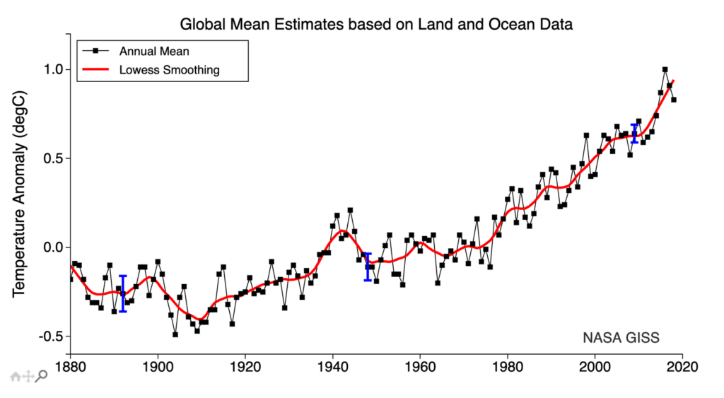
That’s curious. Because on the NASA website, it looks like this:

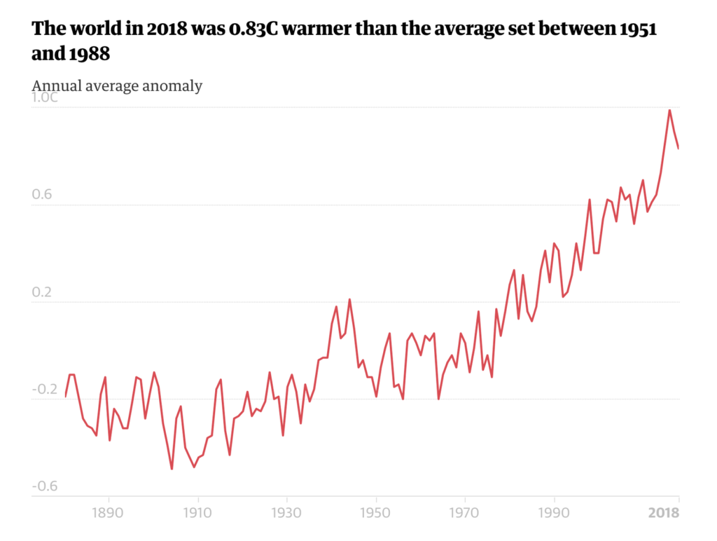
Spot the difference? No? Maybe it’s more obvious in this chart by the Guardian, also published yesterday:

The charts by both NASA and the Guardian show other values than the New York Times chart. The year with the highest temperature – 2016 – is more than 1.2 degree Celsius warmer than the average in the New York Times chart, but “only” 1.0 degree warmer in the two other charts. Why?
Here’s the explanation: NASA and the New York Times compared the same values to two different mean temperatures. In the chart above, NASA calculated the average temperature of the years 1951-1980 and then compared all the other values with this average. The New York Times took the 1880-1899 average. This average is lower – so 2016 was even hotter in comparison.
When looking at a baseline chart like this one, we need to ask: “What are values compared to?” Compared to the 2014-2018 temperature average, all other years since 1880 are “too cold”. Compared to the averages of the cold-ish years 1902-1913, 2016 is an astonishing 1.37 degree hotter. (I had some fun with different averages in this Google Sheet.)
So what is the best time frame to compare the current temperatures with? We might turn to the Paris Agreement from 2015 to see what’s written in there, but it is surprisingly vague on that. The nations signing it agreed to keep “the increase in global average temperature to well below 2°C above pre-industrial levels”. They didn’t agree on what defines as “pre-industrial”.
I asked the creator of the chart, Nadja Popovich, why she chose averaging the temperature of the earlier time range. She explains:
If you follow climate change news even casually, the one number that is likely in lodged in your brain is 2˚C. That’s the common goal set by policymakers for decades: to prevent Earth’s temperature from rising more than 2˚C above pre-industrial times. With that in mind, I thought it would be more useful to show readers the data in comparison to a roughly pre-industrial baseline (the late 19th century is a little later, but close enough). This representation would allow them to see how much the world has warmed already in comparison to a time before we started pumping large amounts of CO2 and other greenhouse gases from industry and transportation into the atmosphere. The late-19th century average does a better job of providing context for the amount of warming the world has already experienced.
By the way: In 2017, the NYT still went with the 1951-1980 average. In 2016, they even took the 1901-2000 average. But since the byline states Nadja’s name – last year and this year – the charts show the 1880-1899 average. I’ll see you next week!
Comments