

Radish to romanesco: A year in vegetables
February 20th, 2025
4 min
This article is brought to you by Datawrapper, a data visualization tool for creating charts, maps, and tables. Learn more.
Interpolation, explained
I was browsing my favorite website on the planet this week (ok, one of them), when I saw a chart about flight distance records. I starred at this chart for quite some while. Like every chart plotting records over time, it’s fascinating to see how quickly records become obsolete; how humans thrive to get better and better at things. Achievements which were mind-boggling fifty years ago are now just “meh”.
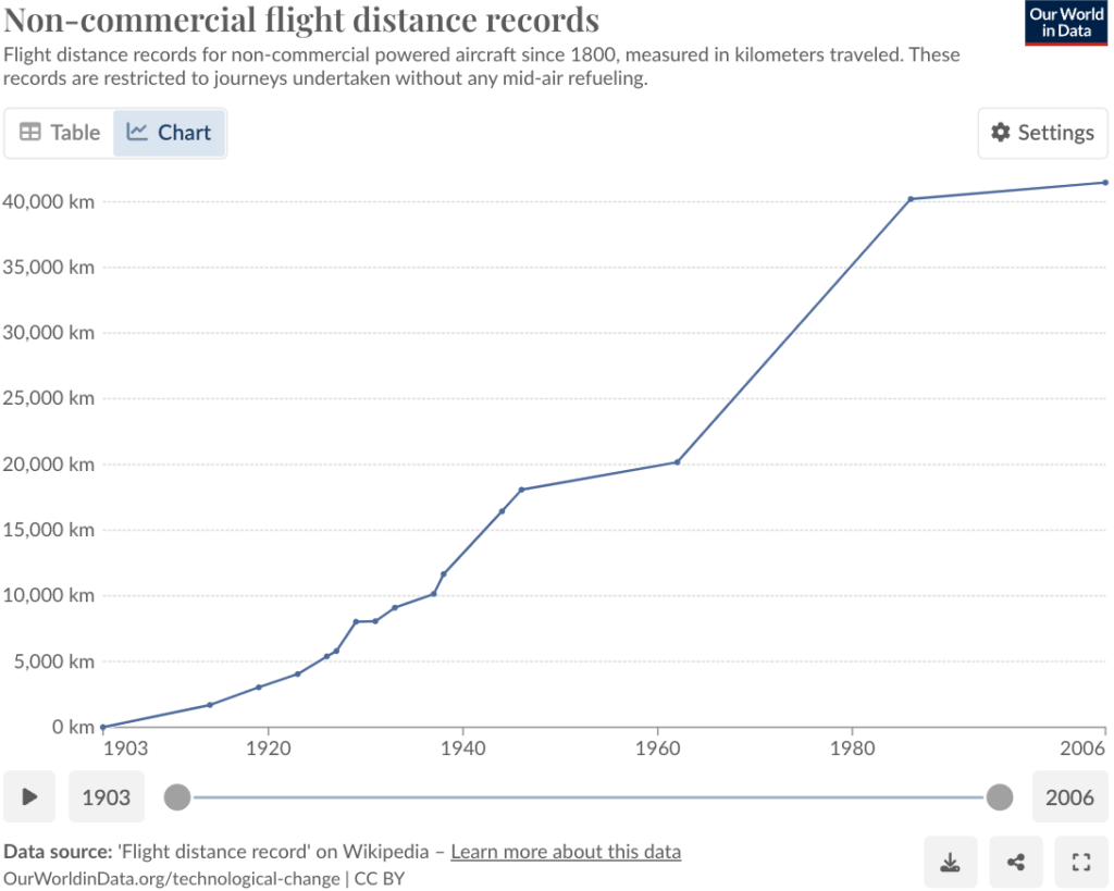
Something about this chart bothered me, though: The linear interpolation. (I’ll explain what this means shortly.) And I thought: You know what would be really intuitive and fun to plot on an y-axis? Not the flight distance, but the flight height:
This chart was really boring before I added all these reference points and little annotations that might be familiar to the reader: Felix Baumgartner, the Wright Brothers, weather, satellites, the ozone layer, meteors. New information becomes far more interesting in the context of known information. (I’m sure I will write a whole blog post just on this topic one day.)
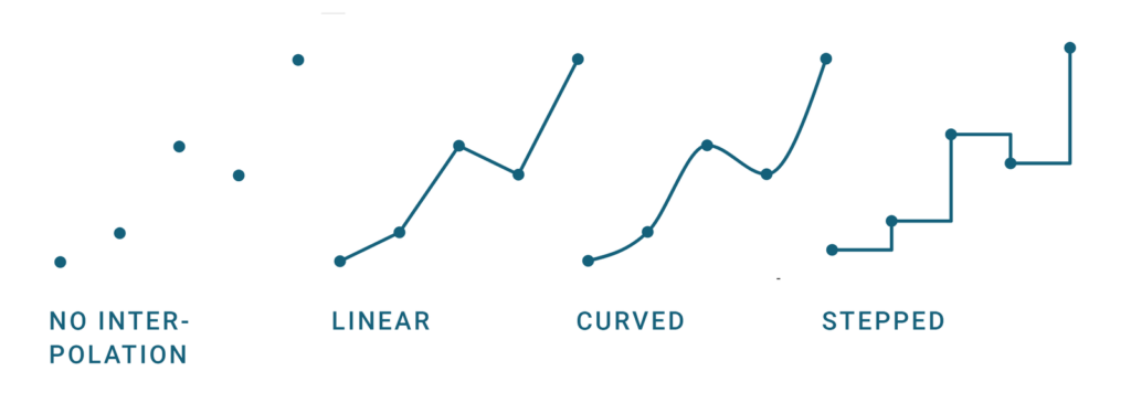
Back to the interpolation! Interpolation means we draw an “inter”-line between “poles”; we connect the dots. Doing so makes a chart full of dots to a line chart. There are different interpolation methods: linear, curved, stepped; and which interpolation method we use will have an impact on how our readers perceive the data. In the best case, our chosen interpolation resembles how the data behaves in the real world.
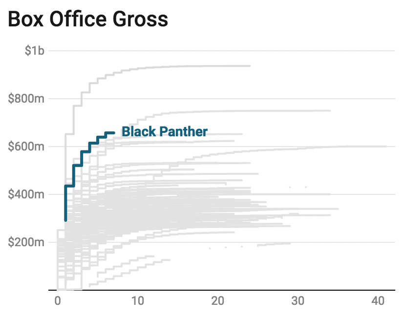
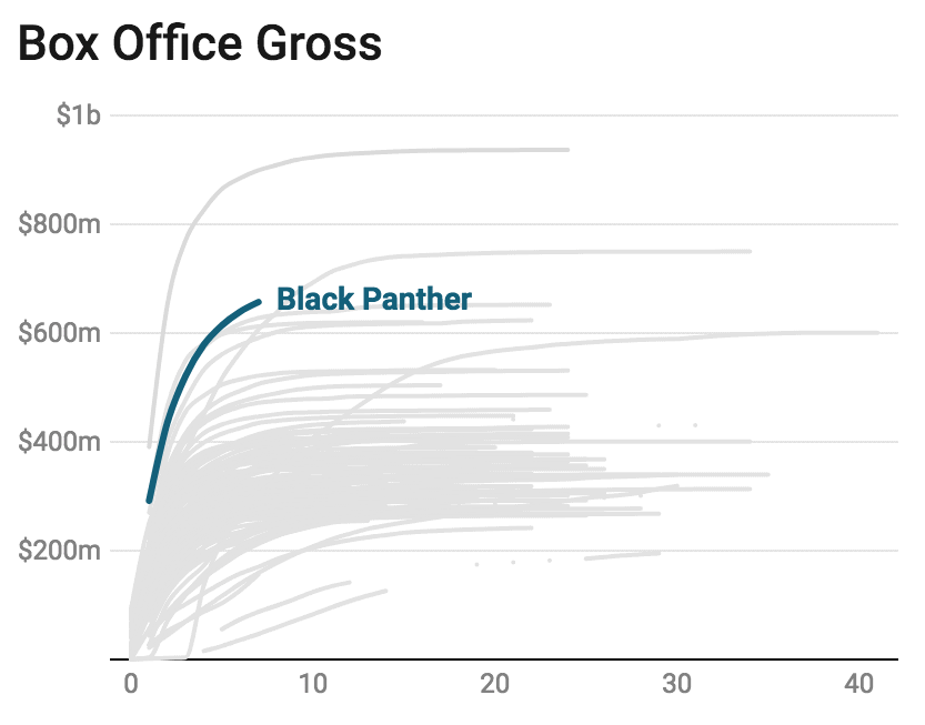
What does that mean? Well, let’s assume we look at box office gross for the movie “Black Panther” in the US. Box Office Mojo tells us the gross on a daily basis. But of course, people go to the cinema all the time, not just once a day. The amount of money made with this movie goes up by a little bit every minute or even second at peak times. And that’s what’s important: When choosing an interpolation, we shouldn’t ask how often the data is measured, but how often the data changes in the real world.
Does the data change from moment to moment, like temperature, unemployment rates or box office gross? Then we should use a linear or curved interpolation. Or does the data stay the same until a big change appear, like with records or parliament seats? Then, a stepped interpolation will be the best idea.
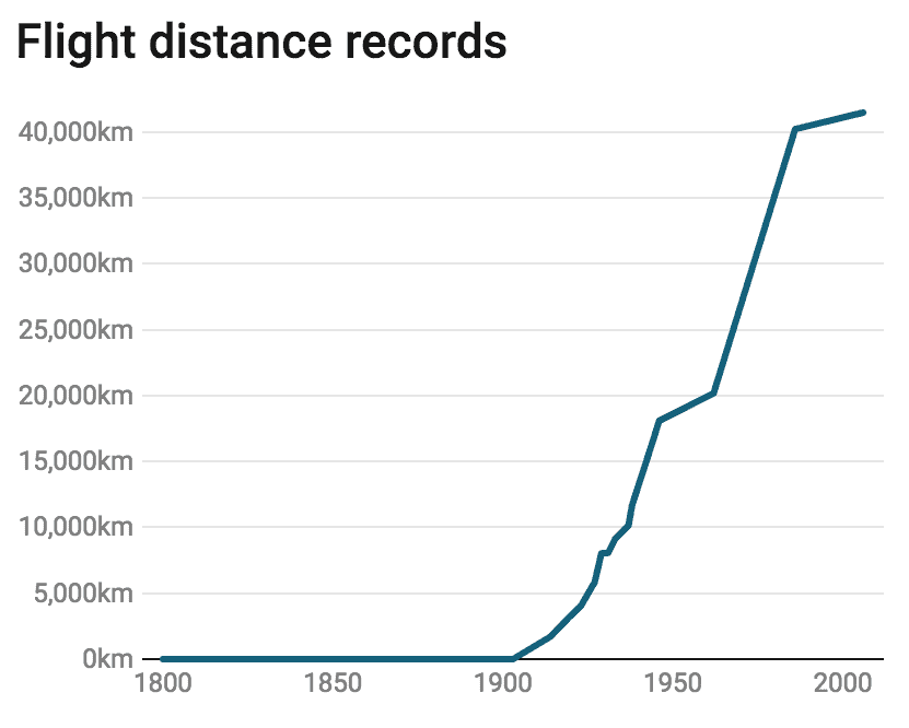
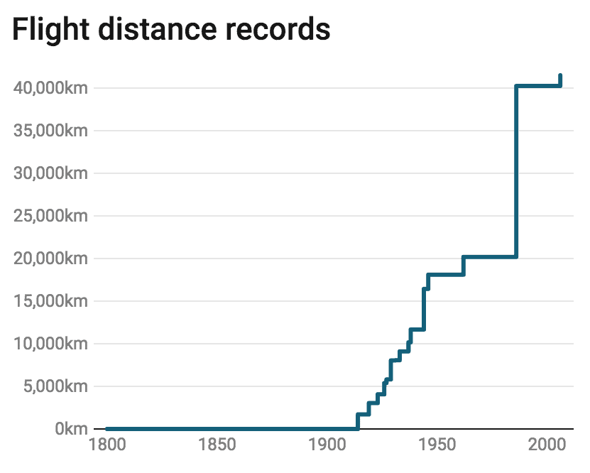
I used a stepped interpolation for the Weekly Chart above: One world record stays exactly the same until a new record is achieved. The same should be true for the flight distance records chart on Our World In Data: It has a linear interpolation but deserves a stepped one[1]. Here’s the difference:
Of course, the situation can be the other way round, too: Two days ago, Axios chose to show office box grosses with a stepped interpolation. It’s a great chart, but it looks like all US cinemas are empty all the time – until that one single moment each week, when ten thousands of people rush to the movies. Here, a curved interpolation might make more sense:
Choosing an interpolation is a great example of how a small detail in a chart can make a big difference. If you want to see more of these examples, I recommend having a look at Andy Kirk’s “The little of visualisation design” series. I’ll see you next week!


Comments