This article is brought to you by Datawrapper, a data visualization tool for creating charts, maps, and tables. Learn more.
Carbon dioxide concentration over time
Fitting 6 decades of monthly data into a tiny chart
Hi, Gregor here. Lisa asked me to write this Weekly Chart so she can work on some articles for our Academy (like this one).
This week we’re looking into a fascinating monthly timeseries on carbon dioxide concentration in the atmosphere, published by the U.S. National Oceanic and Atmospheric Administration (NOAA).
The chart shows a couple of things:
- First, we notice that over the last six decades, carbon dioxide concentration has increased steadily, which is why the lines stack up nicely in a non-stacked chart type like this.
- And the chart doesn’t just show that CO2 concentration is going up, it even reveals that the pace of the increase is accelerating, as the vertical space between the decade lines is getting wider and wider.
- We’re also able to see the periodic pattern that follows the seasons. Carbon dioxide concentration hits a low around September, climbs up to a peak the next May, from where it then drops to the next low in September etc.
- Finally, this form allows comparisons between the peaks and lows of different years. For instance, we can see that the “September low” of 2017 was already higher than the “May peak” of 2014.
Chart choices
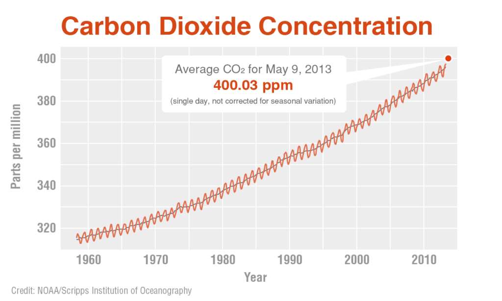
So why did I decide to split the time series into separate lines per decade? To explain this let’s take a look a the typical form used for this dataset, like the one below that was published on NASA’s website in 2013:

The problem with this is that it’s not very effective to compress almost 60 years of monthly data into such a tight space.
A simple way out would have been to only show the seasonally adjusted version of the time series, shown as a black line in the above chart. But I’d argue that in this case, the seasonal pattern is actually very interesting. If you don’t believe me, just look at this fascinating NASA video “A Year in the Life of Earth’s CO2” (hint: the video also explains the seasonal highs and lows).
But if we want to keep the seasonal pattern in the chart the line gets squeezed so much that it just ends up looking like a funny snake texture. Unless we give it more space by splitting it up into multiple lines per decade!
By the way, this problem of finding the “right” aspect ratio for a line chart has been researched in the information visualization field a little bit. If you’re interested, I recommend Robert Kosara’s summary, but the short version is: we still don’t really know how to find the ideal aspect ratio, so it’s often best to just eyeball it.


Comments