

We’re waiting longer than ever for our favorite TV shows to return
November 28th, 2024
2 min
This article is brought to you by Datawrapper, a data visualization tool for creating charts, maps, and tables. Learn more.
Symbol maps, explained
After publishing the cartogram world map last week, I had to notice that we’ve never featured one specific map type in the Weekly Charts: the symbol map. Of course that had to change. So this week, I’ll present you yet another world map:
Symbol maps can give us quantitative information about specific locations, not just countries or states like the choropleth map. And as opposed to choropleth maps, we can show more than one variable with symbol maps. In the one above I chose to map the number of citizens of each city with the circle size, and the information how these cities have grown between 2000 and 2016 with the circle color.
It gets interesting if you zoom into the map to see the visual pattern on each continent.
In good old Europe, cities are relatively small and have not grown awfully much (circles in a light blue represent cities with an average annual growth of less than 2.5%):
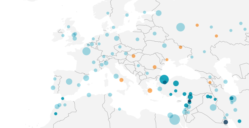
We can see a similar pattern in Australia, South America and North America, although not as clear. In the US, cities like Las Vegas, Austin or Charlotte have grown at a considerable rate of 3-5% each year. None of the European cities have had such a high growth rate. Berlin, Rome and Paris all grew by less than 1% on average since 2000.
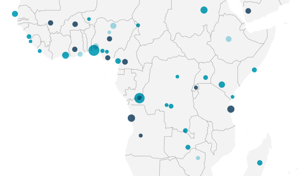
In Africa, cities are as small as in Europe – but they grow way faster. We can see that many African cities have grown by more than an average 5% each year (in dark blue), like Yaoundé in Cameroon or Harcourt in Nigeria:
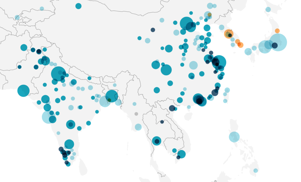
Asia has many cities that have a similarly high annual growth as African cities. The difference? Asian cities are already crazy big. And there are many of them. The whole east coast of China looks like one uninterrupted band of circles, if you just zoom out enough:
Because of these different regional patterns, a map works really well with this kind of data.
Next week, we are talking about polls – get ready for some opinions.


Comments