This article is brought to you by Datawrapper, a data visualization tool for creating charts, maps, and tables. Learn more.
The rich are killing the planet

Hi, this is Simon, I am a software engineer at Datawrapper. For this week’s edition of the weekly chart, I took a look at carbon dioxide emissions around the world.
The climate crisis is driven by consumption. The more we spend, the more we contribute to global warming. In a much-quoted report from 2015, Oxfam pointed out that the richest 10 percent of the world’s population is responsible for half of humanity’s carbon emissions. When I first read this back in 2015, it seemed so clear to me: The rich are killing the planet. With their private jets and giant mansions, their gas-guzzling luxury cars and outrageous lifestyles, they destroy our children’s future.
But the truth is much more inconvenient. I am actually part of the richest 10 percent myself, and if you live in Western Europe or the United States, chances are extremely high you are too. We are the privileged few that account for half of the world’s carbon emissions. The climate is in crisis because we drive cars and eat too much meat and dairy. It is in crisis because we buy too many clothes and electronics, and because of our holiday trips to Thailand or the Bahamas.
Different ways to look at the emission curve
Two weeks ago, my colleague Gregor made a series of charts that visualize the world’s ever-increasing carbon dioxide emissions: The only chart we should be looking at. Gregor’s post has an important message and does an amazing job of bringing it across. If you haven’t read it yet, you should do it right now. But there’s one thing I thought was missing, and that’s a breakdown by population.
The following area chart is taken directly from Gregor’s post. It shows a dramatic increase in emissions for China, while emissions for Europe and the US are slightly decreasing.
As Gregor pointed out, this partly because western countries have “outsourced” their industrial production to China. The second reason is much more obvious. China and India are the most populous countries in the world. And as the economies of China and India thrive, so do their carbon emissions. The above scatter plot correlates per capita emissions with economic wealth, but it does not show the change over time. So I created a simple line chart:
This line chart shows emissions per person[1] , while Gregor’s original area chart shows total emissions across regions. When we look at the per capita data, it becomes clear that while emissions for the United States are indeed going down, the per capita emissions are still much higher than in China, Europe, and India. In 2016, a person in the U.S. was responsible for nine times as much carbon dioxide as a person in India. And if we dug deeper and looked at income groups within countries, we would see even more extreme differences.
For example, someone in the richest 10 percent of citizens in India amounts on average just for one-quarter of the carbon of someone in the poorest half of the population of the United States.[2] The line chart also shows another connection between money and CO2: Significant decreases in emissions in Europe and the U.S. can be linked to times of economic downturn, particularly the oil crises of the 1970s and the 2007-2008 financial crisis with the recession that followed.
The line chart also shows another connection between money and CO2: Significant decreases in emissions in Europe and the U.S. can be linked to times of economic downturn, particularly the oil crises of the 1970s and the 2007-2008 financial crisis with the recession that followed.
Chart choices: Log or linear scales?
The scatter plot illustrates the world’s extreme inequality in terms of financial wealth and its correlation with CO2 emissions. Looking at the data, we see a strong concentration of low income and low emission countries, which makes it difficult to visualize the data without too much overlap between countries on the lower end of the scale. And then there’s Qatar. The country has the highest per capita income in the world and is also the biggest polluter per capita. It is such an extreme outlier that it makes the rest of the world look tiny in comparison.
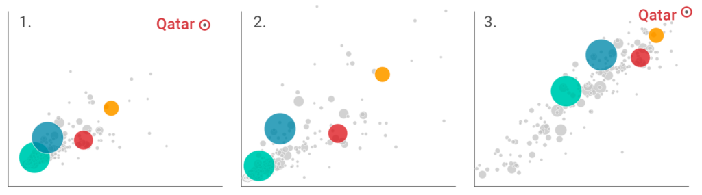
With Qatar removed, the graphic is already clearer, but it is still difficult to distinguish countries at the lower end of the scale. I worked around this by using logarithmic scales. Log scales give more prominence to the bottom half of the scale but can also be misleading, because they visually reduce the extreme differences between countries.
That’s it from me for this week. As always, do let us know if you have feedback, suggestions or questions. I am looking forward to hearing from you at simon@datawrapper.de, Mastodon, or Twitter.
The per capita emission data comes from the European Commission’s EDGAR emissions database. EDGAR reports carbon dioxide emissions from fossil fuel use and other industrial processes, which include less obvious things such as cement production and burning waste. As an indicator for wealth, I used the World Bank’s per capita gross national income (GNI) data, which is corrected for purchasing power parity (PPP) and reported in international dollars. An international dollar has the same purchasing power as a U.S. dollar has in the United States. Still, it is just an approximation. It does not allow for conclusions on the wealth of individuals or income distribution among the population within countries. ↩︎
Oxfam Media Briefing: Extreme Carbon Inequality – Why the Paris climate deal must put the poorest, lowest emitting and most vulnerable people first ↩︎


Comments