Election madness 2024 — one year in the Data Vis Dispatch
January 9th, 2025
3 min
Datawrapper lets you show your data as beautiful charts, maps or tables with a few clicks. Find out more about all the available visualization types.
Our mission is to help everyone communicate with data - from newsrooms to global enterprises, non-profits or public service.
We want to enable everyone to create beautiful charts, maps, and tables. New to data visualization? Or do you have specific questions about us? You'll find all the answers here.
Data vis best practices, news, and examples
250+ articles that explain how to use Datawrapper
Answers to common questions
An exchange place for Datawrapper visualizations
Attend and watch how to use Datawrapper best
Learn about available positions on our team
Our latest small and big improvements
Build your integration with Datawrapper's API
Get in touch with us – we're happy to help
This article is brought to you by Datawrapper, a data visualization tool for creating charts, maps, and tables. Learn more.
Hi, this is Lisa; I’m responsible for the blog and the general communication at Datawrapper. I published lots of live-updating charts, maps, and tables about the coronavirus last Friday. Guess what today’s chart is about.
Edit: We don’t know how many people are infected because the amount of testing differs widely in different countries. We do know how many people died due to the virus. That’s why I changed the chart to show the number of deaths instead of confirmed cases. You can still find the chart showing confirmed cases here.
By now, #FlattenTheCurve is trending on Twitter. We collectively learn that “it is not the number of cases and deaths that matters. It is their growth rate that matters”, as Max Roser from “Our World in Data” explains in this tweet. The trajectory is important. And many countries are on the same:
Some media outlets have published a chart on a log scale like the one above, like SPIEGEL or the Financial Times (that’s an excellent one, with great annotations). What I haven’t seen so far is this chart with the number of confirmed cases in Europe, and with helper lines that explain doubling times.
The doubling time is the time a population (e.g. coronavirus cases) needs to double. Let’s compare Norway and Japan to understand its consequences.
If Japan follows the course it’s on, it will double the current number of confirmed COVID19-infected people in a week. Instead of the current 650 cases, there’d be 1,300. And 2,600 in two weeks.
Norway is on a course to double its confirmed cases every second day. (Norways is in the chart, but hidden – hover over the lines to find it!) There are currently 600 confirmed cases. In a week, Norway might have to deal with 6,800 cases. A week later? 76,800 cases.
Or not. Norway – and all the other countries that currently show a steep growth rate in their coronavirus cases – might flatten their curve, like South Korea, China, Japan, and Hong Kong successfully did.
You can compare the impact of different doubling times in the following table. They’re the same I show in the chart above. China, South Korea, Japan and Hong Kong’s coronavirus cases doubling time is currently either a week or less, so they’d be in the blue columns. Europe and the US have currently doubling times that are colored in pink here:
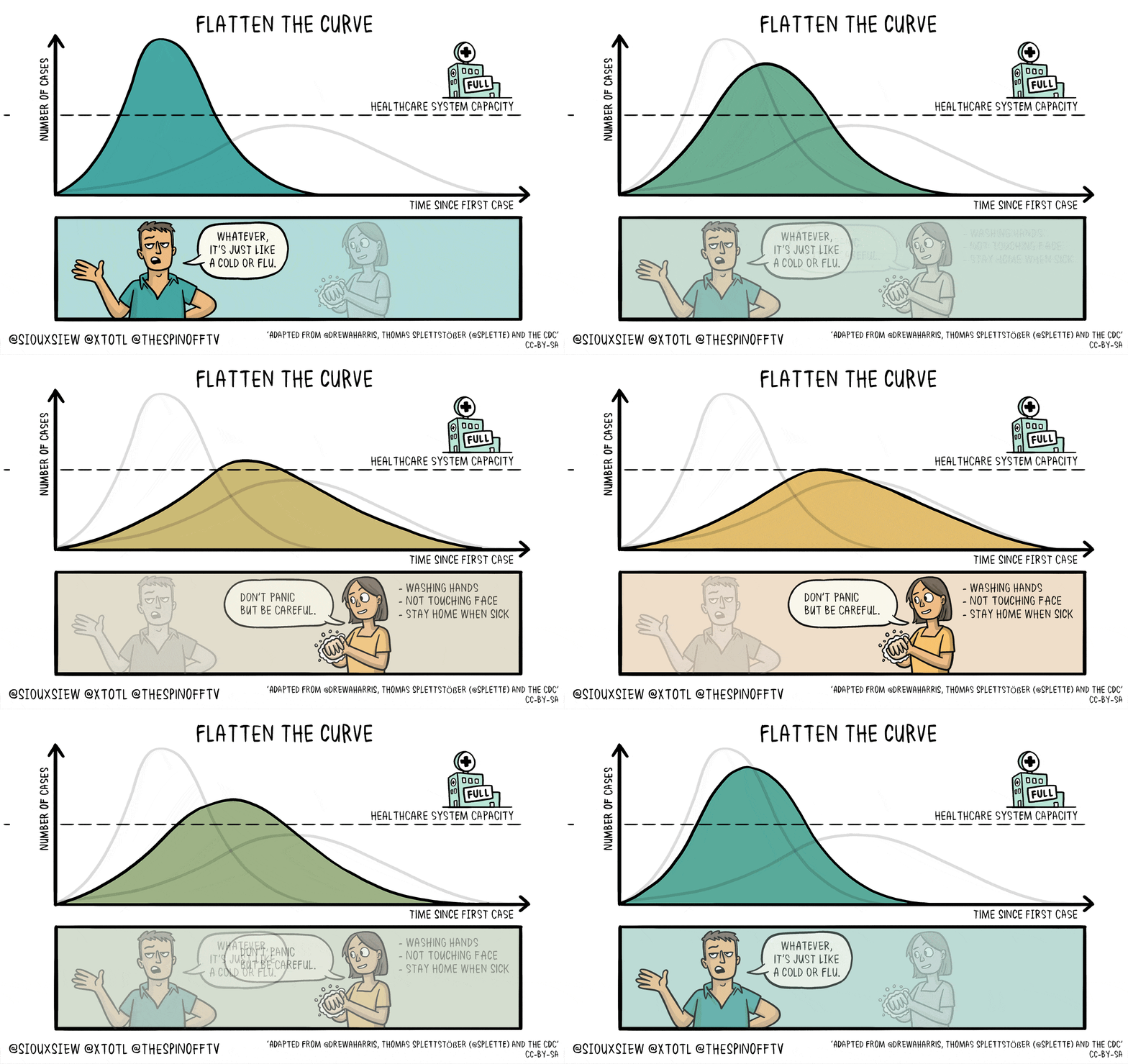
The main priority of many nations right now is to move to a slower doubling time. That’s what #FlattenTheCurve is about. Locked down areas, school closings, conference and sports event cancellations, washing hands, avoiding gatherings – all of this ensures slow doubling times, therefore less crowded hospitals and therefore a lower case fatality rate.
I’ll end with a great GIF that sums this all up. A GIF which you’ve seen probably on Twitter already – but if you haven’t, I don’t want you to miss it:

Phew, that was not the first article about the coronavirus you read today, was it. Maybe turn off your smartphone for a while. Take a deep breath. Stretch a bit. Try yoga. Or read a novel. We’ll see you next week.
Comments