This article is brought to you by Datawrapper, a data visualization tool for creating charts, maps, and tables. Learn more.
Datawrapper, JavaScript, and the Elbe

Hi, this is Hendrik, backend developer and system administrator at Datawrapper. Here’s the story of how I tried to hook into an API using only JavaScript and failed.
When my time has come again to write a Weekly Chart, the most pressing question I have is always:
“Where do I get my data from?”
Here at Datawrapper, I have to interact with APIs daily. So I had the idea to get the data for a chart directly from an API.
Usually, I would then dump all the data to some sqlite database and use the SQL language’s power to prepare the data. But I had another idea: This time, I wanted to explore how complicated it would be to do not jut the data-fetching, but also the pre-processing for a Datawrapper-compatible CSV in JavaScript, not using any statistical tools or languages like R or SQL database features (like I prefer).
The path was clear. So the remaining question was:
“What am I going to visualize?”
I recently saw my coworker Gregor’s excellent chart about Global Temperature Anomaly, and it reminded me of a feeling I have about a local river running through the city of Magdeburg where I live, the Elbe.
My coworker Lisa said it’s important to show our readers where Magdeburg is, so she built this locator map.
The recent years were hotter and dryer than I am used to.
Because there was less snow melting up in the mountains feeding the Elbe in spring and less rain all over the year, the water levels this year and the years before were so low that there were several months where no ships could pass the Elbe anymore.
I wanted to see if I could prove an obvious trend in falling water levels, just how Gregor did with the temperature. (Scroll all the way down to see the result.)
So I searched the web for an API where I could read local water levels from. The REST API of pegelonline.wsv.de looked promising. With a little digging via curl, I found the endpoint for my local measurement station.
This is where I made the first mistake.
Instead of reading the full API documentation, I started right away coding a small JavaScript helper that was dedicated to create timespans of a month and using these to download the related time series of measurements.
The endpoint was simply W/measurements.json?start=&end=. It returned simple JSONs:
{
	"timestamp": "a-timestamp",
	"value": "level-in-cm"
}
I was thrilled.
This would make a great example of transforming API returned data to something Datawrapper could use!
If there hadn’t been a tiny bit of information I was missing.
While the descriptive endpoint returned an object that had validFrom: "2006-11-01" in it, this referred to the gaugeZero level and not to the timespan I could download.
A simple sentence in the API documentation wrecked my plans:
Es können Daten für die letzten 31 Tage bezogen werden.
In English: You may retrieve data for the last 31 days.
No data reaching back many years. Instead, my helper just fetched a folder full of empty arrays. (At least it would have if I hadn’t stopped it after downloading the first few 2-byte files.)
But I had already written the tool to parse this data …
…so instead of changing to a completely different topic (one day before the release of this Weekly Chart), I searched for another data source on the same issue that I could somehow fit to my tools.
All I found was a dusty PDF.
Somehow the people collecting this data don’t seem to be keen on releasing it to the public in a computer-readable format. Sigh. While this PDF is not a scanned document (be praised), you still can’t mark text in a way that would enable you to copy data. The internal structure is too fuzzy.
Lisa came to the rescue: “There are tools that can help you get data out of a PDF. We have an Academy article on this!”
After reading it, I decided to use Tabula.
Finally I had a dataset of at least 5 years of Elbe water levels. I almost immediately wrote a tool that parses this CSV to prepare a JSON blob just alike that API that I could not use would have returned.
The data transformation. Or: more tools!
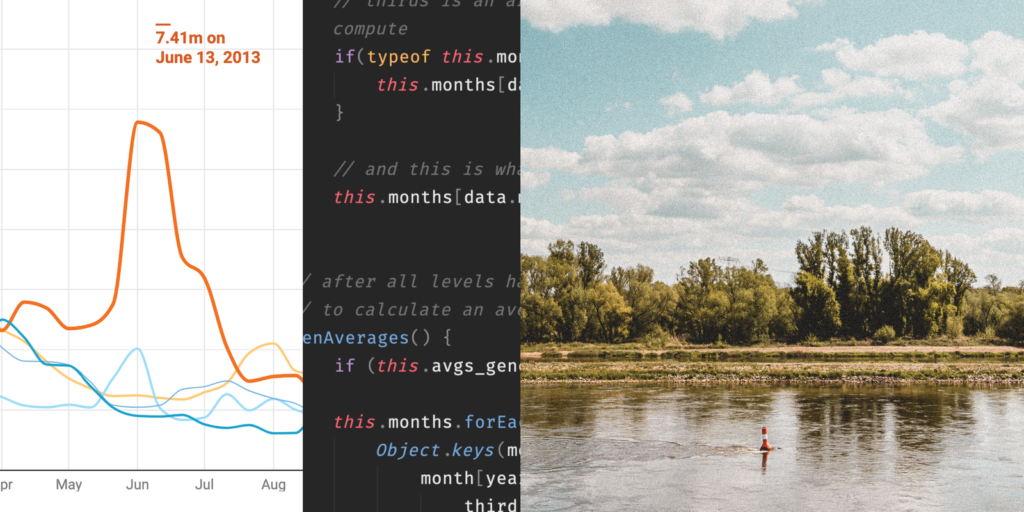
While Gregor’s chart was perfectly fine with 12 data points per year, local water levels move faster than global temperature. I thought it would be a good idea to calculate averages of 10 days, so I’d have three data points per month.
Later on, this raised another problem. While Gregor got away with using only month names, I had to use “fake” years in my dates, like April 21, 1970 to make Datawrapper understand to parse an April 21 as a date.
Here comes the 3rd tool I wrote.
As I said, I like working with databases. So I used an internal mini JavaSript database to work with the data.
All I needed to do was
(Unfortunately, because I divided the months into thirds upon data insertion, implementing something like a moving average would have been a bigger task, but I think this is ok for a proof of concept.)
And yes, I also needed to build the chart. Here it is:
The conclusion
It wasn’t all rainbow-unicorn in the process. But we’ve learned something:
- You can create Datawrapper charts using only plain JavaSript without any modules, tools, or dedicated languages.
- You could even use an API (if that API gives you the data you want).
- This chart is not suitable to prove my point of sinking annual levels, because five years is just not enough.
- Because of the ten-day average, it does not even show the peak level of 7.41m that made parts of the city drown in a flood in 2013.
- Backend developers are not the ones to ask when you want to have charts that provide insights.
Thanks for reading! As always, you can have a look at the inner workings of the chart yourself when hovering over it and clicking on “Edit this chart” in the top right corner. Have a nice day, and we see you next time!


Comments