This article is brought to you by Datawrapper, a data visualization tool for creating charts, maps, and tables. Learn more.
How good is your English?
There is no perfect chart, just weighted priorities

Last week we looked at marriage, but that actually was an excuse to talk about bringing nuance to a chart. This week’s Weekly Chart will be about English skills as measured by EF, but that’s actually an excuse to talk about priorities and compromises in chart design:
Look, it’s our first arrow chart in a Weekly Chart! Why is it an arrow chart? That’s why:
Chart choices
I love arrow charts because they are dense. They show you a lot of information at the same time: the state for different categories at two dates, and how these categories changed between these dates. Arrow charts are basically a split bar (“state at two dates”) plus a bar chart with positive and negative values (“change between two dates”):
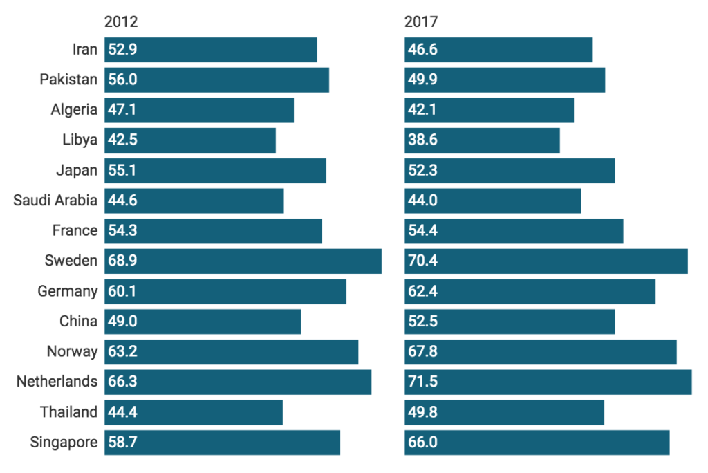
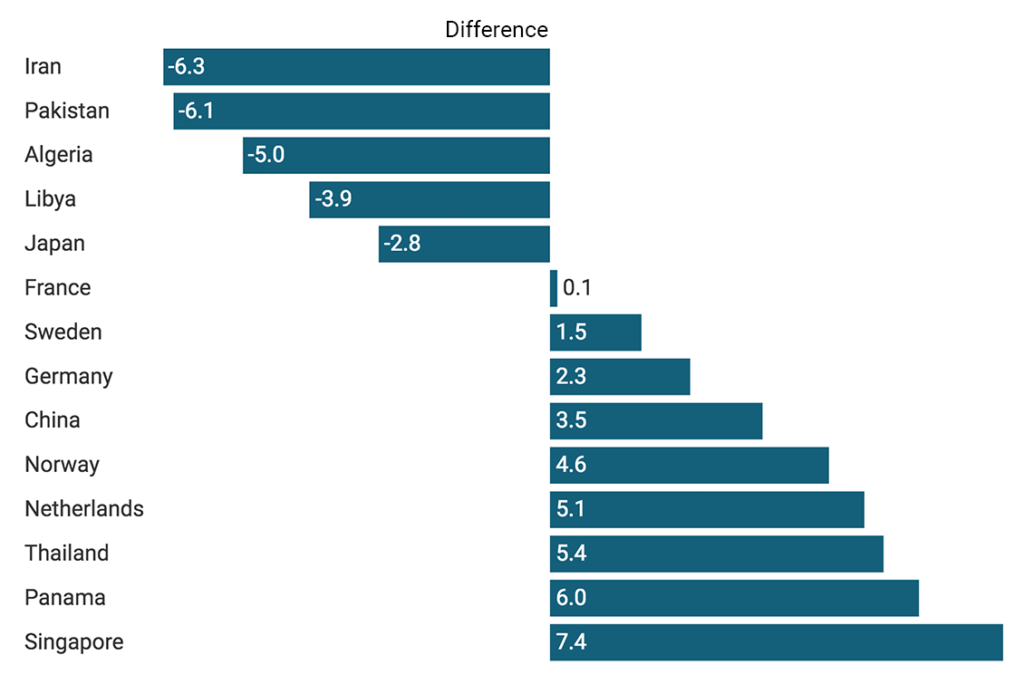
Our arrow chart shows exactly the same information as these two bar charts. Not just that: Arrow charts connect this information. We can see the relationship between our three variables (state 2012, state 2017 and change). For example when we look at the selected countries in our chart at the top, we see that the countries with declined English skills had only moderate, low or very low English skills in 2012. None of the countries with strong English speakers worsened in English proficiency. That’s something we could not have spotted easily in two separated charts.
So arrow charts are better, right? Because they show more? Well, not necessarily. Arrow charts are hard as heck to read. I’m sure it took you at least five seconds to figure out what’s going on up there.[1] That makes sense: It just takes longer to read arrow charts with three variables compared to a classic bar chart with just one variable.
There is no perfect chart, just statements we want to make and weighted priorities – priorities for us as chart creators, e.g. grabbing the readers attention, honesty or beauty. In this case, we need to weigh up giving our readers the option to get more complex insights out of the data, and being able to understand the chart faster. The bar chart gives readers fewer insights but is faster to read. The arrow chart gives more insights but is harder to read.
Both are good charts. Which chart we choose says more about our priorities than about whether we’re good at creating charts.
Yes, that’s because this particular arrow chart has some extra bits of complexity, like colors, weird sorting, arrows in two different directions and very small ranges. And yes, there are definitely some ways to make an arrow chart faster to parse for your readers – and I’ll talk about them in an upcoming “What to consider when creating arrow charts” article.↩︎


Comments