Charting the corona effect

Hi, this is David, CEO of Datawrapper. For this weekly chart, we’ll take a look at the impacts of the coronavirus crisis on politics, and in particular the different governments’ election poll numbers around the world.
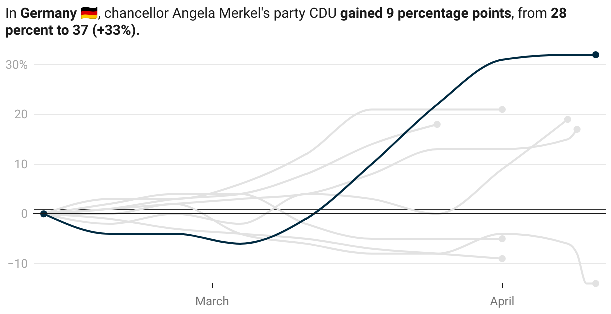
In the past weeks, something interesting happened in German politics: The leading party of the government, CDU, had a remarkable rally in the public opinion polls. It rose from 28% at the beginning of March to 37% on April 8th, a 33% increase in voters!
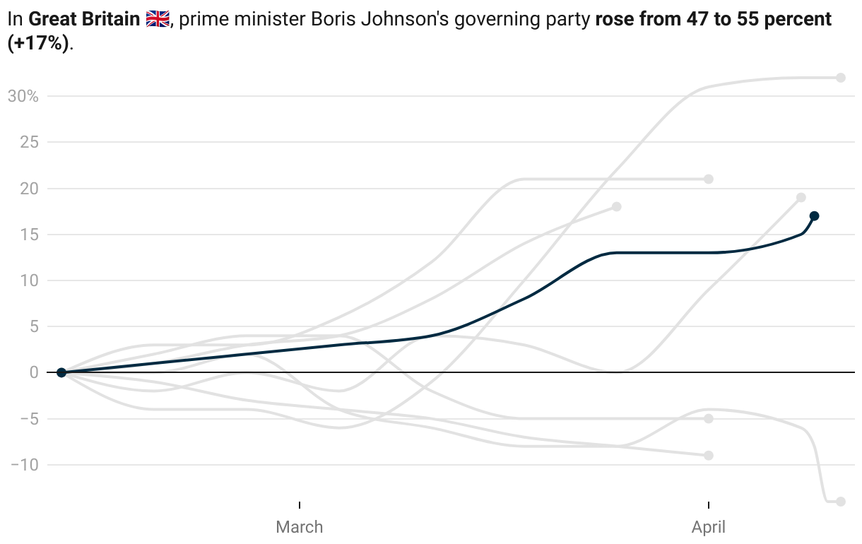
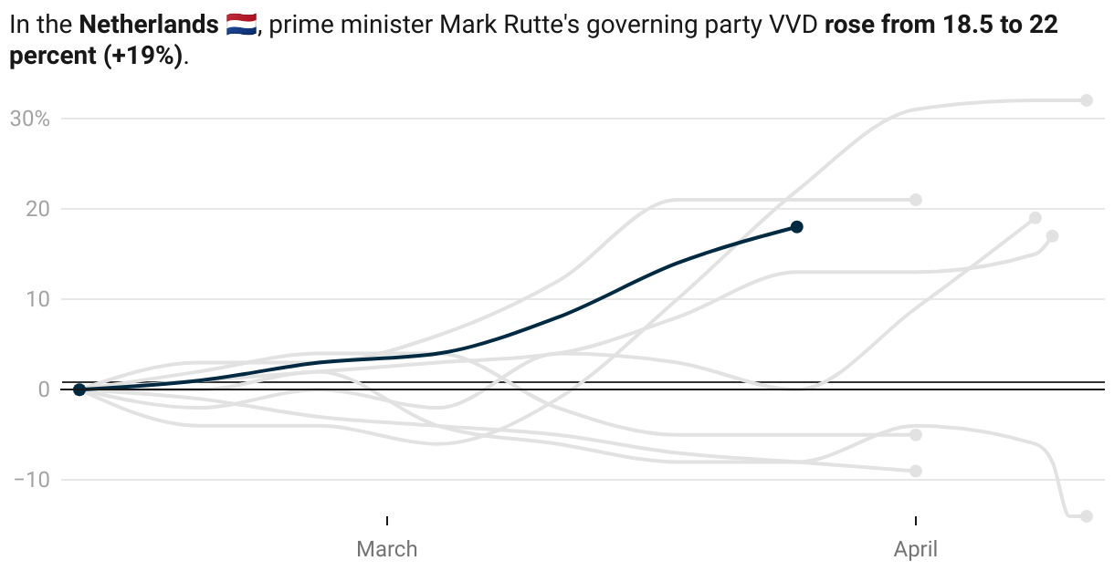
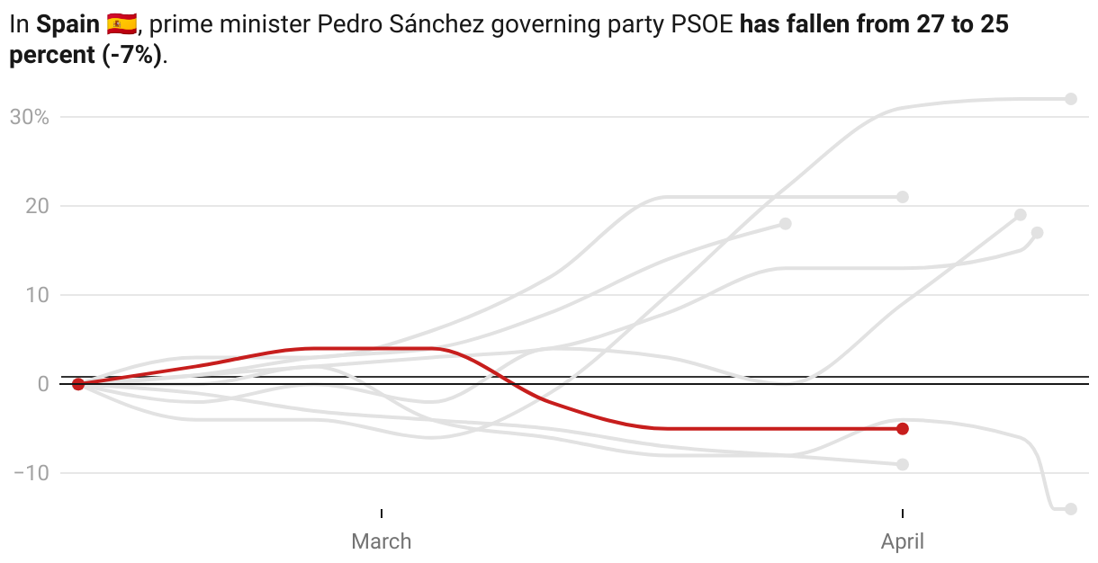
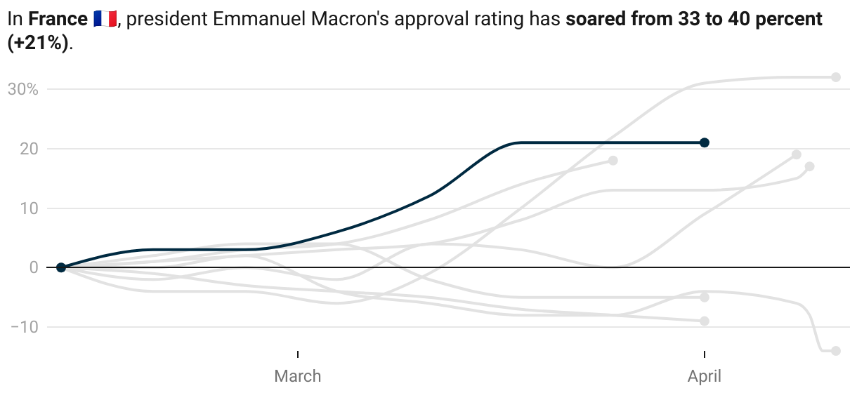
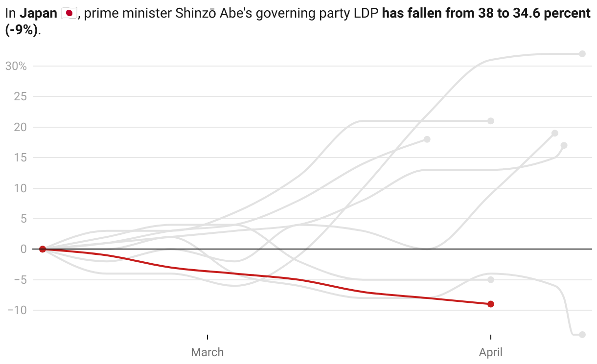
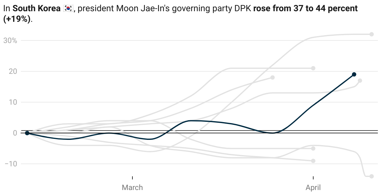
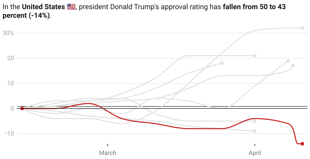
It turns out that similar tendencies can be observed in other democracies - however, not in all of them. While France’s Emmanuel Macron or South Korea’s Moon Jae-In received a significant increase in popularity, others, such as Spain’s Pedro Sánchez or US president Donald Trump are faced with decreasing poll numbers.
Picking February 12th as the baseline reference point before the global pandemic, let’s have a look at how the poll results developed for different politicians around the world, relative to where they started:
There are multiple possible explanations for this: maybe constituents are happy with the government’s response to the crisis. Then again, there’s also a well-studied phenomenon of political leaders gaining in popularity during a crisis. It even has a name: the rally 'round the flag effect.
Chart choices
- The most important choice was to choose an indexed line chart instead of comparing absolute values. It has the advantage of focussing on the recent development, rather than the absolute values. However, it can also be misleading: For example, it might suggest that Germany’s CDU is more popular than the British Conservatives, which they aren’t in absolute terms.
- Initially, I tried to display all countries in a big, single line chart. That turned out to be completely unreadable, due to the many overlapping lines. Instead, I decided to create individual line charts for each plotted country, with the other countries greyed out for comparison, a technique known as small multiples.
- Another important question was the start date to choose, which would have a significant impact on the slope of the lines. I chose mid-February, which is when the pandemic started to break out in Italy and began dominating the public conversation.
- Also, given that I had to aggregate various polls taken at different points in times, I decided to disable tooltips for the charts, since they would suggest a level of precision that the data does not offer.
Where are Italy, China and the others?
I would have liked to include more countries for comparison, particularly those that enforced stricter regulations to slow the outbreak of the disease. However, not for all of them, data was available:
- For countries with an authoritarian political system, such as China, Iran, Russia or Turkey, there is no trustworthy data available.
- In Italy, the prime minister Giuseppe Conte is not a member of any of the two governing parties. This makes it difficult to use election poll results to gauge the public perception on his politics. His personal approval ratings are however only collected on a monthly basis. While they were pointing steeply upwards in March, I decided to exclude him from the chart due to the lack of precision in the data.
Sources
I used various sources for the individual countries:
- For the United States, I used the historical Presidential Approval Index by Rasmussen Reports.
- For France, I used Presidential Approval Ratings as aggregated by Politico.
- For South Korea, I used the election polls from Gallup Korea.
- For Germany, I used the election poll results from Forsa.
- For the United Kingdom, I used the election poll results from Opinium.
- For Spain, I used the election poll results from Electomania.
- For the Netherlands, I used the aggregated election poll results from Peilingwijzer, which are based on research by I&O Research, Ipsos/EenVandaag and Kantar.
- For Japan, I used the election poll results from JNN.
That’s it from me for this week. Stay tuned for next week’s chart, with only a 92.4% chance of covering a coronavirus-related topic.