

French people are losing confidence in the Paris Olympics
March 28th, 2024
3 min
This article is brought to you by Datawrapper, a data visualization tool for creating charts, maps, and tables. Learn more.
If you’ve checked the news or some social media platform in the past few days, maybe you’ve stumbled over a photo of sled dogs that walk on meltwater and a chart like this one from The Economist:
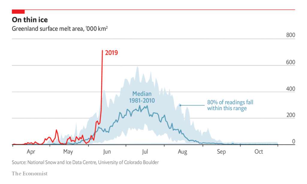
It’s a powerful chart. The red 2019 line drills itself out of the light blue area. This interdecile range and its really nice explanation (“80% of readings fall within this range”) seem to tell us: “Normally, you know, it stays down here”.
This chart evoked in me something that Hans Rosling calls “The Straight Line Instinct” in his book “Factfulness”. “OMG,” I thought. “So this red line will continue and will go where no line has gone before, and Greenland will be actually green in no time.”
I was curious if that is the case. So I charted the data myself:
Turns out, it’s not the case quite yet. Yes, it’s getting worse. Yes, the climate catastrophe will probably lead to Greenland being green at some point in the future, and it won’t be a good future.
But there isn’t this OMG moment that the chart by The Economist and other sources suggest. It’s not a completely new situation that so much ice has melted in Greenland. We’ve had similar alarming readings in 2002 and 2007. And we had readings of 1,400k sq. km being melted in July 2012; which is almost double of what was measured a few days ago.
I feel uncomfortable writing this article. My criticism of the Economist chart is that their chart nudges me to think that this year, the situation is worse than ever before. Which means that it nudges me to believe something that’s not true. And I’m all for the truth.
But I also want global warming to get more attention. I want people to feel like it’s bad, and that they need to do something. I want people to feel what I felt when I first looked at The Economist chart: “OMG.”
My redesign doesn’t achieve that. It doesn’t scare me. It makes me think: “Many dots, complex topic, well well.”
But our readers trust us writers. They trust us to communicate the truth so that they can form their own opinion; they trust us that we won’t nudge them. Even if the nudging has a short-term effect which is objectively positive – make more people care about global warming –, it might lead to distrust in the long-term. And to fewer readers who we could make care about these topics in the first place.
So I think we should find ways to achieve both: Communicating complexity & making people care. Some charts that achieve that are this one by Derek Watkins I’ve written about before, the “warning stripes” or the “climate spiral” by Ed Hawkins.
Edit June 21: Alex Selby-Boothroyd, Head of Data Journalism at The Economist, replied with a tweet in which he showed the print version of this chart – as powerful as the first one, but with more context. Thank you, Alex!
Great post and totally valid criticism. We made that chart last Friday based on this simple version (all we had at the time). We then came across this better version and have used it as the basis for our print piece, which puts this spike in better context https://t.co/zFwrsWRldr pic.twitter.com/VhZMC90Wzx
— Alex Selby-Boothroyd (@AlexSelbyB) June 20, 2019
Getting the data proved to be not easy in this case. The data is published in a Highcharts chart on nsidc.org. My coworker Gregor wrote a short R script to get the data. You can find the script and the data for the chart above in this Github repo. Download it from there, or click on “Edit this chart” in the chart at the top – I’m curious to see what you’ll come up with. See you next week!


Comments