

French people are losing confidence in the Paris Olympics
March 28th, 2024
3 min
This article is brought to you by Datawrapper, a data visualization tool for creating charts, maps, and tables. Learn more.
Hi, Elana here. At Datawrapper, I’m typically found on the other end of our support@datawrapper.de inbox, helping you with all your charting, mapping, and data-wrangling questions.
In my day-to-day work, I spend my time thinking about how to use Datawrapper to best create high-quality visualizations that are engaging and communicate a clear message.
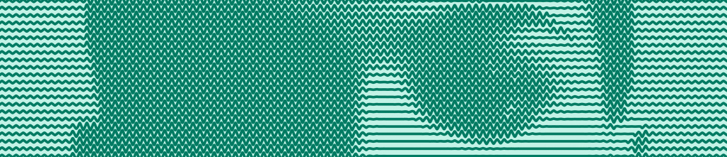
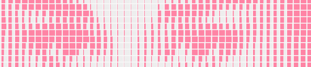
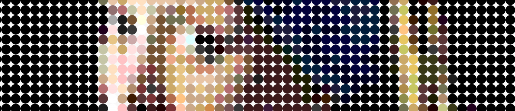
On my own time though, I find myself using Datawrapper in rather unintended ways. A particular hobby of mine: transforming images into chartable datasets. In case you missed them, check out my past creations:
To be honest, I was kind of running out of ideas, and then I realized, I had completely neglected a huge part of Datawrapper: maps.
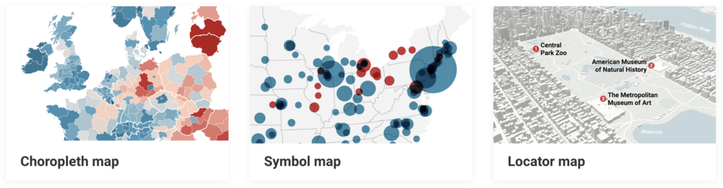
Datawrapper offers three map types. Two of those: symbol, and locator maps allow you to precisely position symbols on a map by coordinate. That could certainly work nicely for my purposes, but seemed just a bit too simple.
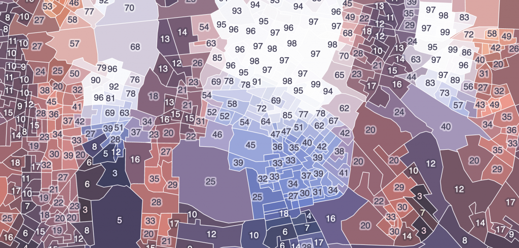
A choropleth map, on the other hand, where geographical regions get colored according to a dataset – now that sounded more intriguing.
What if I could somehow use a map’s regions as my image pixels? What would that look like?
See for yourself. Can you recognize these famous city landmarks?
I think the results are pretty interesting. Although they’re programmatically generated, there’s a human abstractness that emerges through the human-made geographical boundaries. Each map is messy in its unique human way.

This would not have been possible without a bit of code. To generate the datasets and create the maps, I built myself a little tool that would:
And that’s essentially it! If you’d interested in me making this publicly available, let me know.
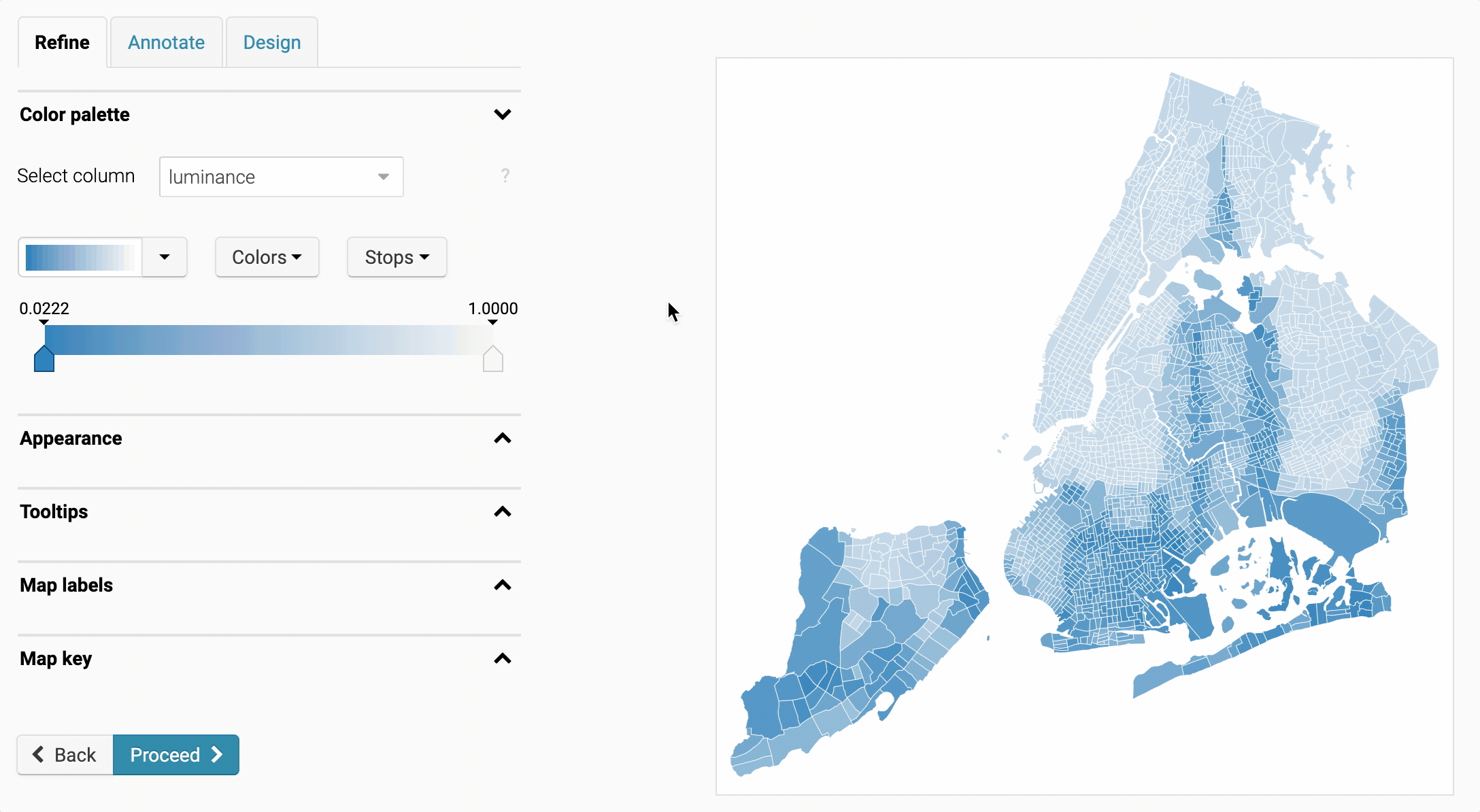
In the above maps, I colored each region according to explicit categories. With colors taken directly from the source images. Often though, choropleth maps are colored using a color scale that corresponds to numeric data. This is something that I could have experimented with further.
For example, here we see the same map of New York, with the regions colored according to the numeric luminance column instead.
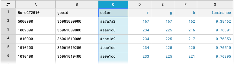
I included the red, green, blue, and luminosity (brightness) of each region in the map datasets, so if you hover over one of the maps and click Edit this chart you can experiment with different color scales for yourself!
I hope you enjoyed this! Next Thursday you can expect a Weekly Chart by our developer Fabian. See you then!


Comments