

French people are losing confidence in the Paris Olympics
March 28th, 2024
3 min
This article is brought to you by Datawrapper, a data visualization tool for creating charts, maps, and tables. Learn more.
I’ve always been a pen & paper person.
Hi, I’m Aya, the new writer & support intern at Datawrapper. This week’s chart is on a light-hearted personal topic: my diary.
I’ve always been a pen & paper person. When I was in elementary school in Japan, we were asked to write a diary every single day – it was a fairly common homework back then. The habit has stuck with me. For the past 20 years, I’ve kept a diary almost every day, filling more than 150 notebooks.
Then, two years ago, I started traveling. I realized I couldn’t carry around dozens of notebooks with me in my small backpack, so I started using an app called Day One. (It’s also better for the trees!)
Journaling can mean different things to different people. I am a chronic forgetter, so I write everything down to remember it. But I also write to forget, to decompress my brain. Which is probably why I never reread my diaries.
Until this week! Day One allows users to download their data, so I had a lot to play with. I decided to use it to paint a picture of my past two years in one chart. Here’s the result:
These two past years of my life were unusual because I traveled (or rather drifted) so much. I took a short trip in July 2018 to revisit the UK where I spent some time in my early teens. This trip motivated me to explore more. In August 2018, I left the part of Japan where I grew up for an internship in Israel and then ended up wandering after that. I’m not proud of my carbon footprint. But I learned a lot.
You will notice the big white spaces near the top and bottom of the chart. I did write diary entries on these days, but in a notebook instead of the app. It seems that if I’m staying in one place for longer than 1 or 2 months, I quickly tend to go back to pen and paper.
Let me take you through my thought process of how I ended up with this particular chart.
My initial motivation was to try and understand what I wrote in my diaries, when I wrote and why I wrote them. My diary as a whole was a complete mystery to me. I wanted to decipher it.
Since a diary is something very personal, I wanted to analyze it without showing its actual content in the final chart. That’s why, after converting the Day One JSON file into a CSV, I did some simple text analysis: On Google sheets, I calculated the text length from each diary entry using the =LEN() formula, and the =DetectLanguage() formula to detect the language I was writing in. I also tried using an R library called sentimentr to do simple sentiment analysis. Then I compared the results with different variables that Day One also stores, like the weather, location, step counts, and timestamps.
Unfortunately, I couldn’t come up with anything useful or interesting.
So, I shifted my focus. Instead of seeking new insights, I decided to create a chart using the data to tell a story I already knew, but in a more appealing way.
I experimented a lot with what to show in the final chart and settled on step counts, after realizing that for me, step counts = happy meter.
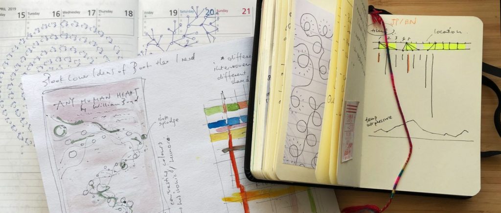
Some inspirations and idea sketches for this Weekly Chart.
However, the app didn’t collect my step counts for certain dates. So instead I used the Apple Health data my iPhone recorded. (You can read how to do this in my coworker Fabian’s Weekly Chart from a few weeks back, although I used this Python script to achieve the same.)
For the days on which I wrote my diary, I plotted the step counts as circles on a scatterplot. Because moving around is what I mostly did in the past two years, I decided to highlight that with colors. I then included some more details in the tooltips, like text length, what language I wrote in, and – for the top and the bottom 5% of the days with the most and least step counts – some explanation of what was going on this day.
It is surprisingly satisfying to see an overview of my personal past, to realize that these shapes and colors mean something to me. When starting this project, I was concerned that the chart will be too personal to make sense to anybody else. But maybe it’s ok to create charts which have you as the main audience.
And I hope that the idea of analyzing and visualizing one’s diary can be interesting to many more people. I’m curious as to how everybody else approaches this. Do you write a diary? Have you ever analyzed it? I would love to learn how other people journal. Write to me at aya@datawrapper.de, or leave a comment below. We’ll see you next week!


Comments