This article is brought to you by Datawrapper, a data visualization tool for creating charts, maps, and tables. Learn more.
Two charts in one

This morning, I saw a chart that made me incredibly happy (almost as happy as Elana’s Weekly Chart from last week!). It was unintended. Not expecting any charts at all, I started to read the first pages of “Utopia for Realists” by De Correspondent journalist Rutger Bregman. It was only 7am – but by page 3 this book had already made my day. On page 3, Bregman shows the following chart:
The chart above is a Datawrapper version that I made. In Bregman’s book the chart looks like this:
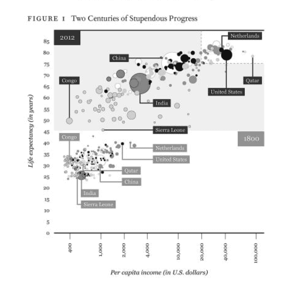
So what is the idea in these two charts that got me so excited? This scatterplot shows values for the same countries for two years, 1800 and 2015. Doing this in one plot with so many data points – to pull this off, the data needs to work in our favor. Imagine we’d use data from 2010 instead of 1800: The 2010 and 2015 values would be too close to each other and all the country bubbles would overlap.[1]
“But Lisa,” you’ll say, “think of small multiple scatterplots. Or animated scatterplots. They can show trillions of years!” True – but in different views. They won’t show me the same insights as a chart that combines both years in the same view. Only the scatterplot above shows me at a glance that the shortest life expectancy in 2015 is longer than the longest life expectancy in 1800 (Max Roser from Our World in Data shows this well with this line chart). Or that Somalia is the only country in which GDP per capita was lower in 2015 than in 1800, although its life expectancy increased.[2]
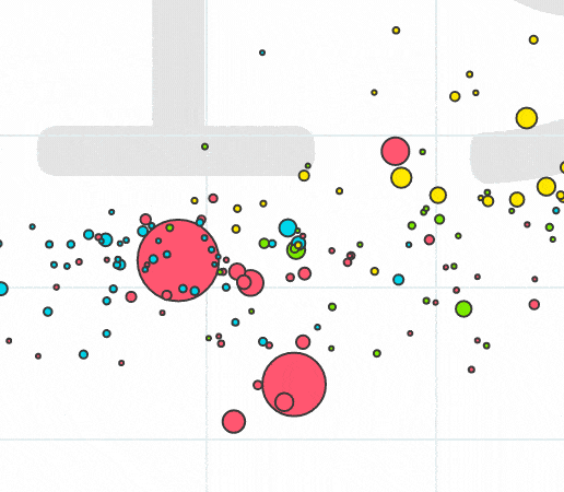

The closest I can think of are “data worms” like in this TED talk by Hans Rosling or in this project by Moritz Stefaner. I like them a lot. But here again, we bump into a limitation: We can only show so many data worms before the whole chart becomes incomprehensible. A data worm chart with as many countries as in Bregman’s chart would be a (nice-looking!) mess.
Do you know any forms of bringing years into scatterplots other than animation, small multiples or data worms? Let me know on Twitter, via email or here in the comments. I’ll see you next week!
-
Although that’s true, we can solve this: We simply don’t show the population anymore. Max Roser does exactly that and shows us four years from the same dataset. Note how the plot would be really hard to read without the trendlines. ↩︎
-
The lines I added for e.g. Somalia make this chart a two-dimensional range plot. Which makes me even more excited about this chart type. ↩︎


Comments