

French people are losing confidence in the Paris Olympics
March 28th, 2024
3 min
This article is brought to you by Datawrapper, a data visualization tool for creating charts, maps, and tables. Learn more.
Hi, this is David. At Datawrapper, I work on the UI/UX and general design. For this Weekly Chart, let’s look at how to use Datawrapper to create an infographic.
Earlier this week, NASA’s SpaceX Crew-1 astronauts arrived at the International Space Station. That’s a big deal: Since NASA’s Space Shuttle program had been stopped in 2011, crewed spaceflights to the ISS were only possible with the Russian Soyuz spaceraft. Crew-1 was the first operational crewed flight of a commercially developed spacecraft into orbit and to the International Space Station (ISS).
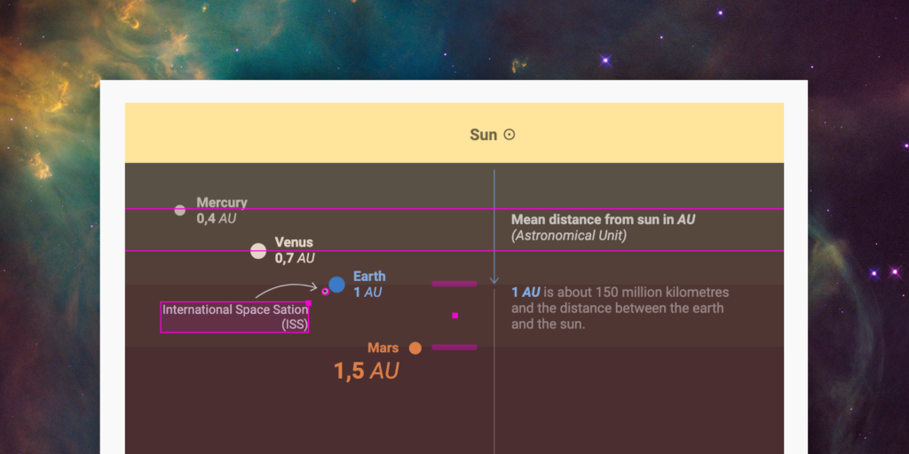
So these are exciting times to have a look at planets around us. And that’s exactly what I’ve done for this week’s chart, an infographic about the distances in our solar system.
Datawrapper is a good tool to create charts, maps, and tables, but it’s not designed for creating infographics – but that won’t stop us 🙂 Here is a look behind the scenes of this graphic:
As a basis, I used a scatterplot, which offers a lot of freedom: It’s easy to scale the planets based on a certain variable (in this case the Equatorial radius (km)) and you can use both axes (horizontal and vertical) to encode additional data. This graphic uses the vertical axis to show the distance of the planets from the sun. When we’re talking about space, we’re talking about huge distances, and this long vertical format underlines the distances and helps to show the planets next to Earth. The horizontal axis help with this, too: it orders all the planets from left to right, giving the planets close to the sun some space to breathe.
If you don’t use a custom theme, all Datawrapper charts have a white background – but a dark background is more appropriate for this topic. So I used the recently redesigned range highlight feature to create the different background shades that “shine” from the sun at the top to each planet. The colors of this gradient were generated by the Chroma.js Color Palette Helper that my colleague Gregor built. It really helps to create equally distant color stops of a gradient.
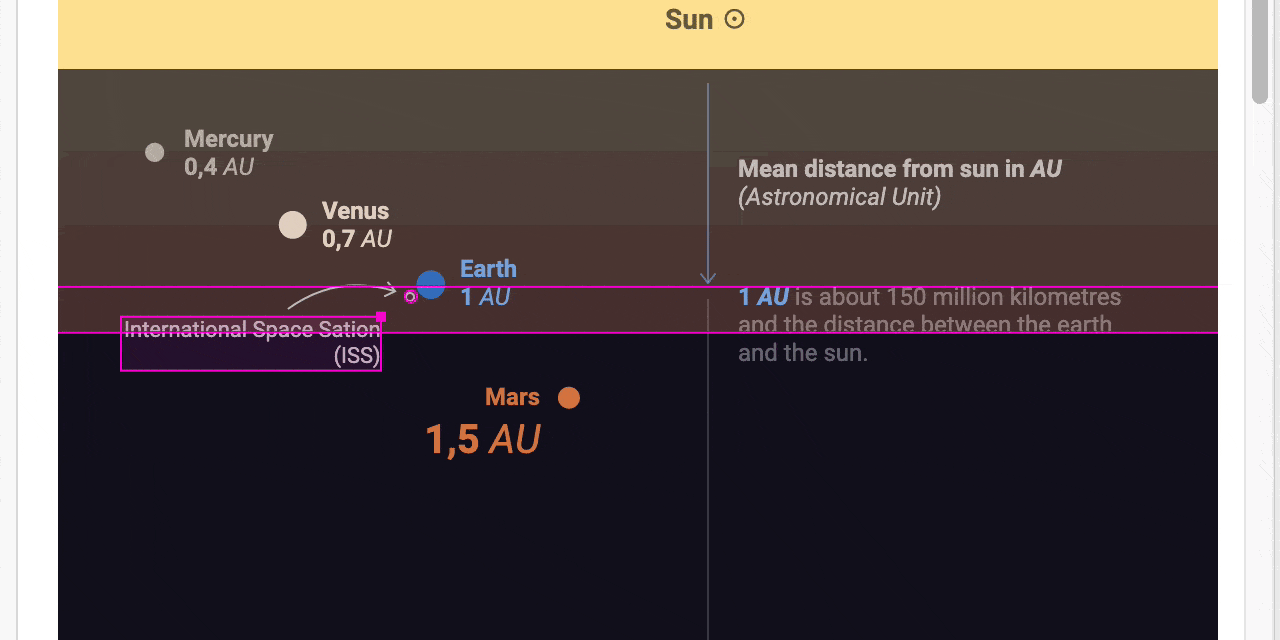
The second feature I used are our (also freshly redesigned) text annotations. Normally a scatterplot only shows the data points and labels for some of them. In this case, I wanted to show extra information like the mean distance from the sun for each planet. I also added information that is not in the dataset with the annotation feature, like the ISS and the Voyager.
(In case you are wondering: The arrows that explain the distance are also text annotations but have no text.)
Interactions can provide extra information or can offer a look at the data from a different perspective. Datawrapper doesn’t give us many ways to add interaction…but it does give us tooltips. You can use them to provide more information to your readers without cluttering the graphic.
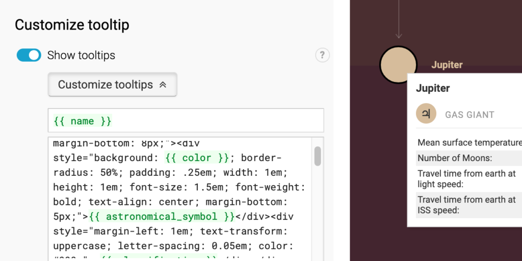
Here I used the tooltips to show each planets’ characteristics and the travel time from Earth at different speeds. You really can get creative with tooltips: You can add variables from your dataset, <html> tags or inline CSS styles. For example, I used a <table> to show several values in a more organized style. I also placed the astronomical symbol in a colored circle with some simple HTML/CSS to show a little icon of each planet. (Both values, the symbol and the color, are stored in the dataset.)
You can go even further and also add little column charts into tooltips as Lisa explained last week.
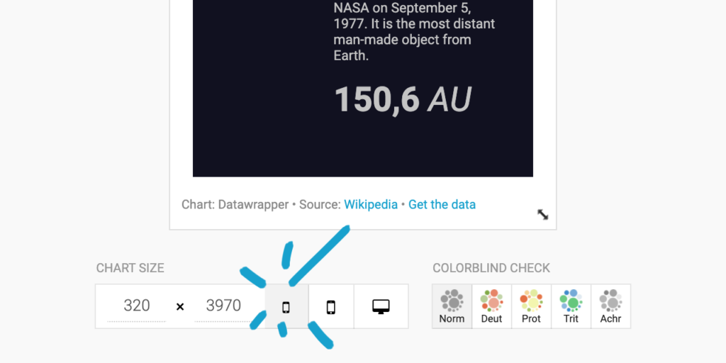
It’s always a good idea to view your chart (or, in this case, graphic) in different sizes to make sure it looks good and everything is readable wherever your chart will be embedded or viewed. In this case, it’s even more important because we use a lot of text annotations, and those can’t be scaled easily like most other things. Sometimes, it’s easier to design everything on a small size and make sure it looks good when increasing the size.
You can use the different preset buttons below a chart to preview it in different sizes in the Datawrapper app:
You can duplicate this chart by hovering over it and clicking on the top right button. Look at how this graphic was made or to use it as a starting point for your stellar infographic ✨. If you have any questions, let me know in the comments or write a mail to support@datawrapper.de. See you next week!


Comments