This article is brought to you by Datawrapper, a data visualization tool for creating charts, maps, and tables. Learn more.
Time off
I’m on vacation 🌴☀️⛱😎[1]! If you see this, one of my coworkers has successfully pushed a “Publish” button[2]. And to prepare you for the fact that this won’t be the only Weekly Chart that is going to be published while I’m on vacation, I proudly present to you this chart this table:
The data for this chart comes from Wikipedia (don’t try this at home) and I’m not sure how accurate it is.
Chart Choices
Yes, it’s a table 😱. I know. This is weird. Tables are like nerdy, quiet kids in the corner of the classroom. They can’t sell themselves well. Why is it not a chart, with colorful shapes and lines and all these fun things? Let’s look at the alternative chart types to understand why they fall short of a table in this case:
It’s obvious, isn’t it? We need a map! Do we, though; do we? We want to show three values, but a simple choropleth map maps only one of those. Also, we just want to show values for ten countries. Some of them are not that big (Iceland ❤️). Readers won’t be able to spot these countries easily on a worldmap. It’s quite some waste of space.
Maybe a scatterplot? That’s a pretty empty scatterplot thanks to our small number of values. And here, too, we can’t show all our three variables, only two (e.g. paid vacations & holidays).
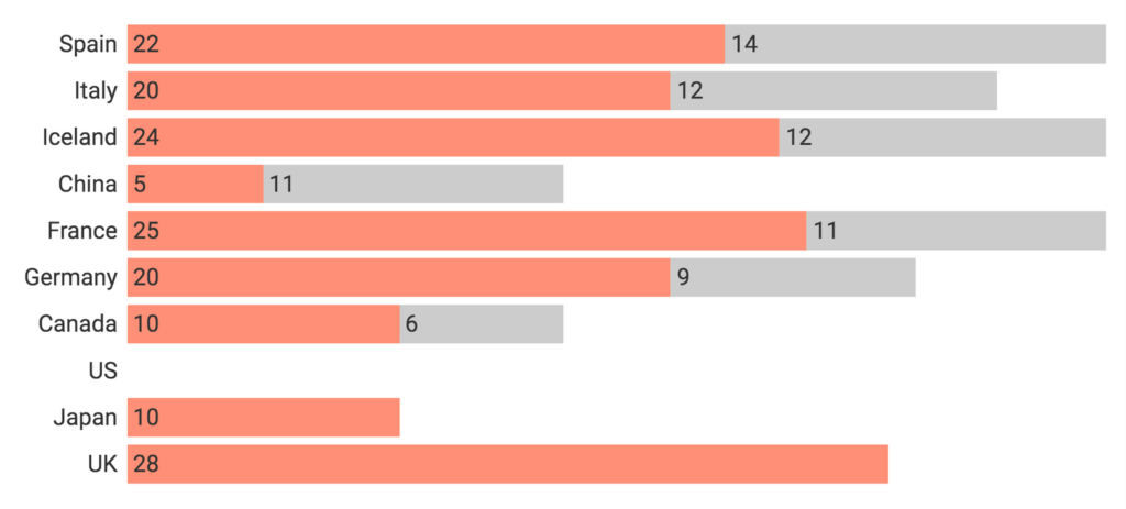
A stacked bar chart! Good idea, because we don’t need to explicitly spell out the sum of the two values: The “vacations”-bar and the “holiday”-bar stack up to let us easily compare the sum of these days. There are two problems, however: Of the two variable we show, we can only compare the vacation days well with each other. The “holiday” bars starts at very different points on the y-axis. Second: In the US, workers have zero paid leave days. That’s a really important number in our table – but in a stacked bar, missing values are rather irritating than interesting. Have a look yourself:

But split bars would work well! Yes, they would. Well, our table up there is basically a split bars chart, thanks to their tiny orange bars. There’s just one reason why the Datawrapper split bars fall short: You can’t let readers sort them. But you can let readers sort a table (and that makes quite some sense in this case).
We have a winner: The table. I won’t say that too often. But this time, I’m happy to pull that nerdy kid out of the classroom corner and announce it as the best possible chart type for this case. Go home, colorful chart types.
Next week, I’ll be back to the normal Berlin office life. See you then for a new Weekly chart (definitely not about vacations; I promise.)


Comments