This article is brought to you by Datawrapper, a data visualization tool for creating charts, maps, and tables. Learn more.
Less link blue, more red? A web color history

Hi, I’m Jakub, a software engineer at Datawrapper. I joined the team a few months ago to work on the vector export feature. This * dramatic pause * is my first Weekly Chart.
With data, you can check your assumptions. Do you feel like something is maybe true? Using the proper tools, you can replace these feelings with hard facts. (Which you can then again choose to ignore, but more on that another time.) For this Weekly Chart, I wanted to do exactly that.
So which were my assumptions?
I like the web and its history, and I like web history projects like One Terabyte of Kilobyte Age. And I thought: The web has surely changed a lot in the past decades. I had two hypotheses regarding colors on the web:
- It felt like blue underlined links are not a thing anymore.
- And I believed there has been more red color lately.
A few cups of coffee and queries to the excellent Internet Archive later, I came up with these lovely charts:
Now we have a clearer view of how the colors of these selected websites changed in time.
(Note that not all of the charts cover the very beginning of a website’s history, because the archived data is sparse there.)
We can see how the website redesigns affected the ratio of colors. Wikipedia shifted to a more pale color scheme around the year 2005. Google introduced a dark top navigation bar in 2011 and dropped it in 2019.
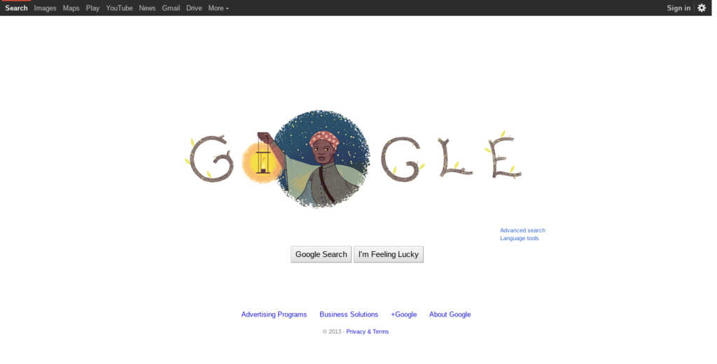
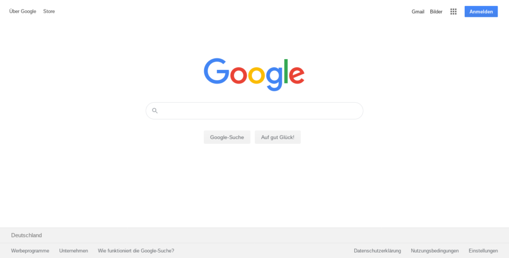
Google.com with the dark top navigation bar they introduced in 2011, and how it looks now.
What about my original assumptions? Is there less blue now? – Definitely. More red? – Not really.
That said, there’s a huge bias in which websites I decided to analyze. I chose a few ones that I think were popular back in the days and are still popular now, but this tells us little about the overall trends in web colors. To analyze that, we would need a larger and more objective sample, for instance use the historic data of the paid Alexa ranking of website traffic.
How the charts were made
It would make me happy if my learnings helped you make similar projects or extend this one. You can find the essential code in the datawrapper/snippets repo and the full project in my personal repo. Moreover, here are some technical details about the process. We will be speaking Python.
To make a chart of the history of a website’s colors, follow these steps:
- Donate to the Internet Archive – not optional, they’re doing a great job.
- Query the Wayback Machine API to find the URLs of the archived snapshots of the chosen website on a chosen date.
- Capture a screenshot of each archived snapshot – you can use Firefox controlled by Selenium to automate this.
- Reduce the number of colors of each image, so we can compare colors even when they’re a bit different – Pillow can do that.
- Count statistic of the pixel colors – there’s a function in pandas for that.
- Sort the colors by hue (in the HSV color model) to make the resulting chart more pleasing to the eye.
- Create the chart using Datawrapper’s API.
Each of the steps is more or less time consuming, so it’s critical to always save all the intermediate results (snapshot URLs, screenshots, color analysis). This allows us to change the logic of a single step and rerun it without also needing to run all the previous steps again. Luigi is a nice project that will manage such a workflow for us.
The Datawrapper Area Chart parameters I used are:
{
    "visualize": {
        "area-opacity": "1",
        "custom-colors": {
            "#000000": "#000000",
            "#0000c0": "#0000c0",
            "#002040": "#002040",
            "#002060": "#002060",
            "...": "..."
        },
        "interpolation": "step",
        "label-colors": false,
        "labeling": "off",
        "show-tooltips": false,
        "show-tooltips": false,
        "stack-to-100": true,
        "y-grid": "off",
        "y-grid-format": "0%"
    }
}
That’s it! You can reach out to me at jakub@datawrapper.de if you have any comments or questions regarding this project, or you can simply leave a comment below. Until then, take care and happy plotting!


Comments