This article is brought to you by Datawrapper, a data visualization tool for creating charts, maps, and tables. Learn more.
Women graduate, men are in power.
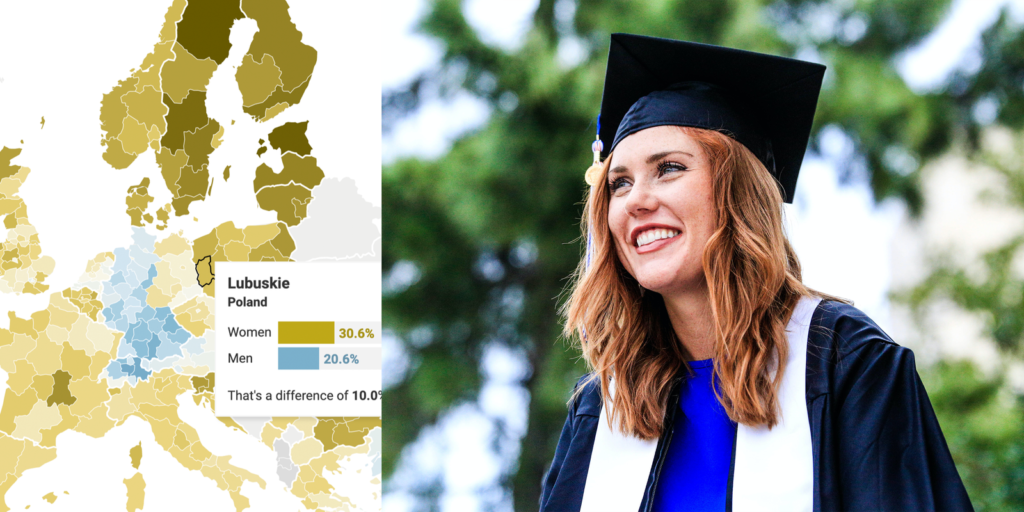
More women than men in almost all European regions have a university degree, as this map shows.

Hey everyone, it’s Lisa. You might know me from writing a blogpost or two on the Datawrapper blog.
A few weeks ago, I saw a tweet with two maps of Europe, showing the share of women and men with a university degree. I was intrigued. Switching back and forth between the two maps, it became more and more apparent that more women than men have a university degree in Europe.
Here’s my attempt to combine the two maps from the tweet:
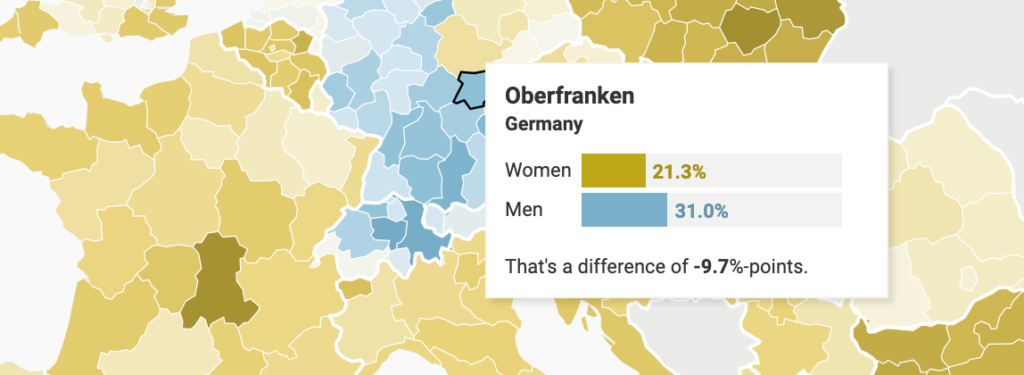
That’s a curious visualization. You don’t often see a map of Europe where Germany, Austria, Switzerland, and Turkey show the same pattern (= more male then female people who graduated university) – even if it can be explained by different reasons.
Where are all the men?
But let’s take a step back. Maybe Germany and Turkey are not the interesting countries here, but every other country. Why are there more women than men graduating?
(By the way, this is not just a European phenomenon. No matter if Poland or Panama, Qatar or Costa Rica, Thailand or Egypt, Brazil or China, the US or Russia – in most countries, more women graduate than men. It’s especially common in high-income countries, as Edward B. Fiske writes for the UNESCO.)
Of course, there are many reasons why more women graduate now than 50 years ago. Just to name a few: Better contraception and therefore postponed kids. More equal relationships and therefore the chance to combine family and career. Fewer gender stereotypes. And more educated parents who are therefore more open to the idea that their daughters will go to university.
But, as Stéphan Vincent-Lancrin writes for the OECD:
It was to be expected that the removal of material and psychological barriers to the participation of women should enable them to catch up with men, but it was by no means self-evident that it would be replaced by a reversal of the inequalities to the detriment of men.”
Why this is remains a mystery. Girls don’t come into the world more intelligent than boys. Instead, fewer men might study because they have better alternatives. Or because girls get better prepared for university in school: Most teachers are women, and studies have shown that teachers favor students of their sex. Already in 2003, 15-year old girls had more aspirations to go to university than boys of the same age – in all OECD countries, as Vincent-Lancrin points out.
More women in university ≠ more women in power
But we all know: The job world looks different than university campuses. Women might be the ones graduating more. But when we watch the news at night, we see mostly men. And this very article quotes two men, not two women.
That disparity already starts in university: Globally, more women get bachelor’s and master’s degrees than men – but more men write PhDs, and far more men get employed as researchers or professors. Here’s how this plays out in Germany:
“Clearly women face considerable barriers as they move up the educational ladder to research careers,” Fiske writes. He continues: “Women in research are […] often paid less than equally-qualified men, are less likely to be promoted, and are consistently clustered at the lower ranking of the science system.”
Sigh.
So what’s up with Turkey, Switzerland, Austria, and Western Germany? Why didn’t women catch up with men there? Frankly, I don’t know – and I couldn’t find good reasons online. If you know of good research in this regard, let me know, e.g. in the comments or via email.
A map with tooltips with charts
If you hover over the regions in the map above, you’ll find that they contain little bar charts:
I created them with inline-styled <div> tags, like so:
<div style="width:{{ 1.3*women }}px; height:15px; background-color:#BFA817; color:white; padding:4px 4px 0px 4px; vertical-align:bottom; font-weight:bold; display:inline-block;"></div>You can learn more about it in our new Academy article “How to add charts to tooltips”.
The color legend, too, was created with HTML; this time with <span> tags. I based the legend on a tutorial by data reporter Hannah Recht and used cssgradient.io to create the gradients. Hover over the map, click on “Edit this chart” and then go on the Annotate tab to see for yourself.
And if you’re curious about the color key in the title, I can recommend the article “How to turn your title into a color key”.
And that’s it! I’m looking forward to hearing your thoughts. See you next week!


Comments